---
title: "View"
doc_type: static
doc_category: static
doc_version: v20260901
source_url:
html: 'https://developer.shopline.com/docs/apps/checkout/checkout-ui-customizer/ui-components/structure/view'
md: 'https://developer.shopline.com/docs/apps/checkout/checkout-ui-customizer/ui-components/structure/view.md'
---
# View
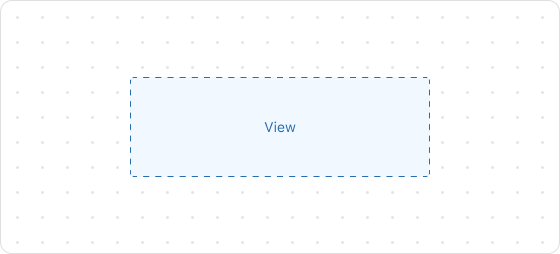
The View component is a universal container that maintains its internal content at its original size without forcibly stretching it. This component is particularly useful within layout components (such as [Grid](https://developer.shopline.com/docs/apps/checkout/checkout-ui-customizer/ui-components/structure/grid.md), [BlockStack](https://developer.shopline.com/docs/apps/checkout/checkout-ui-customizer/ui-components/structure/block-stack.md), [InlineLayout](https://developer.shopline.com/docs/apps/checkout/checkout-ui-customizer/ui-components/structure/inline-layout.md)) to prevent unexpected distortion of child components due to automatic size adjustments by layout components.
## Preview
## Code example
```tsx
render('Checkout::Dynamic::Render', (props) => {
return (
View
);
});
```
## ViewProps
> **tip**
>
> Optional properties are marked with a `?`. Properties without a `?` are required.
### display?
[MaybeResponsiveConditionalStyle](#mayberesponsiveconditionalstyle)<[Display](#display-1)>Default: block
The alignment direction.
----
### maxBlockSize?
[MaybeResponsiveConditionalStyle](#mayberesponsiveconditionalstyle)<[Sizing](#sizing)>
The maximum vertical size.
----
### maxInlineSize?
[MaybeResponsiveConditionalStyle](#mayberesponsiveconditionalstyle)<[Sizing](#sizing)>
The maximum horizontal size.
----
### minBlockSize?
[MaybeResponsiveConditionalStyle](#mayberesponsiveconditionalstyle)<[Sizing](#sizing)>
The minimum vertical size.
----
### minInlineSize?
[MaybeResponsiveConditionalStyle](#mayberesponsiveconditionalstyle)<[Sizing](#sizing)>
The minimum horizontal size.
----
### opacity?
[Opacity](#opacity-1)
The opacity of the component.
----
### overflow?
[Overflow](#overflow-1)
Manages content overflow.
----
### border?
[MaybeResponsiveConditionalStyle](#mayberesponsiveconditionalstyle)\<[MaybeShorthandProperty](#maybeshorthandproperty)<[BorderStyle](#borderstyle)>\>
The border style.
----
### cornerRadius?
[MaybeResponsiveConditionalStyle](#mayberesponsiveconditionalstyle)\<[MaybeShorthandProperty](#maybeshorthandproperty)<[CornerRadius](#cornerradius-1)>\>
The corner radius size.
----
### padding?
[MaybeResponsiveConditionalStyle](#mayberesponsiveconditionalstyle)\<[MaybeShorthandProperty](#maybeshorthandproperty)<[Spacing](#spacing)>\>
Configures the inner padding.
----
### borderWidth?
[MaybeResponsiveConditionalStyle](#mayberesponsiveconditionalstyle)\<[MaybeShorthandProperty](#maybeshorthandproperty)<[BorderWidth](#borderwidth-1)>\>
Specifies the border width. Requires the border to be enabled first. Supports a custom numeric value, such as 20.
----
### backgroundColor
string
The background color. Supports custom color values, for example:
- Color Names: red
- Hex: #FF0000
- RGB: rgb(255, 0, 0)
- RGBA: rgba(255, 0, 0, 0.5)
- HSL: hsl(0, 100%, 50%)
- HSLA: hsla(0, 100%, 50%, 0.5)
> **CAUTION**
>
> Invalid inputs will not be applied.
----
### borderColor
string
The border color. Requires the border to be enabled first. Supports custom color values, for example:
- Color Names: red
- Hex: #FF0000
- RGB: rgb(255, 0, 0)
- RGBA: rgba(255, 0, 0, 0.5)
- HSL: hsl(0, 100%, 50%)
- HSLA: hsla(0, 100%, 50%, 0.5)
> **CAUTION**
>
> Invalid inputs will not be applied.
----
## Type descriptions
### Display
block inline
+ block: Aligns the component vertically.
+ inline: Aligns the component horizontally.
----
### Sizing
number
$\{number\}%
fill
----
### Opacity
10
20
30
40
50
60
70
80
90
----
### Overflow
hidden visible
+ hidden: Hides content that overflows the component bounds.
+ visible: Allows content to overflow and remain visible.
----
### BorderStyle
base dotted none
+ base: Solid border.
+ dotted: Dashed border.
+ none: No border.
----
### CornerRadius
base small large fullyRounded none
----
### Spacing
none base extraTight tight loose extraLoose
----
### BorderWidth
base medium number
----
### MaybeResponsiveConditionalStyle
T | [ConditionalStyle](#conditionalstyle)\
+ Example of a plain value: base
+ Example of a conditional value: \{ defaultValue: 'tight', conditionals: [\{ conditions: \{ viewportInlineSize: \{ min: 'medium' } }, value: 'loose' }] }
----
### ConditionalStyle
\{ defaultValue?: T; conditionals: [ConditionalValue](#conditionalvalue)<T, [Conditions](#conditions)>[] }
----
### ConditionalValue
\{ conditions: [Conditions](#conditions); value: T }
----
### Conditions
[AtLeastOne](#atleastone)<[ViewportSizeCondition](#viewportsizecondition)>
----
### ViewportSizeCondition
\{ viewportInlineSize: \{ min: T } }
----
### AtLeastOne
Partial<T> & U[keyof U]
----
### ViewportInlineSize
extraSmall small medium large
Refer to [Viewport breakpoints](https://developer.shopline.com/docs/apps/checkout/checkout-ui-customizer/component-utilities/style-helper.md#viewport-breakpoints).
----
### MaybeShorthandProperty
T | [ShorthandProperty](#shorthandproperty)<T>
----
### ShorthandProperty
[T, T][T, T, T, T]
----