---
title: "Editor controls"
doc_type: static
doc_category: static
doc_version: v20270301
source_url:
html: 'https://developer.shopline.com/docs/online-store-3-0-themes/theme-and-editor-interaction/editor-controls'
md: 'https://developer.shopline.com/docs/online-store-3-0-themes/theme-and-editor-interaction/editor-controls.md'
---
# Editor controls
Editor controls enable merchants to visually edit online store themes within the theme editor.
You can define the `settings` attributes for each module control in the theme schema configuration.
---
## Basic controls{#IOCQK}
### Standard control attributes{#foIUo}
The following table lists the standard control attributes. Some controls may have specialized attributes. For specific specialized attributes, see the following control descriptions.
| **Attribute** | **Description** | **Required or not** |
| --- | --- | --- |
| type | The control type | Yes |
| id | The configuration item ID, used to access the configuration value | Yes |
| label | The configuration label, displayed in the theme editor | Yes |
| default | The configuration default value | No |
| info | The configuration remarks | No |
### text{#fo1JC}
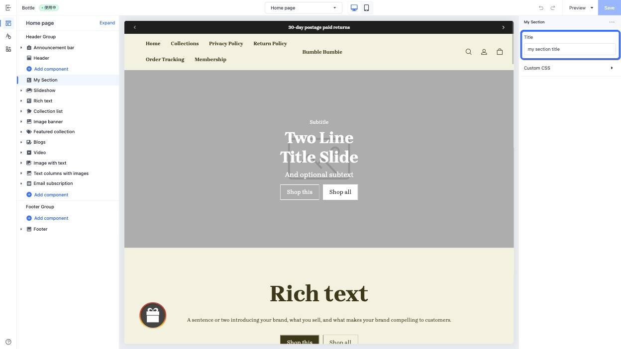
This type of control outputs a single-line text input field, used to enter single-line text, such as a section's title.
When accessing the configuration value of this control, the data is returned as a [string](https://developer.shopline.com/docs/sline/basics.md#RBRfx).
#### Specialized attributes
| **Attribute** | **Description** | **Required or not** |
| --- | --- | --- |
| placeholder | Placeholder text of the input field | No |
#### Use case example
Example code:
```json
{
"name": "My Section",
"settings": [
{
"type": "text",
"id": "title",
"label": "Title",
"default": "my section title",
"placeholder": "please enter title"
}
],
"presets": [
{
"name": "My Section"
}
]
}
```
The corresponding output effect in the theme editor is as follows:
### textarea{#BU9mb}
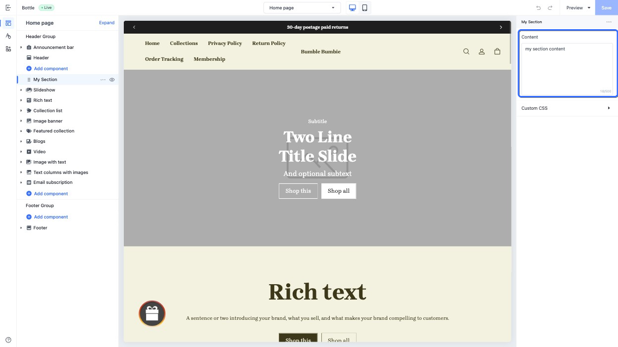
This type of control outputs a multiple-line text input field, used to enter multiple-line text, such as a section's content.
When accessing the configuration value of this control, the data is returned as a [string](https://developer.shopline.com/docs/sline/basics.md?lang=en#RBRfx).
#### Specialized attributes
| **Attribute** | **Description** | **Required or not** |
| --- | --- | --- |
| placeholder | Placeholder text of the input field | No |
| limit | Maximum text input length | No |
#### Use case example
Example code:
```json
{
"name": "My Section",
"settings": [
{
"type": "textarea",
"id": "content",
"label": "Content",
"default": "my section content",
"placeholder": "please enter content",
"limit": 500
}
],
"presets": [
{
"name": "My Section"
}
]
}
```
The corresponding output effect in the theme editor is as follows:
### richtext{#YmyRL}
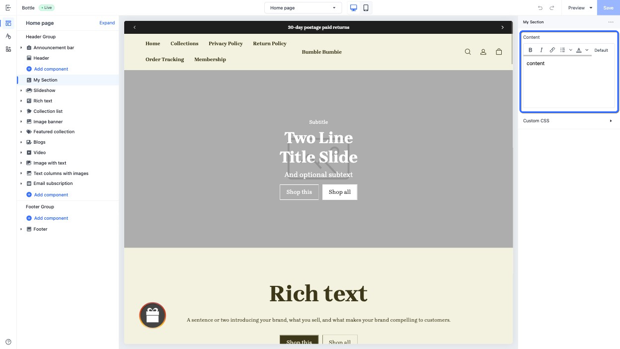
This type of control outputs a rich text input field, used to display diverse text content such as blog posts. It supports basic text formatting, including.
+ Bold
+ Italics
+ Hyperlinks
+ Paragraphs
When accessing the configuration value of this control, the data is returned as a [string](https://developer.shopline.com/docs/sline/basics.md?lang=en#RBRfx).
#### Use case example
Example code:
```json
{
"name": "My Section",
"settings": [
{
"type": "richtext",
"id": "content",
"label": "Content",
"default": "content"
}
],
"presets": [
{
"name": "My Section"
}
]
}
```
The corresponding output effect in the theme editor is as follows:
### range{#vTksL}
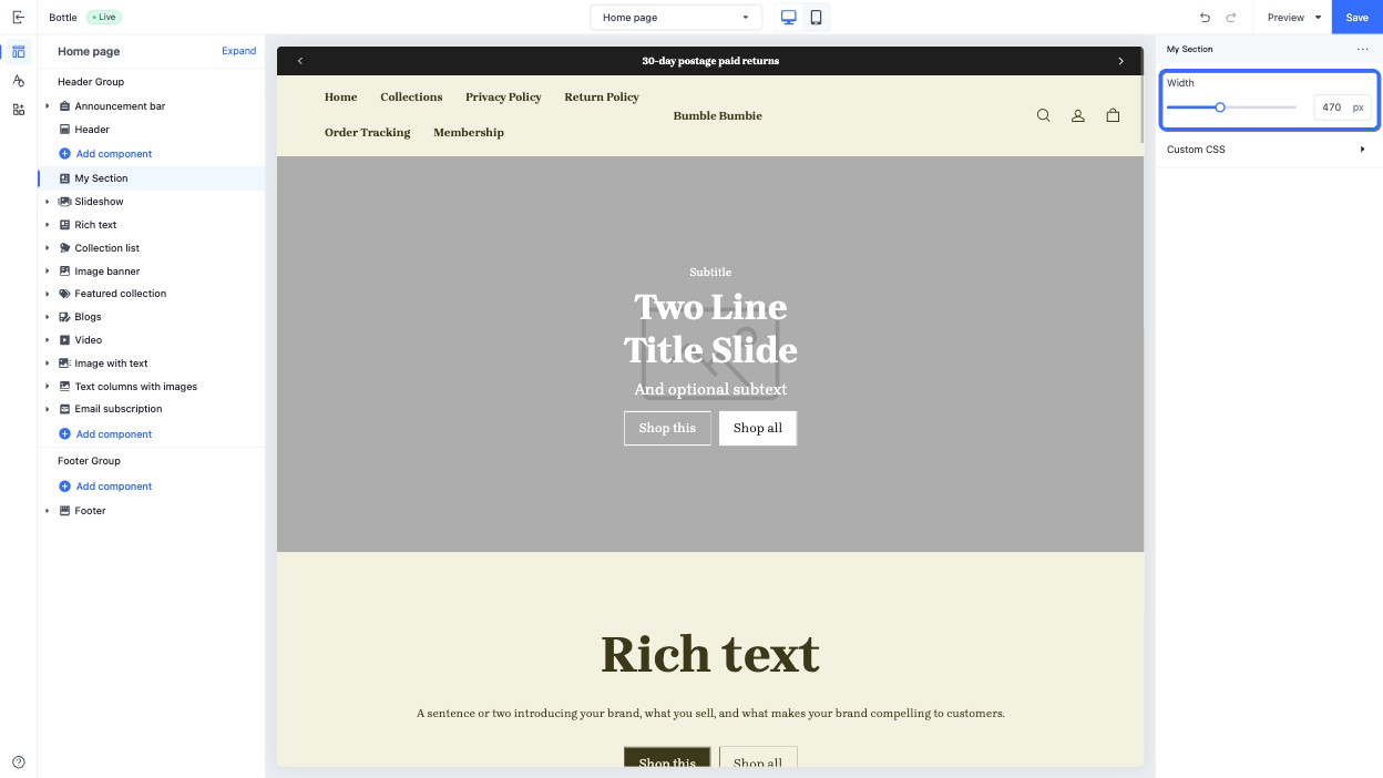
This type of control outputs a slider, used to adjust multiple numeric values, such as the section width.
When accessing the configuration value of this control, the data is returned as a [string](https://developer.shopline.com/docs/sline/basics.md?lang=en#RBRfx).
#### Specialized attributes
| **Attribute** | **Description** | **Required or not** |
| --- | --- | --- |
| min | The minimum value | Yes |
| max | The maximum value | Yes |
| step | The step length of the slider. The value must be greater than `0`, and can be evenly divided by the difference between the maximum and minimum value. | Yes |
| unit | The unit of the input value, displayed on the slider. | No |
> **CAUTION**
>
> + The `default` value for this `range` control is required.
> + The `min`, `max`, `step`, and `unit` attributes must use a numeric data type.
#### Use case example
Example code:
```json
{
"name": "My Section",
"settings": [
{
"type": "range",
"id": "width",
"label": "Width",
"default": 100,
"min": 100,
"max": 1000,
"step": 10,
"unit": "px"
}
],
"presets": [
{
"name": "My Section"
}
]
}
```
The corresponding output effect in the theme editor is as follows:
### select{#LLYnS}
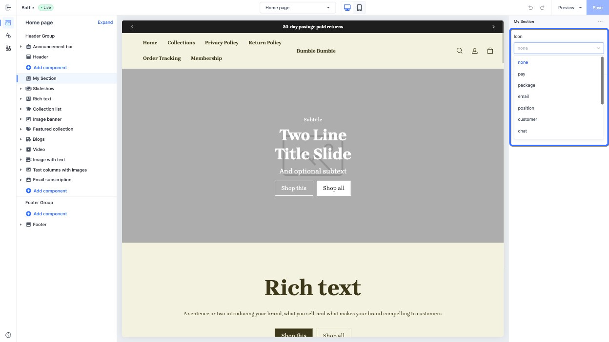
This type of control outputs a dropdown menu, used in scenarios with multiple options, such as the icon selection.
When accessing the configuration value of this control, the data is returned as a [string](https://developer.shopline.com/docs/sline/basics.md?lang=en#RBRfx).
#### Specialized attributes
| **Attribute** | **Description** | **Required or not** |
| --- | --- | --- |
| options | A list of options for the dropdown menu. Each option includes: • `label`: The option label. • `value`: The option value. | Yes |
#### Use case example
Example code:
```json
{
"name": "My Section",
"settings": [
{
"type": "select",
"id": "icon",
"label": "Icon",
"default": "none",
"options": [
{
"label": "none",
"value": "none"
},
{
"label": "pay",
"value": "pay"
},
{
"label": "package",
"value": "package"
},
{
"label": "email",
"value": "email"
},
{
"label": "position",
"value": "position"
},
{
"label": "customer",
"value": "customer"
},
{
"label": "chat",
"value": "chat"
},
{
"label": "gift",
"value": "gift"
},
{
"label": "phone",
"value": "phone"
},
{
"label": "faq",
"value": "faq"
},
{
"label": "logistics",
"value": "logistics"
},
{
"label": "discount",
"value": "discount"
}
]
}
],
"presets": [
{
"name": "My Section"
}
]
}
```
The corresponding output effect in the theme editor is as follows:
### switch{#H2vBl}
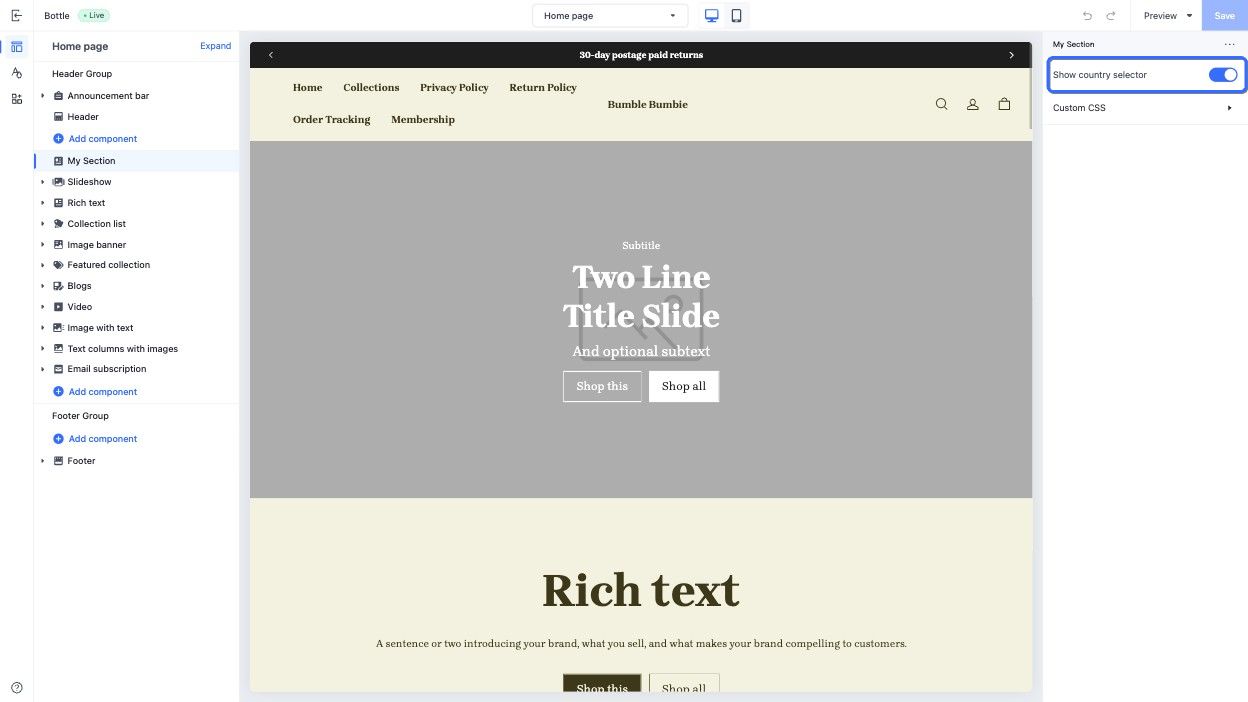
This type of control outputs a switch, suitable for toggling functional states, such as controlling the visibility of a country selector.
When accessing the configuration value of this control, the data is returned as a [boolean](https://developer.shopline.com/docs/sline/basics.md#ocahs).
> **CAUTION**
>
> If the `default` value is not specified, it defaults to `false`.
#### Use case example
Example code:
```json
{
"name": "My Section",
"settings": [
{
"type": "switch",
"id": "show_country_selector",
"label": "Show country selector",
"default": true
}
],
"presets": [
{
"name": "My Section"
}
]
}
```
The corresponding output effect in the theme editor is as follows:
### text_align{#ptyrt}
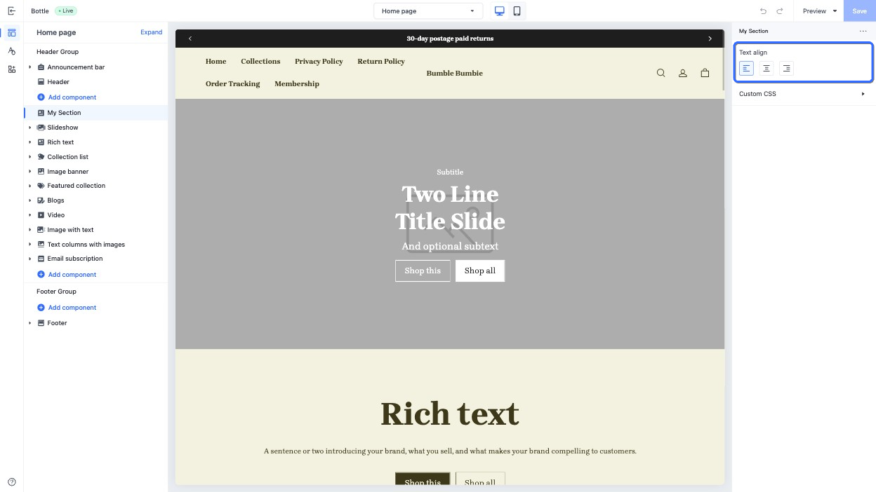
This control provides an interface element for selecting the horizontal alignment of an element, used for text alignment, such as aligning a title horizontally.
When accessing the configuration value of this control, the data is returned as a [string](https://developer.shopline.com/docs/sline/basics.md?lang=en#RBRfx). Possible returned values are as follows. You can also configure the `default` attribute using the following values.
+ `left`
+ `center`
+ `right`
#### Use case example
Example code:
```json
{
"name": "My Section",
"settings": [
{
"type": "text_align",
"id": "text_align",
"label": "Text align",
"default": "left"
}
],
"presets": [
{
"name": "My Section"
}
]
}
```
The corresponding output effect in the theme editor is as follows:
### vertical_align{#ToLR2}
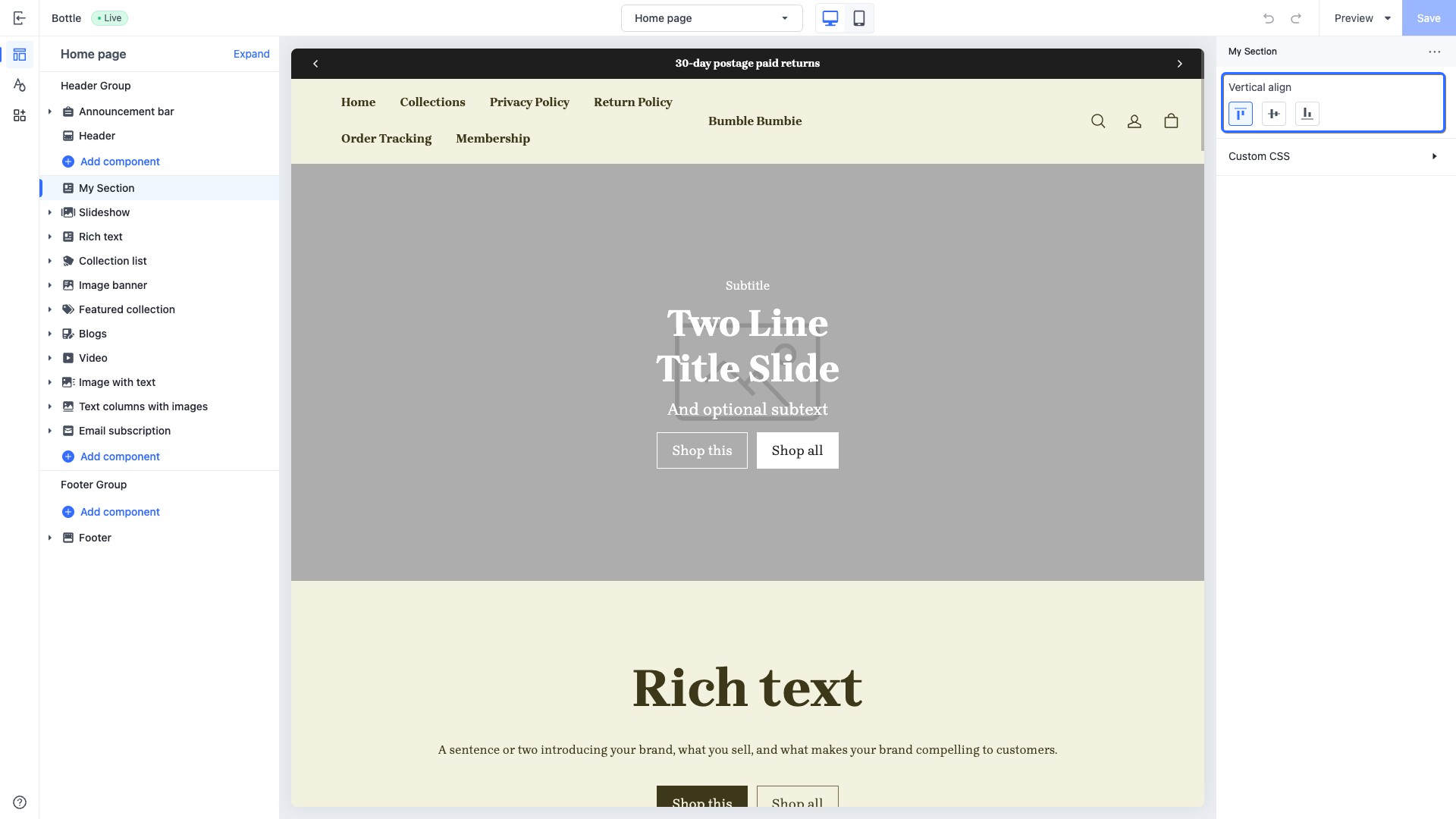
This control provides an interface element for selecting the vertical alignment, used to configure the alignment of elements along the vertical cross-axis, such as aligning section blocks.
When accessing the configuration value of this control, the data is returned as a [string](https://developer.shopline.com/docs/sline/basics.md?lang=en#RBRfx). Possible returned values are as follows. You can also configure the `default` attribute using the following values.
+ `top`
+ `middle`
+ `bottom`
#### Use case example
Example code:
```json
{
"name": "My Section",
"settings": [
{
"type": "vertical_align",
"id": "vertical_align",
"label": "Vertical align",
"default": "top"
}
],
"presets": [
{
"name": "My Section"
}
]
}
```
The corresponding output effect in the theme editor is as follows:
### horizontal_align{#lPLq5}
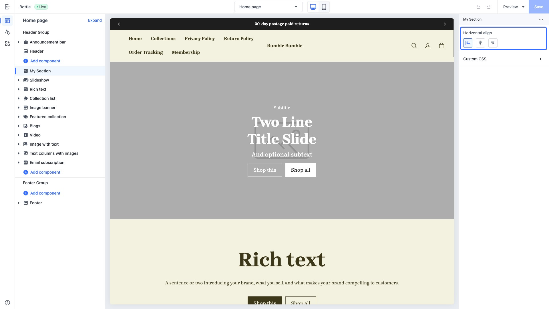
This control provides an interface element for selecting the horizontal alignment, used to align elements along the horizontal main axis, such as aligning section blocks.
When accessing the configuration value of this control, the data is returned as a [string](https://developer.shopline.com/docs/sline/basics.md?lang=en#RBRfx). Possible returned values are as follows. You can also configure the `default` attribute using the following values.
+ `left`
+ `center`
+ `right`
#### Use case example
Example code:
```json
{
"name": "My Section",
"settings": [
{
"type": "horizontal_align",
"id": "horizontal_align",
"label": "Horizontal align",
"default": "left"
}
],
"presets": [
{
"name": "My Section"
}
]
}
```
The corresponding output effect in the theme editor is as follows:
### url{#URtvz}
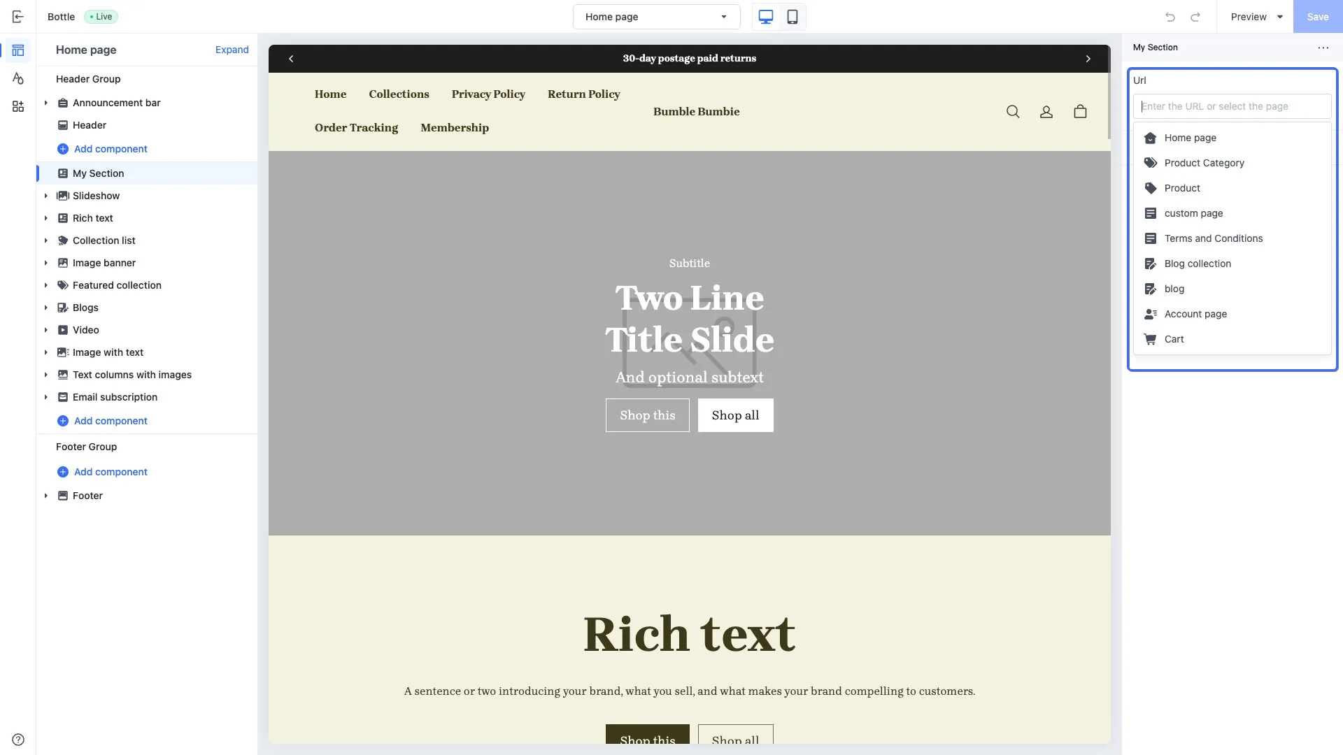
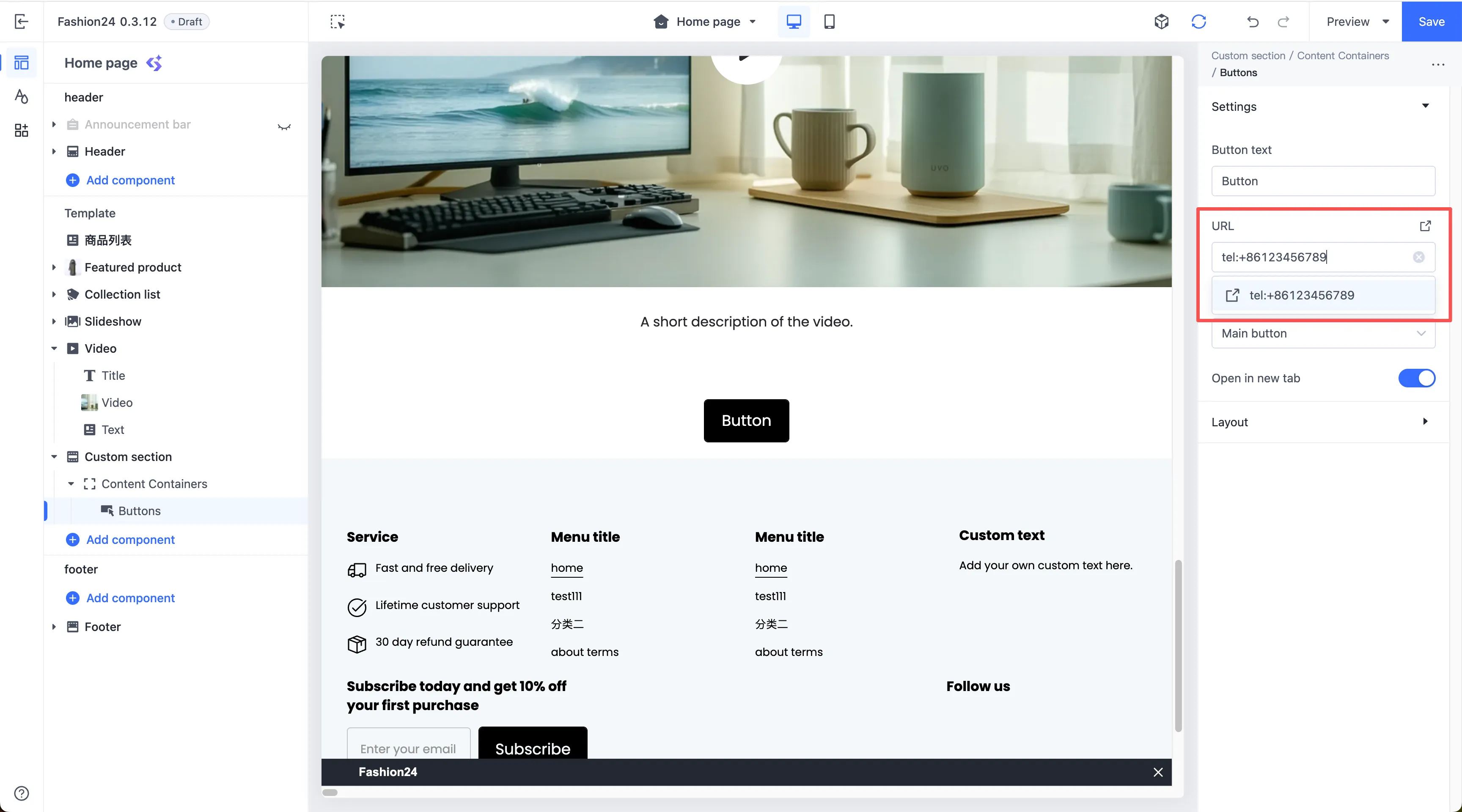
This control provides a URL combo box, allowing merchants to configure navigation targets when building their online store. Merchants can manually input an external URL, a relative path, or a phone number. They can also select the target page in the page selector. The following lists the supported pages:
+ Home page
+ Collection overview page
+ Product detail page
+ Custom page
+ Policy page
+ Blog overview page
+ Blog post page
+ User account page
+ Cart page
When accessing the configuration value of this control, the data is returned in one of the following forms:
+ **String**: A URL string entered directly by the merchant in the input box. For example, `tel:+1123-***-7890` or `https://example.com`.
+ **Resource object**: A structured object containing the page type and ID, returned when the merchant selects a preset page from the dropdown selector.
+ **Empty string**: Returned if the merchant provides no input or makes no selection.
#### Use case example
Example code:
```json
{
"name": "My Section",
"settings": [
{
"type": "url",
"id": "url",
"label": "Url"
},
{
"type": "url",
"id": "tel",
"label": "Tel"
}
],
"presets": [
{
"name": "My Section",
"settings": {
"tel": "tel:+86123456789"
}
}
]
}
```
The corresponding output effect in the theme editor is as follows:
### color{#O8ViG}
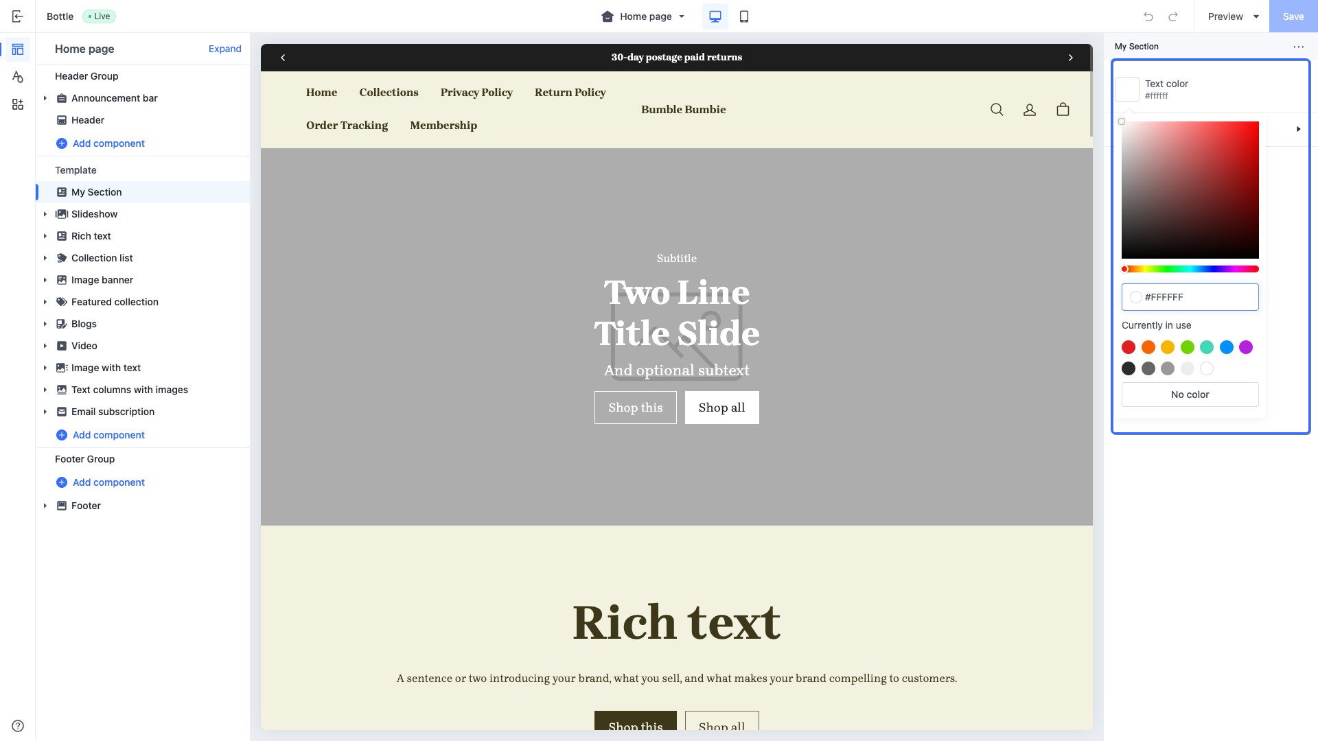
This type of control outputs a color picker, used to manage different element colors, such as a page background color. Merchants can input a color value into the text box or select the desired color in the color picker panel.
When accessing the configuration value of this control, the data is returned in one of the following forms:
+ [color](https://developer.shopline.com/docs/sline/object/color.md) object
+ An empty string if no input is provided
#### Use case example
Example code:
```json
{
"name": "My Section",
"settings": [
{
"type": "color",
"id": "text_color",
"label": "Text color",
"default": "#ffffff"
}
],
"presets": [
{
"name": "My Section"
}
]
}
```
The corresponding output effect in the theme editor is as follows:
### color_background{#e9WFS}
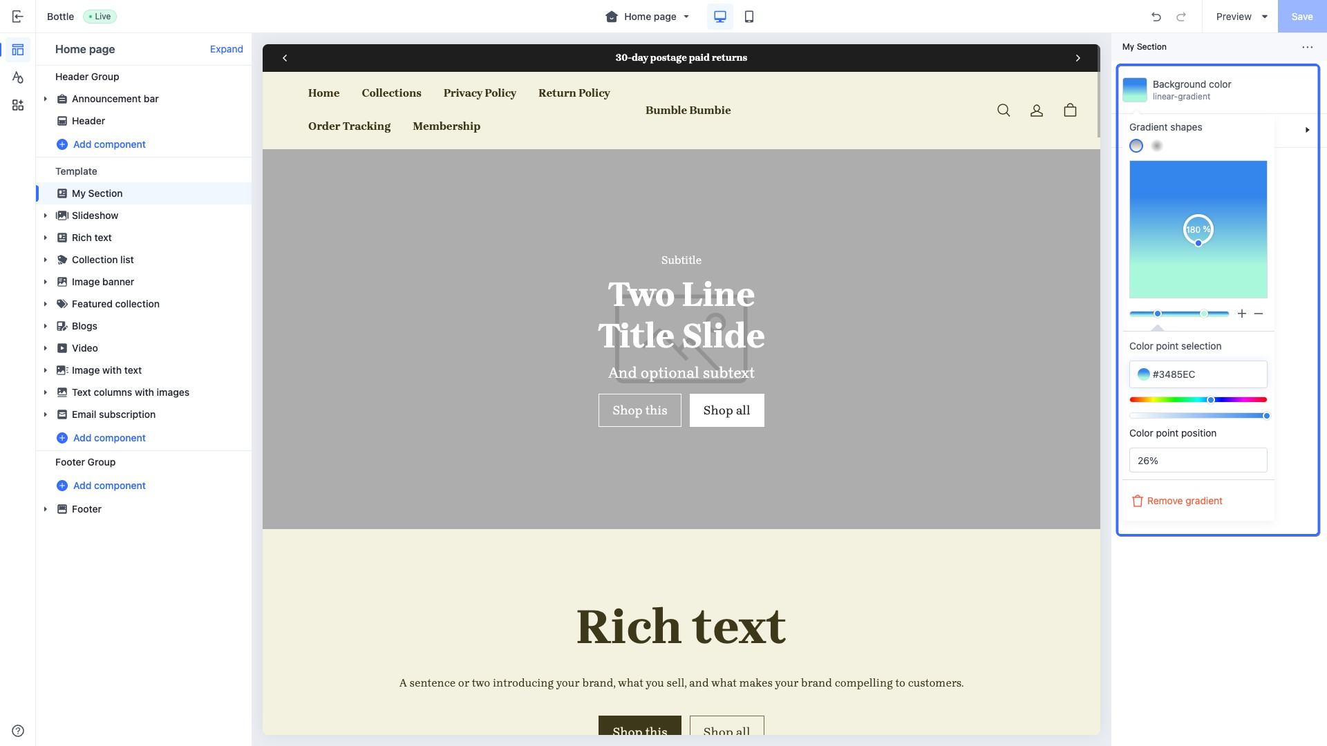
This type of control outputs a gradient color picker, used to manage gradient background colors of elements, such as a page background color. Merchants can select from preset gradient colors or customize the gradient color as needed.
> **CAUTION**
>
> When the `default` attribute of this control is set to an empty string, the control is displayed without any color.
When accessing the configuration value of this control, the data is returned as a linear gradient or radial gradient in CSS code:
+ [linear-gradient()](https://developer.mozilla.org/en-US/docs/Web/CSS/gradient/linear-gradient)
+ [radial-gradient()](https://developer.mozilla.org/en-US/docs/Web/CSS/gradient/radial-gradient)
#### Use case example
Example code:
```json
{
"name": "My Section",
"settings": [
{
"type": "color_background",
"id": "color_background",
"label": "Background color",
"default": ""
}
],
"presets": [
{
"name": "My Section"
}
]
}
```
The corresponding output effect in the theme editor is as follows:
### color_scheme{#edR8X}
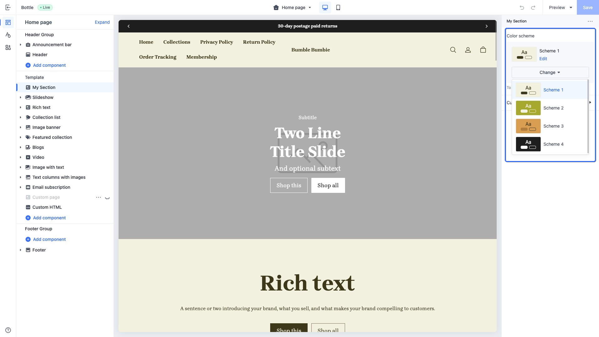
This type of control outputs a selector containing all available theme color schemes and displays a preview of the selected scheme.
The theme color schemes in the selector are defined through the `color_scheme_group` setting. You can apply these color schemes to global theme configurations, sections, and blocks.
When accessing the configuration value of this control, the data is returned in the selected [color_scheme](https://developer.shopline.com/docs/sline/object/color-scheme.md) object from the `color_scheme_group`.
#### Use case example
Example code:
```json
{
"name": "My Section",
"settings": [
{
"type": "color_scheme",
"id": "color_scheme",
"label": "Color scheme",
"default": "scheme-1"
}
],
"presets": [
{
"name": "My Section"
}
]
}
```
The corresponding output effect in the theme editor is as follows:
### color_scheme_group{#wH3Be}
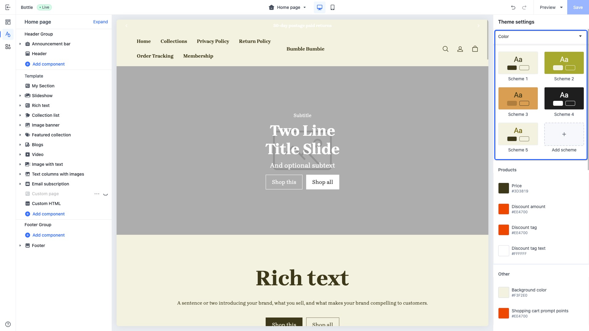
This type of control outputs a color scheme, allowing merchants to modify the theme's color scheme.
The colors defined within the color scheme can only be added in the `settings.schema.json` file.
Color controls are defined in `definition`, and supported control `type`values are limited to the following:
+ `color`
+ `color_background`
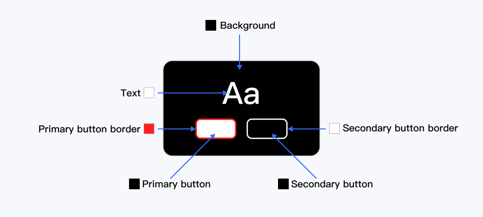
The `role` field outputs a preview of the color scheme. Each field represents a position on the following image, with the value of each field being the control's `id`, as defined in the `definition`.
Rules for defining the `role` field:
| **Role field** | **Type** | **Description** | **Required or not** |
| --- | --- | --- | --- |
| background | • string • \{ solid: string; gradient: string; } | Renders background color | Yes |
| text | string | Renders text color | Yes |
| primary_button | string | Renders color of the first button below the text | Yes |
| secondary_button | string | Renders color of the second button below the text | Yes |
| primary_button_border | string | Renders the border color of the first button below the text | Yes |
| secondary_button_border | string | Renders the border color of the second button below the text | Yes |
#### Use case example
Example code:
```json
{
"type": "color_scheme_group",
"id": "color_schemes",
"definition": [
{
"type": "color_background",
"id": "color_background",
"label": "t:settings_schema.color.settings.color_schemes.definition_0.label",
"default": "#F3F2E0"
},
{
"type": "color",
"id": "color_text",
"label": "t:settings_schema.color.settings.color_schemes.definition_1.label",
"default": "#3D3819"
},
{
"type": "color",
"id": "color_light_text",
"label": "t:settings_schema.color.settings.color_schemes.definition_2.label",
"default": "#726C4A"
},
{
"type": "color",
"id": "color_entry_line",
"label": "t:settings_schema.color.settings.color_schemes.definition_3.label",
"default": "#DDDDDD"
},
{
"type": "color",
"id": "color_button_background",
"label": "t:settings_schema.color.settings.color_schemes.definition_4.label",
"default": "#3D3819"
},
{
"type": "color",
"id": "color_button_text",
"label": "t:settings_schema.color.settings.color_schemes.definition_5.label",
"default": "#F3F2E0"
},
{
"type": "color",
"id": "color_button_secondary_background",
"label": "t:settings_schema.color.settings.color_schemes.definition_6.label",
"default": "#F3F2E0"
},
{
"type": "color",
"id": "color_button_secondary_text",
"label": "t:settings_schema.color.settings.color_schemes.definition_7.label",
"default": "#3D3819"
},
{
"type": "color",
"id": "color_button_secondary_border",
"label": "t:settings_schema.color.settings.color_schemes.definition_8.label",
"default": "#726C4A"
},
{
"type": "color",
"id": "color_button_text_link",
"label": "t:settings_schema.color.settings.color_schemes.definition_9.label",
"default": "#3D3819"
}
],
"role": {
"text": "color_text",
"background": {
"solid": "color_background"
},
"primary_button": "color_button_background",
"primary_button_border": "color_entry_line",
"secondary_button": "color_button_secondary_background",
"secondary_button_border": "color_button_secondary_border"
}
}
```
The corresponding output effect in the theme editor is as follows:
### image{#hoZ1h}
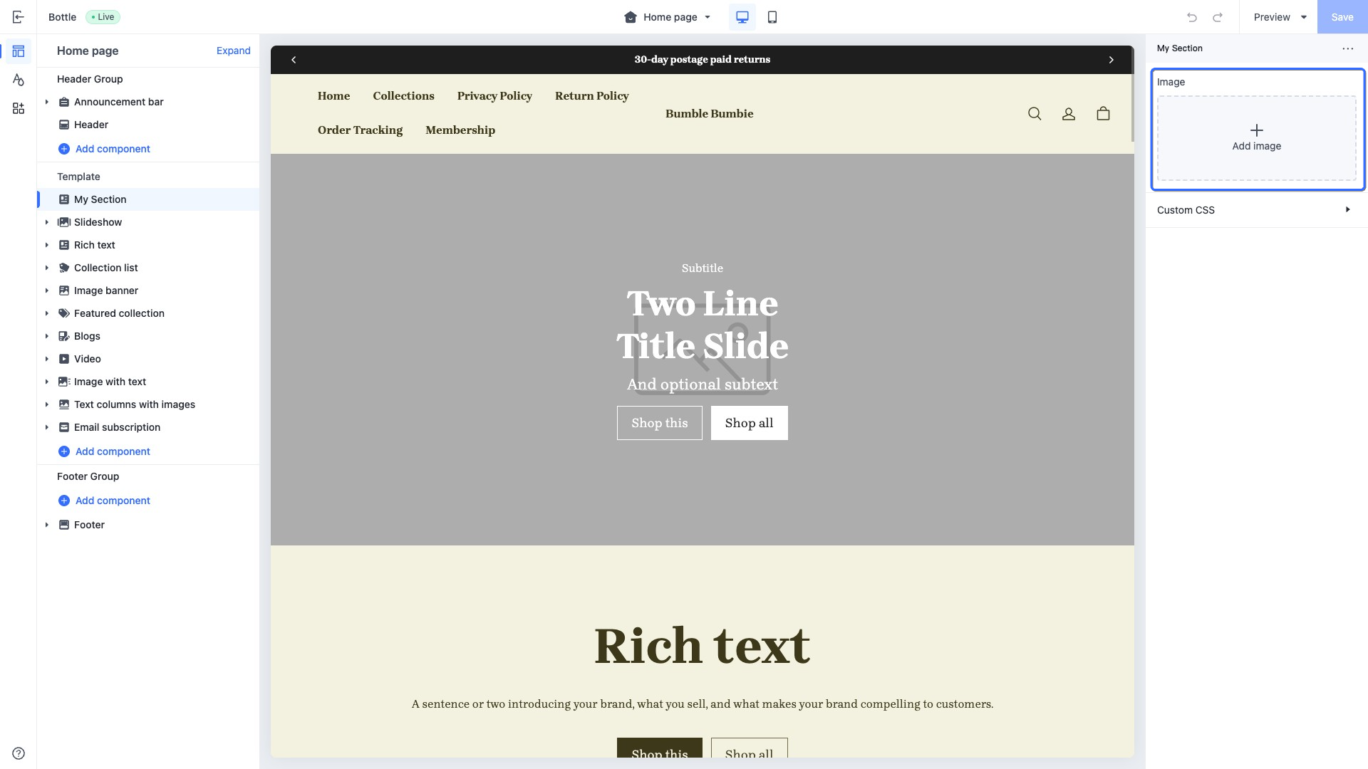
This type of control outputs an image picker. Merchants can directly select images from the image library in the SHOPLINE Admin or upload new images.
When accessing the configuration value of this control, the data is returned in an [image](https://developer.shopline.com/docs/sline/object/image.md) object.
#### Use case example
Example code:
```json
{
"name": "My Section",
"settings": [
{
"type": "image",
"id": "image",
"label": "Image"
}
],
"presets": [
{
"name": "My Section"
}
]
}
```
The corresponding output effect in the theme editor is as follows:
### font{#ptYdS}
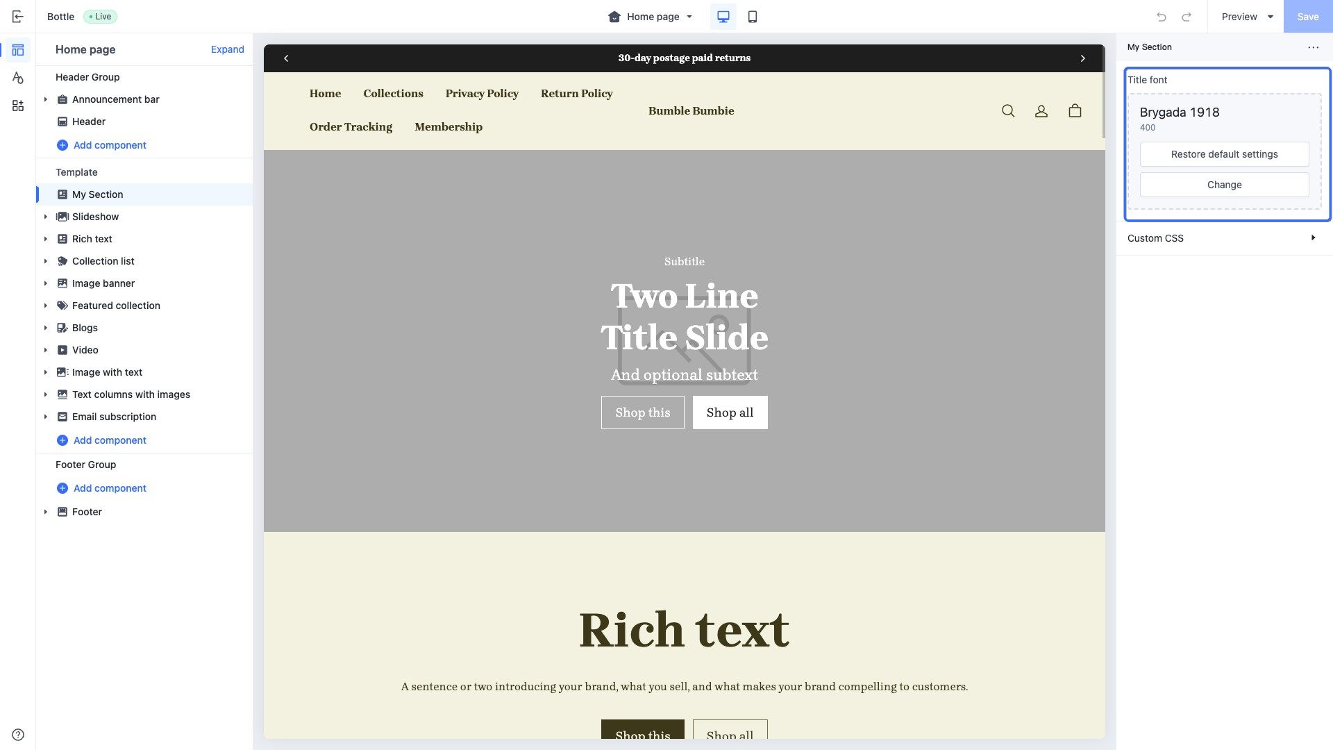
This type of control outputs a font picker.
Merchants can use this control to enhance the variety of font styles on their pages.
> **TIP**
>
> The `default` attribute for this control follows the format: `font:weight`.
When accessing the configuration value of this control, the data is returned in a [font](https://developer.shopline.com/docs/sline/object/font.md?_highlight=font) object. It can be used in conjunction with font-related filters such as [font_modify](https://developer.shopline.com/docs/sline/filter/font-modify.md?_highlight=font_modify) and [font_face](https://developer.shopline.com/docs/sline/filter/font-face.md?_highlight=font_face).
#### Use case example
Example code:
```json
{
"name": "My Section",
"settings": [
{
"type": "font",
"id": "title_font",
"label": "Title font",
"default": "Brygada 1918:400"
}
],
"presets": [
{
"name": "My Section"
}
]
}
```
The corresponding output effect in the theme editor is as follows:
### article{#auBTv}
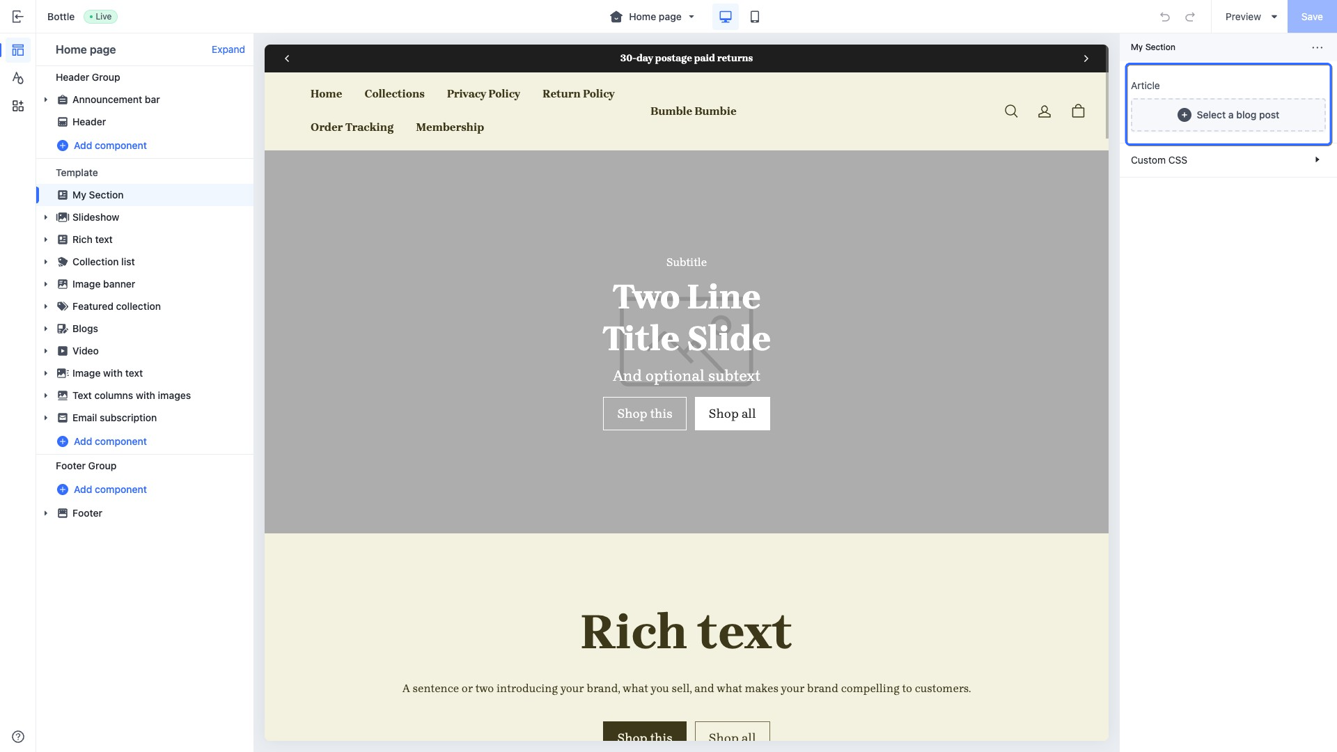
This type of control outputs a blog post picker.
When accessing the configuration value of this control, the data is returned in an [article](https://developer.shopline.com/docs/sline/object/article.md) object.
#### Use case example
Example code:
```json
{
"name": "My Section",
"settings": [
{
"type": "article",
"id": "article",
"label": "Article"
}
],
"presets": [
{
"name": "My Section"
}
]
}
```
The corresponding output effect in the theme editor is as follows:
### blog{#jyXtT}
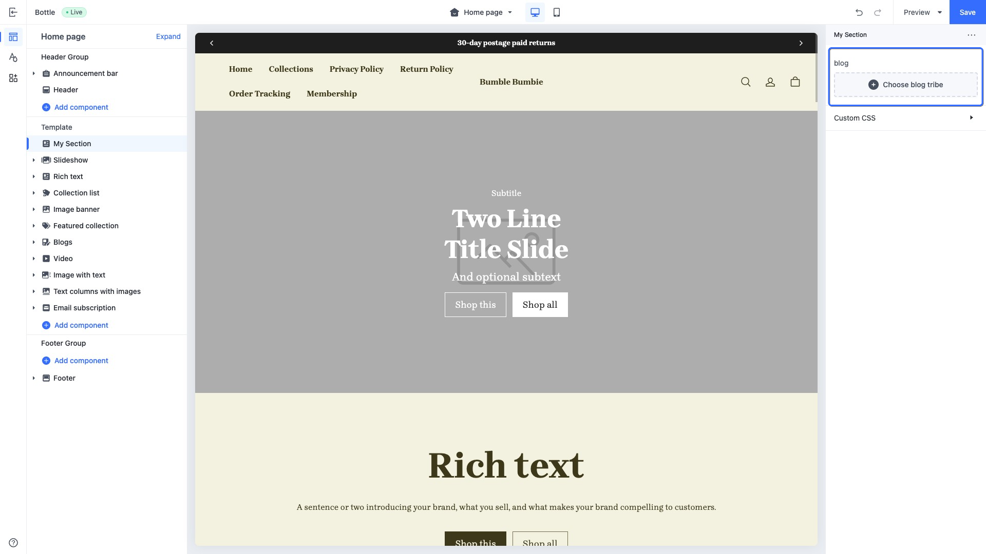
This type of control outputs a blog collection picker.
When accessing the configuration value of this control, the data is returned in a [blog](https://developer.shopline.com/docs/sline/object/blog.md) object.
#### Use case example
Example code:
```json
{
"name": "My Section",
"settings": [
{
"type": "blog",
"id": "blog",
"label": "blog"
}
],
"presets": [
{
"name": "My Section"
}
]
}
```
The corresponding output effect in the theme editor is as follows:
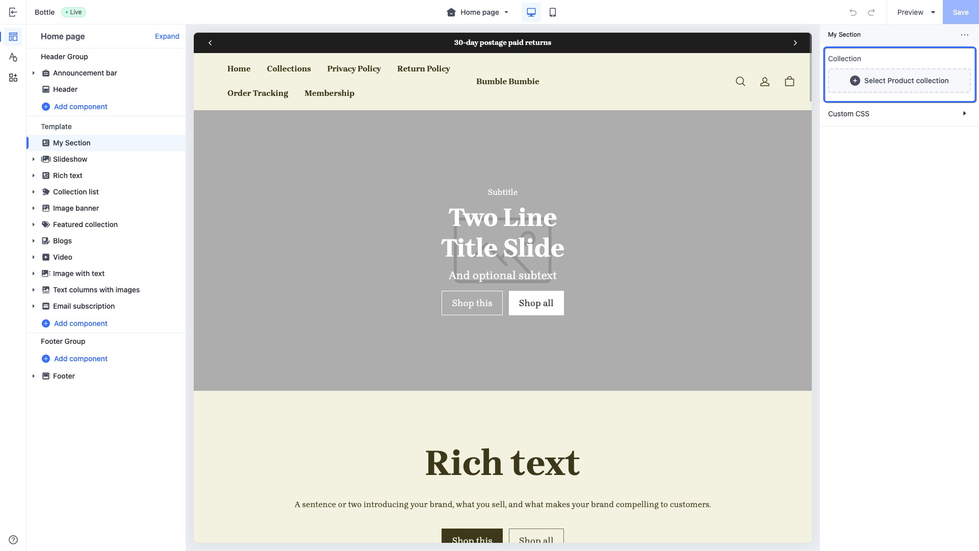
### collection{#z3no3}
This type of control outputs a product collection picker. Merchants can select from available product collections in the store. For example, display the top ten products of the selected product collection on the home page.
When accessing the configuration value of this control, the data is returned in a [collection](https://developer.shopline.com/docs/sline/object/collection.md) object.
#### Use case example
Example code:
```json
{
"name": "My Section",
"settings": [
{
"type": "collection",
"id": "collection",
"label": "Collection"
}
],
"presets": [
{
"name": "My Section"
}
]
}
```
The corresponding output effect in the theme editor is as follows:
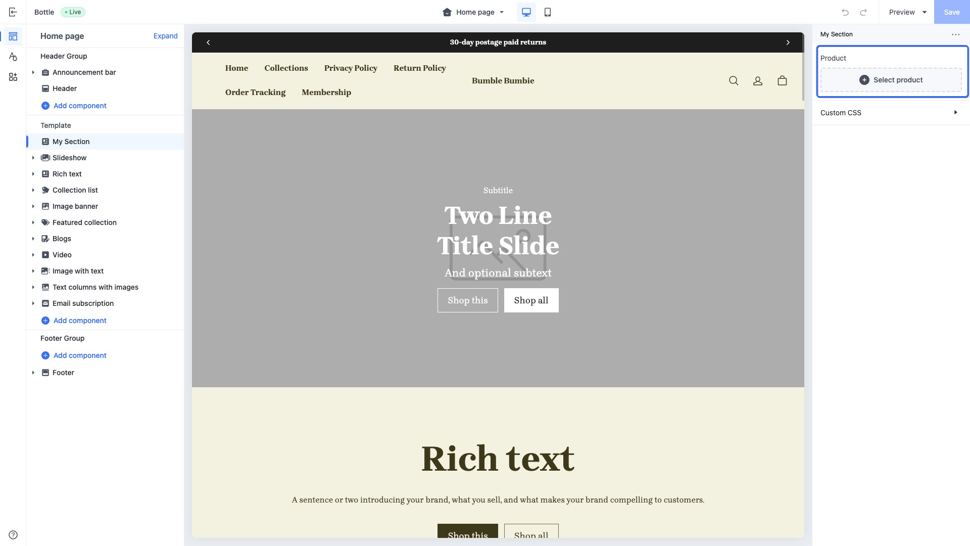
### product{#u989x}
This type of control outputs a product picker, used to select the product for display. For example, display a product's details on the home page.
When accessing the configuration value of this control, the data is returned in a [product](https://developer.shopline.com/docs/sline/object/product.md) object.
#### Use case example
Example code:
```json
{
"name": "My Section",
"settings": [
{
"type": "product",
"id": "product",
"label": "Product"
}
],
"presets": [
{
"name": "My Section"
}
]
}
```
The corresponding output effect in the theme editor is as follows:
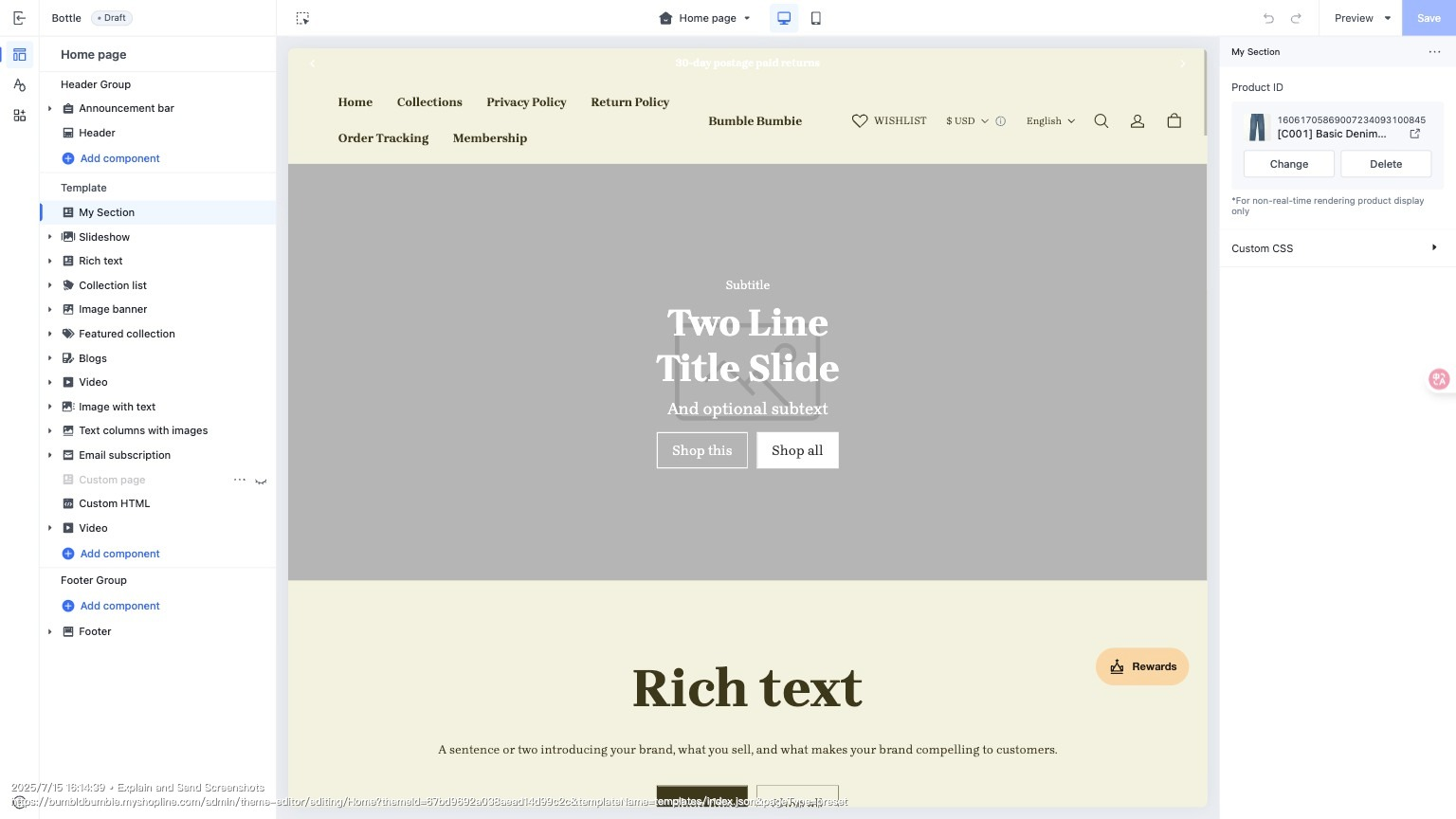
### product_id
This type of control outputs a product picker, used to select a specific product for display. For example, display a specific product's details on the home page.
This control is primarily designed for CSR scenarios. You can use the `product_id` to fetch and render the corresponding product details.
When accessing the configuration value of this control, the data is returned in the actual stored value, which is the `product_id`.
#### Use case example
Example code:
```json
{
"name": "My Section",
"settings": [
{
"type": "product_id",
"id": "product_id",
"label": "Product ID"
}
],
"presets": [
{
"name": "My Section"
}
]
}
```
The corresponding output effect in the theme editor is as follows:
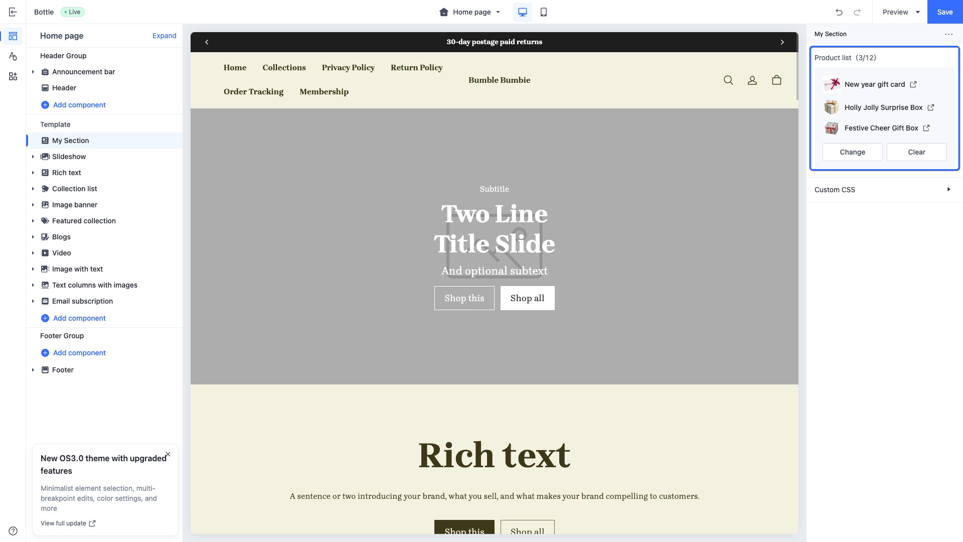
### product_list{#dv3np}
This type of control outputs a product list picker, used to select certain products as a list for display. For example, display some recommended products on the home page.
When accessing the configuration value of this control, the data is returned in a list of [product](https://developer.shopline.com/docs/sline/object/product.md) objects.
#### Use case example
Example code:
```json
{
"name": "My Section",
"settings": [
{
"type": "product_list",
"id": "product_list",
"label": "Product list"
}
],
"presets": [
{
"name": "My Section"
}
]
}
```
The corresponding output effect in the theme editor is as follows:
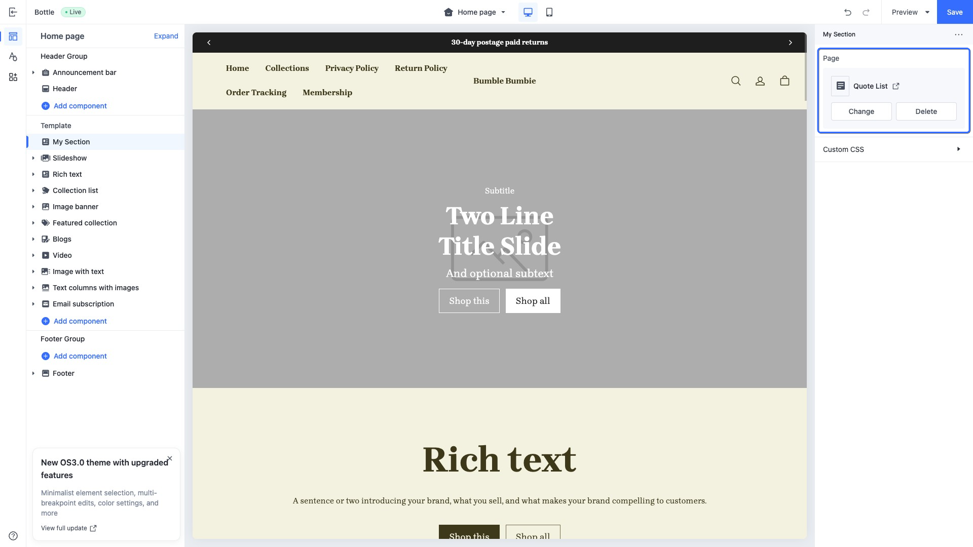
### page{#Nbabt}
This type of control outputs a custom page selector, used to select a custom page for display. For example, display the information of a custom page on the home page.
When accessing the configuration value of this control, the data is returned in a [page](https://developer.shopline.com/docs/sline/object/page.md) object.
#### Use case example
Example code:
```json
{
"name": "My Section",
"settings": [
{
"type": "page",
"id": "page",
"label": "Page"
}
],
"presets": [
{
"name": "My Section"
}
]
}
```
The corresponding output effect in the theme editor is as follows:
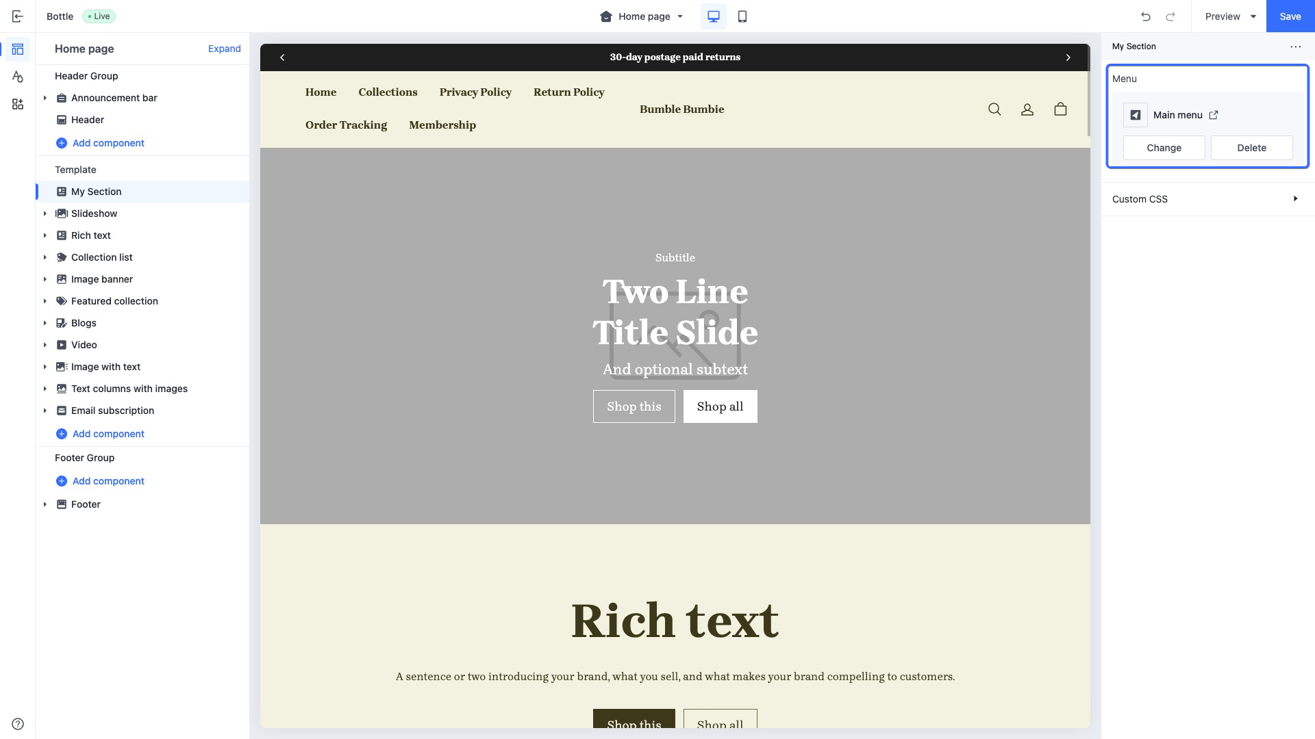
### menu{#3LdfA}
This type of control outputs a navigation menu selector, used to select and display certain navigation menus from those available in the store. For example, display the navigation menus in the page header of the home page.
When accessing the configuration value of this control, the data is returned in a menu object.
#### Use case example
Example code:
```json
{
"name": "My Section",
"settings": [
{
"type": "menu",
"id": "menu",
"label": "Menu"
}
],
"presets": [
{
"name": "My Section"
}
]
}
```
The corresponding output effect in the theme editor is as follows:
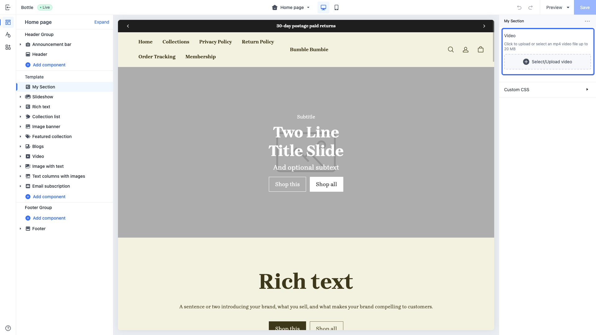
### video{#pKucM}
This type of control outputs a video selector, used to select certain videos from the file library of the SHOPLINE Admin or upload videos. For example, display the product video on the home page.
When accessing the configuration value of this control, the data is returned in a [video](https://developer.shopline.com/docs/sline/object/video.md) object.
#### Use case example
Example code:
```json
{
"name": "My Section",
"settings": [
{
"type": "video",
"id": "video",
"label": "Video"
}
],
"presets": [
{
"name": "My Section"
}
]
}
```
The corresponding output effect in the theme editor is as follows:
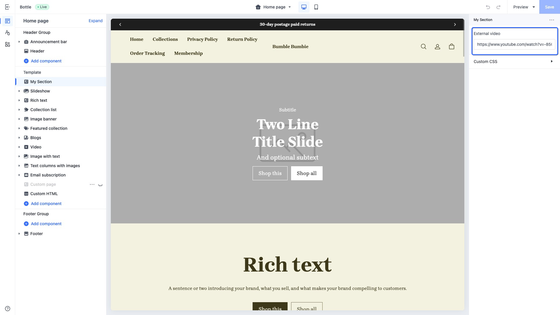
### external_video{#pqUH5}
This type of control outputs a URL input field.
When accessing the configuration value of this control, the data is returned in an [external_video](https://developer.shopline.com/docs/sline/object/external-video.md) object.
#### Specialized attributes
| **Attribute** | **Description** | **Required or not** |
| --- | --- | --- |
| format | The input format. The value is fixed as `video`. If you pass in this attribute, the placeholder value will be verified to ensure that the video provider is supported. Supported video providers are: • YouTube • Vimeo | No |
| placeholder | Placeholder text of the input field | No |
This control can be used to retrieve information from YouTube or Vimeo videos and is typically used in conjunction with the [external_video_tag](https://developer.shopline.com/docs/sline/tag/external-video-tag.md?_highlight=external_video_tag) tag and [external_video_url](https://developer.shopline.com/docs/sline/filter/external-video-url.md?_highlight=external_video_url) filter.
```json
{{#external_video_tag section.settings.external_video | external_video_url() /}}
```
#### Use case example: section title
Example code:
```json
{
"name": "My Section",
"settings": [
{
"type": "external_video",
"id": "external_video",
"label": "External video"
}
],
"presets": [
{
"name": "My Section"
}
]
}
```
The corresponding output effect in the theme editor is as follows:
### padding{#VPrdJ}
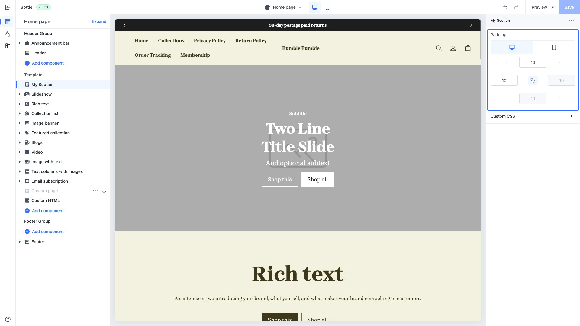
This type of control outputs a padding.
This control is used to store the top, bottom, left, and right padding values of container elements for both desktop and mobile platforms, serving the purpose of defining the internal spacing of the containers.
The default value structure of this control is a data model comprising two objects: one tailored for the desktop view and the other designed for the mobile view. Each object is equipped with specific numerical settings that represent the attributes for the four directions: top, bottom, left, and right.
When accessing the configuration value of this control, the data is returned in the data structure format of the `default` value.
#### Use case example
Example code:
```json
{
"name": "My Section",
"settings": [
{
"type": "padding",
"id": "padding",
"label": "Padding",
"default": {
"pc":{
"left":10,
"right":10,
"top":10,
"bottom":10
},
"mobile":{
"left":10,
"right":10,
"top":10,
"bottom":10
}
}
}
],
"presets": [
{
"name": "My Section"
}
]
}
```
The corresponding output effect in the theme editor is as follows:
### sline{#NBcaz}
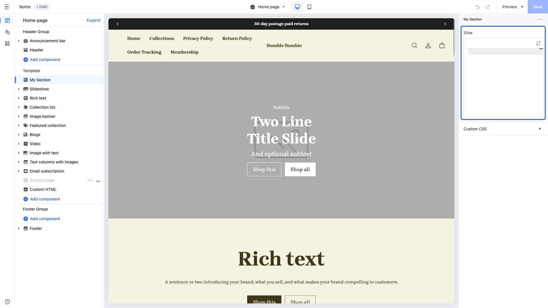
This type of control outputs a code input box that accepts [Sline](https://developer.shopline.com/docs/sline/sline-overview.md) template language. It allows merchants to input custom content using Sline syntax, such as injecting additional information into specific sections on the home page.
When accessing the configuration value of this control, the data is returned as a [string](https://developer.shopline.com/docs/sline/basics.md#RBRfx).
#### Specialized attribute
| **Attribute** | **Description** | **Required or not** |
| --- | --- | --- |
| limit | Maximum text input length | No |
#### Use case example
Example code:
```json
{
"name": "My Section",
"settings": [
{
"type": "sline",
"id": "sline",
"label": "Sline"
}
],
"presets": [
{
"name": "My Section"
}
]
}
```
The corresponding output effect in the theme editor is as follows:
### html{#XH1q0}
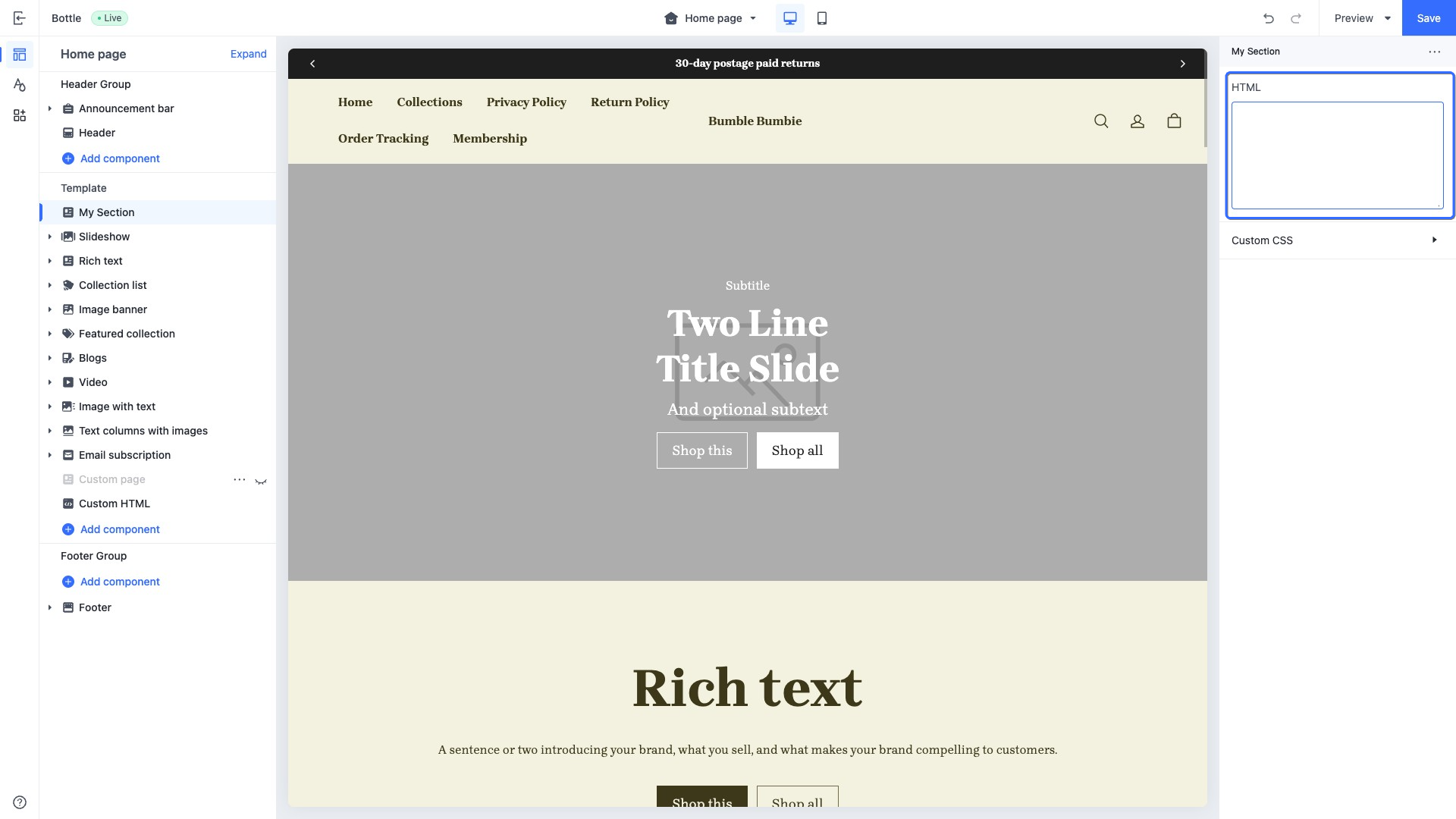
This type of control outputs a multi-line text input box that accepts HTML. It enables merchants to enter custom content using HTML syntax, such as composing HTML within specific sections on the home page.
When accessing the configuration value of this control, the data is returned as a [string](https://developer.shopline.com/docs/sline/basics.md?lang=en#RBRfx).
#### Specialized attributes
| **Attribute** | **Description** | **Required or not** |
| --- | --- | --- |
| placeholder | Placeholder text of the input field | No |
| limit | Maximum text input length | No |
#### Use case example
Example code:
```json
{
"name": "My Section",
"settings": [
{
"type": "html",
"id": "html",
"label": "HTML"
}
],
"presets": [
{
"name": "My Section"
}
]
}
```
The corresponding output effect in the theme editor is as follows:
### payment_icon{#HhBp7}
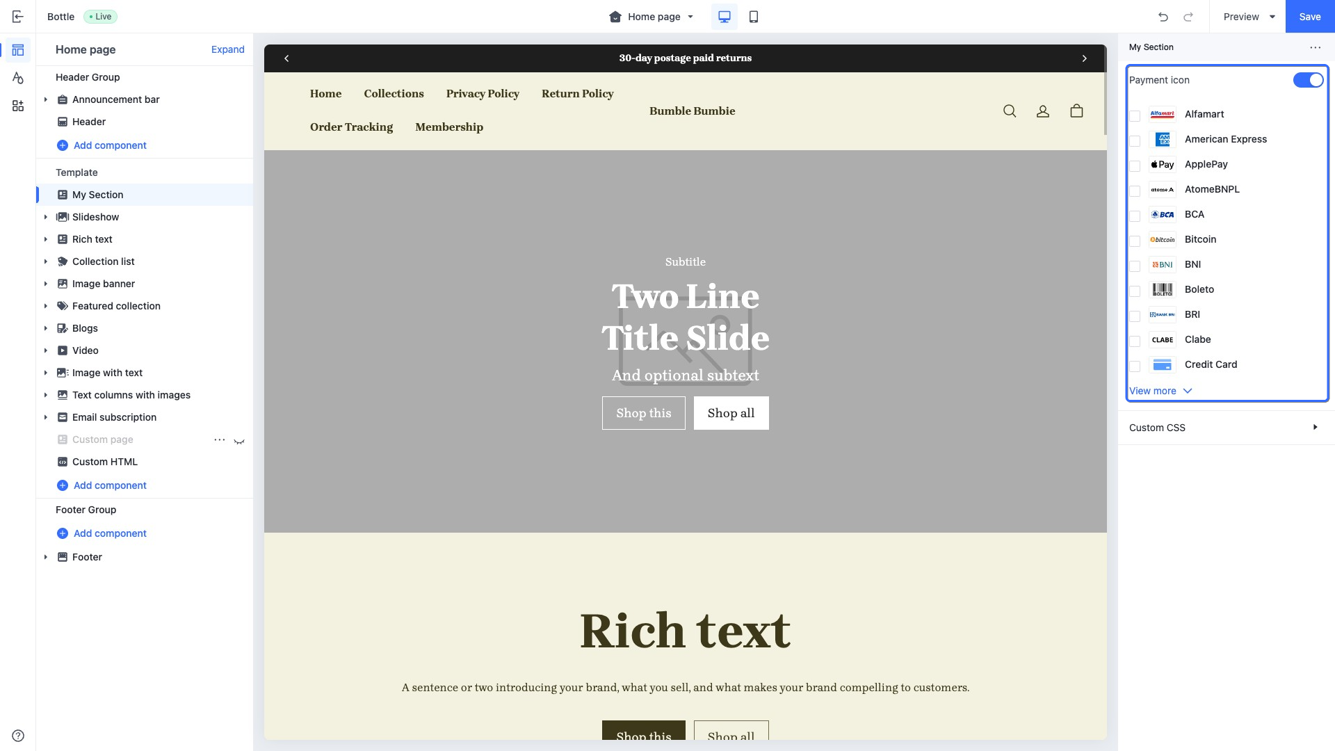
This type of control outputs a list of payment icons. It can be used to select and display the payment methods supported by the store.
When accessing the configuration value of this control, it usually needs to be used in conjunction with the [payment_icon_svg](https://developer.shopline.com/docs/sline/tag/payment-type-svg.md) tag.
```html
```
#### `default` attributes
The default attribute value of this control is structured in JSON format, intended to display a preset list of icons in the theme editor.
| **default** **attribute name** | **default** **attribute value** | **Description** |
| --- | --- | --- |
| show | • `true`: display • `false`: not display | Whether to display the payment icon. |
| pay_channel_list | [ \{ "type": \, "show": \ } ] | Contains a list of payment method icons. |
#### Use case example
```json
{
"name": "My Section",
"settings": [
{
"type": "payment_icon",
"id": "payment_icon",
"label": "Payment icon",
"default": {
"show": true,
"pay_channel_list": [
{
"type": "visa",
"show": true
},
{
"type": "master-card",
"show": true
},
{
"type": "master-card2",
"show": true
},
{
"type": "visa-electron",
"show": true
}
]
}
}
],
"presets": [
{
"name": "My Section"
}
]
}
```
The corresponding output effect in the theme editor is as follows:
### favicon{#WXZml}
This type of control outputs a website icon upload control. It can be used to select and display the website's icon, typically configured in `theme.schema.json`.
#### Use case example
```json
{
...
"schemas": [
{
"name": "website icon",
"settings": [
{
"type": "favicon",
"id": "favicon_image",
"label": "website icon",
}
]
}
]
}
```
The corresponding output effect in the theme editor is as follows:
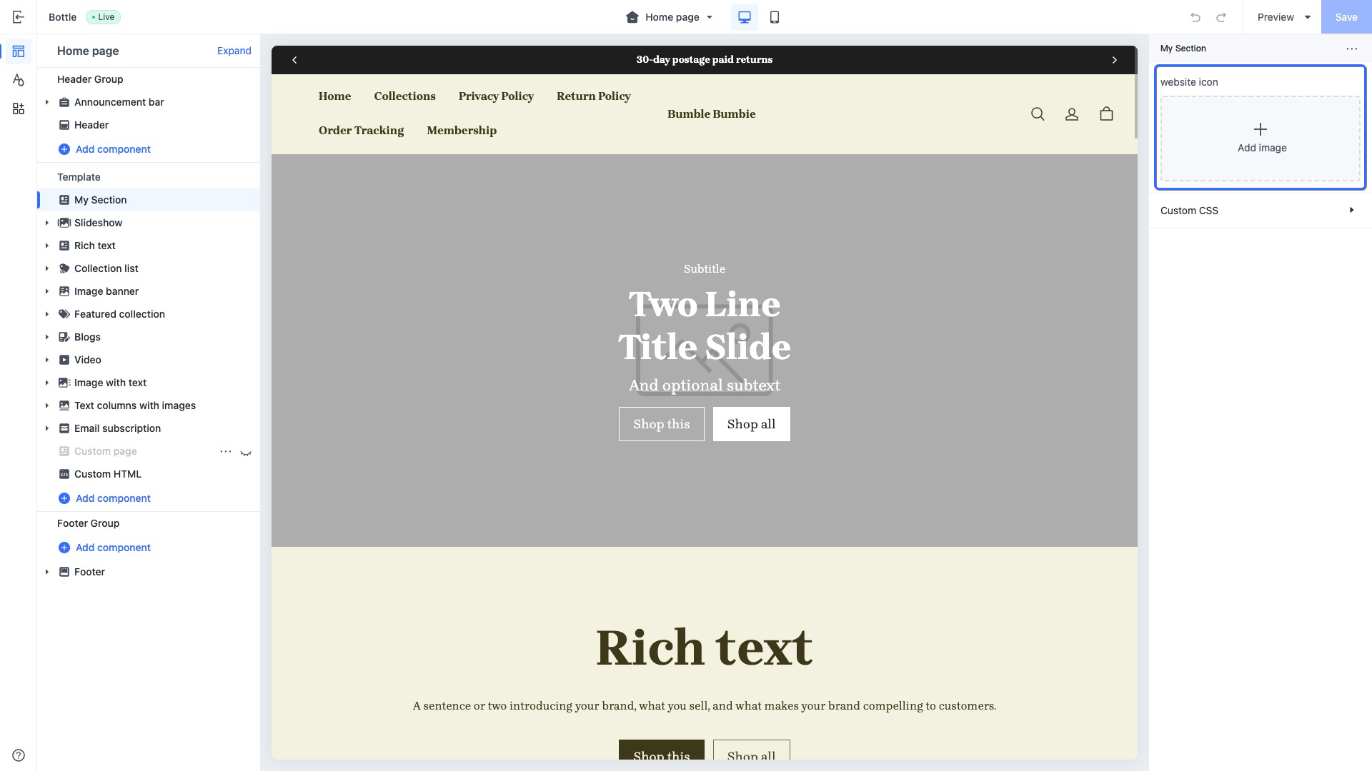
Set the website icon in `layout/theme.html`:
```html
{{#if settings.favicon_image}}
{{/if}}
...
```
The output is as follows:

### date
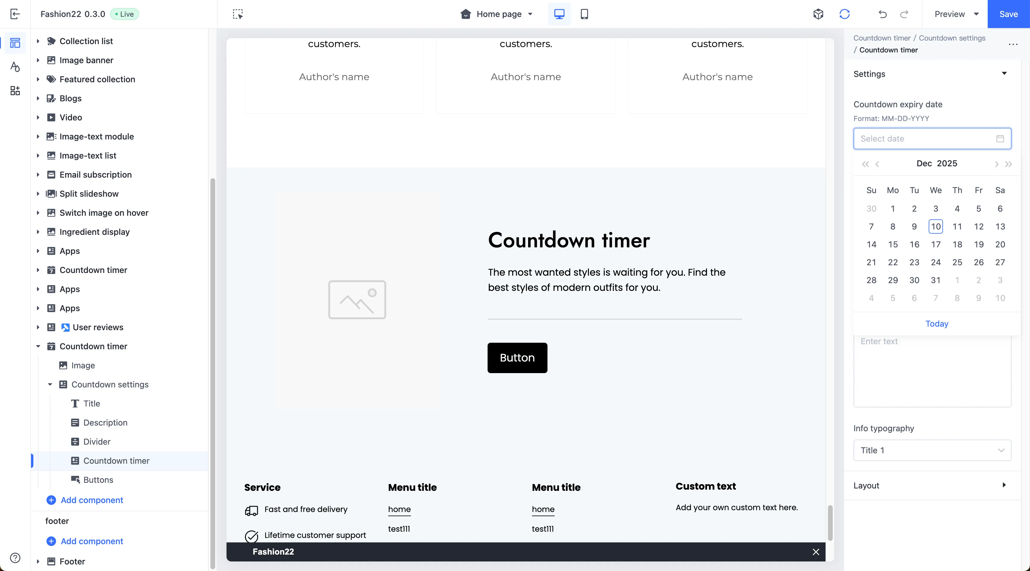
This type of control is used to display or select date information, applicable to all date-related configuration scenarios.
When accessing the configuration value of this control, the data is returned in the `MM-DD-YYYY` format.
#### Use case example
Example code:
```json
{
"name": "countdown-date",
"tag": "",
"settings": [
{
"type": "date",
"id": "deadline",
"label": "Deadline"
}
]
}
```
The corresponding output effect in the theme editor is as follows:
### datetime
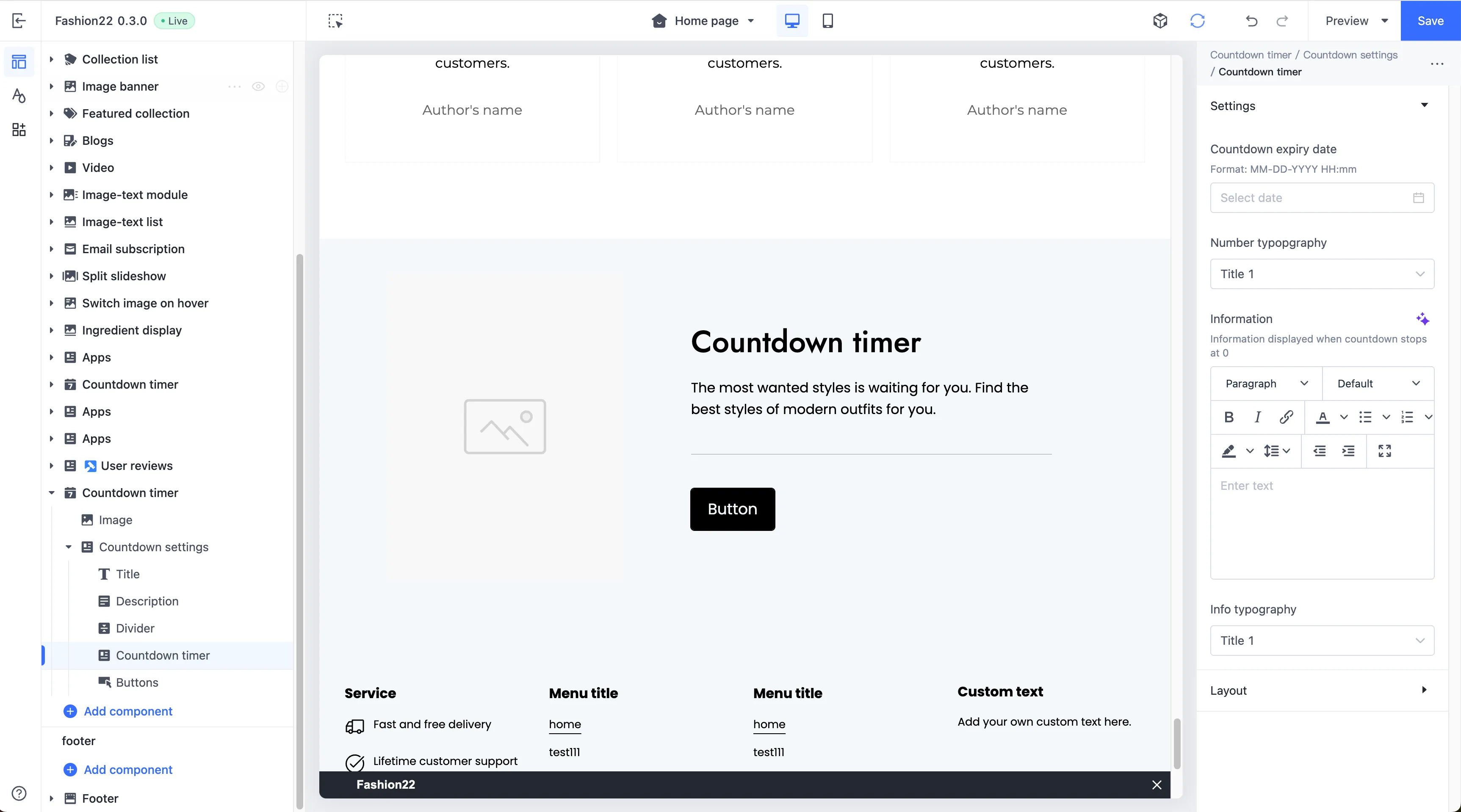
This type of control is used to display or select complete date and time information, applicable to configuration scenarios that require precision down to the minute.
When accessing the configuration value of this control, the data is returned in the `MM-DD-YYYY HH:mm` format. For example, `12-25-2023 14:30` .
#### Use case example
Example code:
```json
{
"name": "countdown-datetime",
"tag": "",
"settings": [
{
"type": "datetime",
"id": "deadline",
"label": "Deadline"
}
]
}
```
The corresponding output effect in the theme editor is as follows:
---
## Display control{#XlDow}
Display controls are exclusively for presenting information and are generally used to organize and group foundational controls for display purposes.
### group_header{#FSyw1}
This type of control adds a heading element and groups it with subsequent configuration settings.
Configuration attributes for this control are as follows:
| Attribute | Description | Required or not |
| --- | --- | --- |
| type | The control type | Yes |
| label | The configuration label, displayed in the theme editor | Yes |
| info | The configuration remarks | No |
#### Use case example
Group the following configurations together:
```json
{
"name": "My Section",
"settings": [
{
"type": "group_header",
"label": "Desktop"
},
{
"type": "range",
"label": "desktop columns",
"id": "desktop_columns",
"default": 2,
"min": 1,
"max": 8,
"step": 1
},
{
"type": "group_header",
"label": "Mobile"
},
{
"type": "range",
"label": "mobile columns",
"id": "mobile_columns",
"default": 2,
"min": 1,
"max": 8,
"step": 1
},
],
"presets": [
{
"name": "My Section"
}
]
}
```
The corresponding output effect in the theme editor is as follows:
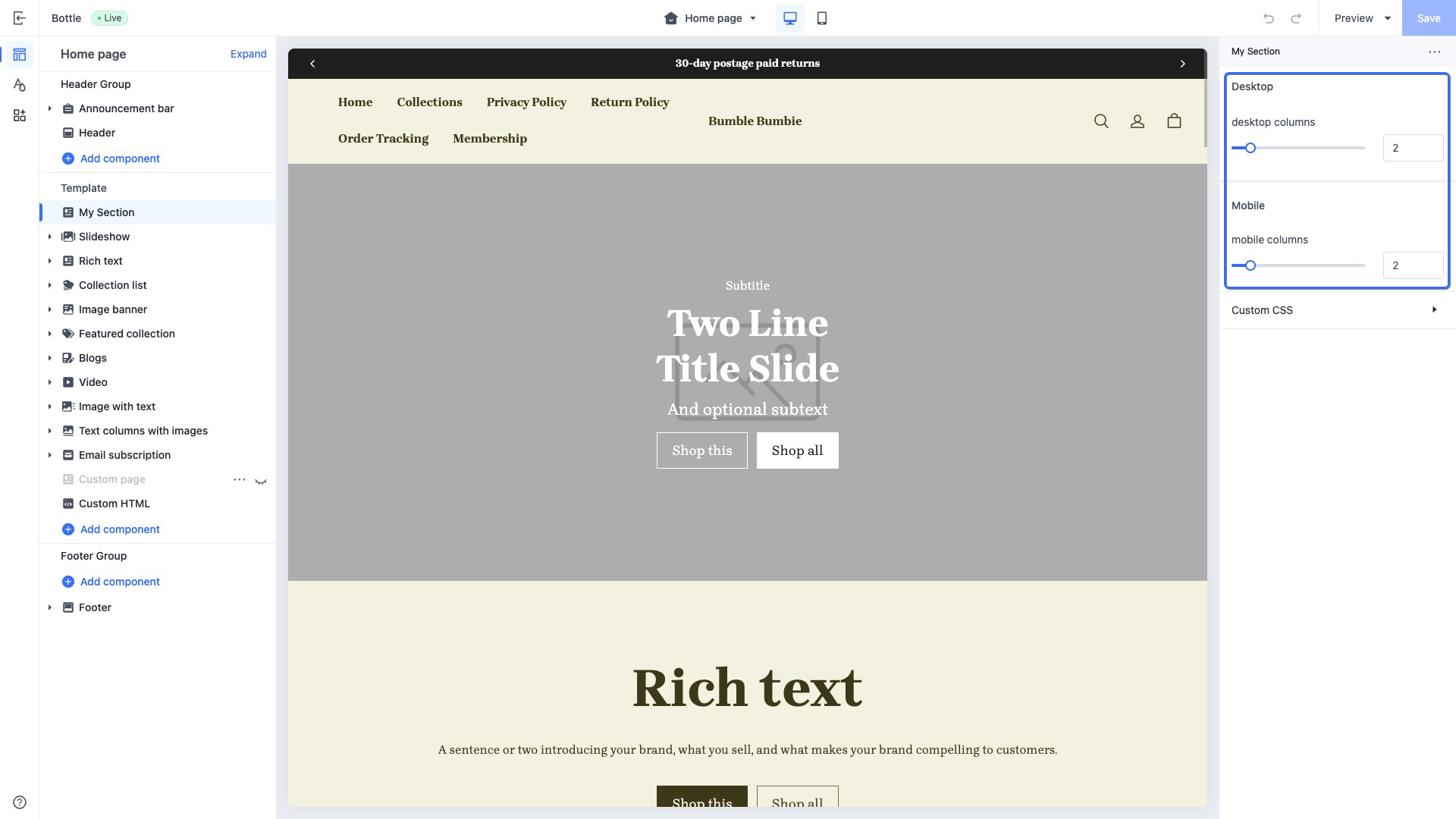
:::tip{title="TIP"}
The `group_header` grouping logic renders settings sequentially. When the type is `group_header`, subsequent settings are grouped under it until the next `group_header` is encountered.