Badge
The Badge UI component is used to highlight contextual information about an object, such as labels or statuses. The object can be anything that carries a state or label, like an order or subscription.
Preview
Code example
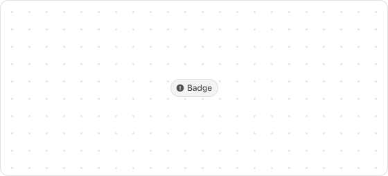
render('Checkout::Dynamic::Render', (root) => {
  return <Badge icon="info">Available</Badge>
});
BadgeProps
tip
Optional properties are marked with a ?. Properties without a ? are required.
appearance?
info
warning
critical
error
accent
Default: info
The type of the badge.
icon?
IconSource
The type of icon displayed on the badge.
iconPosition?
start
end
Default: start
The position of the icon on the badge.
start: Before the badgeend: After the badge
Type descriptions
IconSource
search
arrowDown
arrowUp
arrowLeft
arrowRight
calendar
cart
dot
down
up
right
left
close
closeFill
discount
info
infoFill
lock
minus
plus
success
successFill
store
spin
bag
question
email
phone
share
giftcard
more
timer
hook
ship
location
eyeOpen
eyeClose
menu
parcel
copyWas this article helpful to you?

'%3e%3crect%20x='6'%20y='7.13049'%20width='13'%20height='10'%20rx='1'%20fill='black'/%3e%3cpath%20d='M12.4998%2012.936L-3.65042%200.604835L28.65%200.604838L12.4998%2012.936Z'%20stroke='white'%20stroke-linejoin='round'/%3e%3c/g%3e%3cdefs%3e%3cclipPath%20id='clip0_716_14611'%3e%3crect%20x='6'%20y='7.13049'%20width='13'%20height='10'%20rx='1'%20fill='white'/%3e%3c/clipPath%3e%3c/defs%3e%3c/svg%3e)

'%3e%3crect%20x='5.63086'%20y='7.26086'%20width='13'%20height='10'%20rx='1'%20fill='white'/%3e%3cpath%20d='M12.1306%2013.0664L-4.01956%200.735206L28.2809%200.735209L12.1306%2013.0664Z'%20stroke='%231A2C42'%20stroke-linejoin='round'/%3e%3c/g%3e%3cdefs%3e%3cclipPath%20id='clip0_716_14599'%3e%3crect%20x='5.63086'%20y='7.26086'%20width='13'%20height='10'%20rx='1'%20fill='white'/%3e%3c/clipPath%3e%3c/defs%3e%3c/svg%3e)