Checkbox
The Checkbox UI component provides customers with binary choices, such as opting for receiving marketing information or agreeing to terms and conditions.
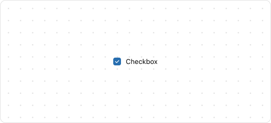
Preview
Code example
render('Checkout::Dynamic::Render', () => {
  return <Checkbox id="checkbox" name="checkbox">Save this information for next time</Checkbox>;
});
CheckboxProps
Optional properties are marked with a ?. Properties without a ? are required.
id?
string
A unique identifier for the UI component.
If this property is not set, the system will automatically generate a globally unique ID for this component.
name?
string
The name of this UI component.
value?
boolean
Indicates whether the checkbox is activated. Valid values are:
true: The checkbox is activated.false: The checkbox is deactivated.
This property is an alias for checked. If both value and checked are set, the checked setting takes precedence.
This design ensures compatibility with form usage, providing a standard value key.
checked?
boolean
Indicates whether the checkbox is activated. Valid values are:
true: The checkbox is activated.false: The checkbox is deactivated.
disabled?
boolean
Indicates whether the component is disabled. Valid values are:
true: Disabled.false: Available.
error?
string
The error message displayed to the customer. If this property is configured, the component will be highlighted in red and show the error message.
accessibilityLabel?
string
A label for this component. Configuring this feature directly sets the aria-label attribute, providing accessibility information for screen readers.
onChange?
(value: boolean) => void
The callback triggered when the checkbox state changes.
This callback accepts a boolean value that indicates whether the checkbox is activated or deactivated.

'%3e%3crect%20x='6'%20y='7.13049'%20width='13'%20height='10'%20rx='1'%20fill='black'/%3e%3cpath%20d='M12.4998%2012.936L-3.65042%200.604835L28.65%200.604838L12.4998%2012.936Z'%20stroke='white'%20stroke-linejoin='round'/%3e%3c/g%3e%3cdefs%3e%3cclipPath%20id='clip0_716_14611'%3e%3crect%20x='6'%20y='7.13049'%20width='13'%20height='10'%20rx='1'%20fill='white'/%3e%3c/clipPath%3e%3c/defs%3e%3c/svg%3e)

'%3e%3crect%20x='5.63086'%20y='7.26086'%20width='13'%20height='10'%20rx='1'%20fill='white'/%3e%3cpath%20d='M12.1306%2013.0664L-4.01956%200.735206L28.2809%200.735209L12.1306%2013.0664Z'%20stroke='%231A2C42'%20stroke-linejoin='round'/%3e%3c/g%3e%3cdefs%3e%3cclipPath%20id='clip0_716_14599'%3e%3crect%20x='5.63086'%20y='7.26086'%20width='13'%20height='10'%20rx='1'%20fill='white'/%3e%3c/clipPath%3e%3c/defs%3e%3c/svg%3e)