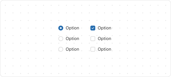
ChoiceList
The ChoiceList UI component is used to display a single-choice or multiple-choice list for customers.
Preview
Code example
render('Checkout::Dynamic::Render', () => {
  return (
    <ChoiceList name="choice" type="radio" value="first" onChange={(value) => {
      console.log(`onChange event with value: ${value}`);
    }}>
      <Choice id="first">Ship</Choice>
      <Choice id="second">Pickup</Choice>
    </ChoiceList>
  );
});
ChoiceListProps
tip
Optional properties are marked with a ?. Properties without a ? are required.
name
string
The name of the UI component.
type
radio
checkbox
The type of the UI component.
value
T
The IDs of the available choices, which can be a string or an array of strings. If it is a string, the option appears as a radio button; if it is an array, the option appears as a set of checkboxes.
onChange
(value: T) => void
The callback triggered when the choice list is changed.
This callback accepts a string or a string list indicating the IDs of choices that are selected.
Was this article helpful to you?

'%3e%3crect%20x='6'%20y='7.13049'%20width='13'%20height='10'%20rx='1'%20fill='black'/%3e%3cpath%20d='M12.4998%2012.936L-3.65042%200.604835L28.65%200.604838L12.4998%2012.936Z'%20stroke='white'%20stroke-linejoin='round'/%3e%3c/g%3e%3cdefs%3e%3cclipPath%20id='clip0_716_14611'%3e%3crect%20x='6'%20y='7.13049'%20width='13'%20height='10'%20rx='1'%20fill='white'/%3e%3c/clipPath%3e%3c/defs%3e%3c/svg%3e)

'%3e%3crect%20x='5.63086'%20y='7.26086'%20width='13'%20height='10'%20rx='1'%20fill='white'/%3e%3cpath%20d='M12.1306%2013.0664L-4.01956%200.735206L28.2809%200.735209L12.1306%2013.0664Z'%20stroke='%231A2C42'%20stroke-linejoin='round'/%3e%3c/g%3e%3cdefs%3e%3cclipPath%20id='clip0_716_14599'%3e%3crect%20x='5.63086'%20y='7.26086'%20width='13'%20height='10'%20rx='1'%20fill='white'/%3e%3c/clipPath%3e%3c/defs%3e%3c/svg%3e)