PhoneField
The PhoneField UI component is an input field designed for entering phone numbers with country codes.
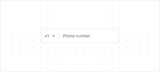
Preview
Code example
render('Checkout::Dynamic::Render', () => {
  return <PhoneField label="Phone" value="1 (555) 555-5555" />;
});
PhoneFieldProps
Optional properties are marked with a ?. Properties without a ? are required.
label
string
The label of this field, which also serves as a placeholder when the field is empty.
accessibilityDescription?
string
A label for this component, used to help screen reader customers understand the function of the component. For more information, refer to Accessible description.
autocomplete?
boolean | Autocomplete
The autocomplete attribute can be a boolean or an Autocomplete object, and it controls whether suggestions are shown for the field content.
When set to true, the browser will use stored data to automatically fill the field; when set to false, the content will never be saved.
Note that in some browsers, the autocomplete feature may not default to off, so do not overly rely on the default behavior when no value is provided. Alternatively, you can provide an Autocomplete object to specify particular data you want to be input in this field.
disabled?
boolean
Indicates whether the field can be changed. Valid values are:
true: Cannot be changed.false: Can be changed.
error?
string
The error message displayed to the customer. If this property is configured, the component will be highlighted in red and show the error message.
icon?
IconSource
The icon which is rendered at the beginning or end of the field, rendered at the beginning by default.
id?
string
A unique identifier for the UI component. If this property is not set, the system will automatically generate a globally unique ID for this component.
maxLength?
number
The maximum number of characters allowed.
name?
string
The name of the component.
readonly?
boolean
Indicates whether the field is read-only. Valid values are:
true: The field is read-only.false: The field is editable.
required?
boolean
Indicates whether the field needs a value. Valid values are:
true: The field needs a value.false: The field does not need a value.
This requirement adds semantic value to the field but does not automatically trigger an error. To display an error when the field is empty, use the error property.
value?
string
The current value of the field. If this property is not set, the field is empty. Use the onChange callback to update this value.
areaCode?
string
Default: +1
Specify an area code.
defaultAreaCode?
string
The default area code.
defaultValue?
string
Default: ''
The default value.
onChange?
(value: {phoneNumber: string; areaCode: string}) => void
The callback triggered after a customer edits the field or selects a country.
onInput?
(value: string) => void
The callback triggered when the customer changes anything in the field (including selecting a country from the dropdown).
onFocus?
() => void
The callback triggered when the input is focused.
onBlur?
() => void
The callback triggered when the focus is removed.
onKeyDown?
(event: React.KeyboardEvent<HTMLInputElement>)=>void
The callback triggered upon a keyboard press.
Type descriptions
Autocomplete
{group?: AutocompleteGroup, field: AutocompleteField}
AutocompleteGroup
shipping
billing
location
AutocompleteField
Refer to autofill field.
IconSource
search
arrowDown
arrowUp
arrowLeft
arrowRight
calendar
cart
dot
down
up
right
left
close
closeFill
discount
info
infoFill
lock
minus
plus
success
successFill
store
spin
bag
question
email
phone
share
giftcard
more
timer
hook
ship
location
eyeOpen
eyeClose
menu
parcel
copy

'%3e%3crect%20x='6'%20y='7.13049'%20width='13'%20height='10'%20rx='1'%20fill='black'/%3e%3cpath%20d='M12.4998%2012.936L-3.65042%200.604835L28.65%200.604838L12.4998%2012.936Z'%20stroke='white'%20stroke-linejoin='round'/%3e%3c/g%3e%3cdefs%3e%3cclipPath%20id='clip0_716_14611'%3e%3crect%20x='6'%20y='7.13049'%20width='13'%20height='10'%20rx='1'%20fill='white'/%3e%3c/clipPath%3e%3c/defs%3e%3c/svg%3e)

'%3e%3crect%20x='5.63086'%20y='7.26086'%20width='13'%20height='10'%20rx='1'%20fill='white'/%3e%3cpath%20d='M12.1306%2013.0664L-4.01956%200.735206L28.2809%200.735209L12.1306%2013.0664Z'%20stroke='%231A2C42'%20stroke-linejoin='round'/%3e%3c/g%3e%3cdefs%3e%3cclipPath%20id='clip0_716_14599'%3e%3crect%20x='5.63086'%20y='7.26086'%20width='13'%20height='10'%20rx='1'%20fill='white'/%3e%3c/clipPath%3e%3c/defs%3e%3c/svg%3e)