Select
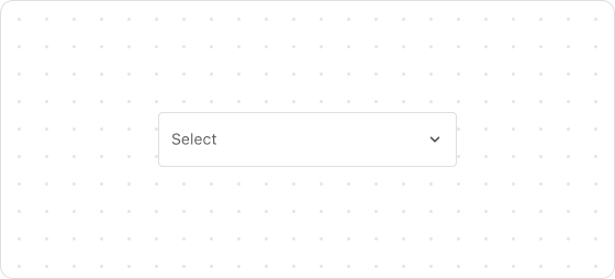
The Select UI component allows customers to select an option from a dropdown list. When you set four or more options, consider using this component to avoid overwhelming the UI with too much information.
Preview
Code example
extend('Checkout::Dynamic::Render', () => {
  return <Select label='Country' value='2' options={[
    {
      value: '1',
      label: 'Australia',
    },
    {
      value: '2',
      label: 'Canada',
    },
    {
      value: '3',
      label: 'France',
    },
    {
      value: '4',
      label: 'Japan',
    },
    {
      value: '5',
      label: 'Nigeria',
    },
    {
      value: '6',
      label: 'United States',
    },
  ]} />;
});
SelectProps
Optional properties are marked with a ?. Properties without a ? are required.
label?
string
The label for the component.
options
Option[]
A list of options that the customer can select.
id?
string
A unique identifier for the UI component.
If this property is not set, the system will automatically generate a globally unique ID for this component.
name?
string
The name of the component.
value?
string
The option that the customer selects. This value must be one of the values provided in the options property.
required?
boolean
Default: false
Indicates whether the property needs a value. Valid values are:
true: The field needs a value.false: The field does not need a value.
This property is intended to add semantic meaning but does not automatically trigger an error. To display an error when the property is empty, use the error property.
disabled?
boolean
Default: false
Indicates whether the option can be changed. Valid values are:
true: Cannot be changed.false: Can be changed.
readonly?
boolean
Default: false
Indicates whether the field is read-only. Valid values are:
true: The field is read-only.false: The field is editable.
error?
string
The error message displayed to the customer. If this property is configured, the component will be highlighted in red and show the error message.
autocomplete?
boolean | Autocomplete
The autocomplete attribute can be a boolean or an Autocomplete object, and it controls whether suggestions are shown for the field content.
When set to true, the browser will use stored data to automatically fill the field; when set to false, the content will never be saved.
Note that in some browsers, the autocomplete feature may not default to off, so do not overly rely on the default behavior when no value is provided. Alternatively, you can provide an Autocomplete object to specify particular data you want to be input in this field.
onChange?
(value: string) => void
The callback triggered when the selected option is changed.
This callback accepts the value provided in the option property.
labelPosition?
inline
inside
outside
Default: inside
The position of label. Valid values are:
inside: Displayed internallyinline: Not displayedoutside: Displayed externally
placeholder?
string
The placeholder text.
Type descriptions
Option
{value: string, label: string, disabled?: boolean}
Autocomplete
{group?: AutocompleteGroup, field: AutocompleteField}
AutocompleteGroup
shipping
billing
location
AutocompleteField
Refer to autofill field.

'%3e%3crect%20x='6'%20y='7.13049'%20width='13'%20height='10'%20rx='1'%20fill='black'/%3e%3cpath%20d='M12.4998%2012.936L-3.65042%200.604835L28.65%200.604838L12.4998%2012.936Z'%20stroke='white'%20stroke-linejoin='round'/%3e%3c/g%3e%3cdefs%3e%3cclipPath%20id='clip0_716_14611'%3e%3crect%20x='6'%20y='7.13049'%20width='13'%20height='10'%20rx='1'%20fill='white'/%3e%3c/clipPath%3e%3c/defs%3e%3c/svg%3e)

'%3e%3crect%20x='5.63086'%20y='7.26086'%20width='13'%20height='10'%20rx='1'%20fill='white'/%3e%3cpath%20d='M12.1306%2013.0664L-4.01956%200.735206L28.2809%200.735209L12.1306%2013.0664Z'%20stroke='%231A2C42'%20stroke-linejoin='round'/%3e%3c/g%3e%3cdefs%3e%3cclipPath%20id='clip0_716_14599'%3e%3crect%20x='5.63086'%20y='7.26086'%20width='13'%20height='10'%20rx='1'%20fill='white'/%3e%3c/clipPath%3e%3c/defs%3e%3c/svg%3e)