Stepper
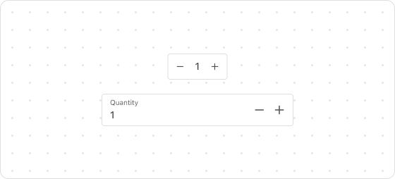
The Stepper UI component allows customers to increment or decrement numeric values seamlessly. Common usage includes adjusting quantities such as item counts.
Preview
Code example
render('Checkout::Dynamic::Render', (props) => {
  return <Stepper label="Quantity" max={5} min={0} step={1}></Stepper>;
});
StepperProps
Optional properties are marked with a ?. Properties without a ? are required.
label
string
Describes the intent of the stepper, such as Quantity for specifying the quantity.
max
number
The maximum integer value allowed.
min?
number
Default: 0
The minimum integer value allowed.
step?
number
Default: 1
Increment value, a positive integer.
error?
string
Used to display error messages for customers to view.
disabled?
boolean
Default: false
Indicates whether the stepper is disabled.
true: Disabledfalse: Dvailable
readonly?
boolean
Default: false
Indicates whether the field is read-only. Valid values are:
true: The field is read-only.false: The field is editable.
prefix?
string
Text to display as a prefix, such as $ for currency symbols.
value?
number
The controlled numeric value.
defaultValue?
number
The uncontrolled initial numeric value.
onChange?
(value: number) => void
Triggered when the value changes.
onFocus?
() => void
Triggered when the input field gains focus.
onBlur?
() => void
Triggered when the input field loses focus.

'%3e%3crect%20x='6'%20y='7.13049'%20width='13'%20height='10'%20rx='1'%20fill='black'/%3e%3cpath%20d='M12.4998%2012.936L-3.65042%200.604835L28.65%200.604838L12.4998%2012.936Z'%20stroke='white'%20stroke-linejoin='round'/%3e%3c/g%3e%3cdefs%3e%3cclipPath%20id='clip0_716_14611'%3e%3crect%20x='6'%20y='7.13049'%20width='13'%20height='10'%20rx='1'%20fill='white'/%3e%3c/clipPath%3e%3c/defs%3e%3c/svg%3e)

'%3e%3crect%20x='5.63086'%20y='7.26086'%20width='13'%20height='10'%20rx='1'%20fill='white'/%3e%3cpath%20d='M12.1306%2013.0664L-4.01956%200.735206L28.2809%200.735209L12.1306%2013.0664Z'%20stroke='%231A2C42'%20stroke-linejoin='round'/%3e%3c/g%3e%3cdefs%3e%3cclipPath%20id='clip0_716_14599'%3e%3crect%20x='5.63086'%20y='7.26086'%20width='13'%20height='10'%20rx='1'%20fill='white'/%3e%3c/clipPath%3e%3c/defs%3e%3c/svg%3e)