TextField
The TextField UI component is used to obtain the customer's text input, such as a name, email address, or message.
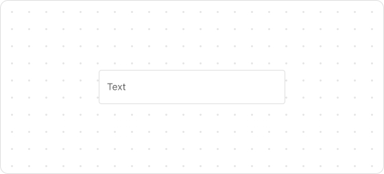
Preview
Code example
render('Checkout::Dynamic::Render', () => {
  return <TextField label="Last name" />;
});
TextFieldProps
Optional properties are marked with a ?. Properties without a ? are required.
label
string
The field label, which is used as a placeholder when the field is empty.
id?
string
A unique identifier for the UI component. If this property is not set, the system will automatically generate a globally unique ID for this component.
icon?
IconSource
The icon which is rendered at the beginning or end of the field.
name?
string
The name of the UI component.
accessibilityDescription?
string
A label for this component, used to help screen reader customers understand the function of the component. For more information, refer to Accessible description.
value?
T
The current value of the field. If this property is not set, the field is empty.
type?
text
email
number
telephone
Default: text
The type of content that customers will enter.
required?
boolean
Default: false
Indicates whether the property needs a value. Valid values are:
true: The field needs a value.false: The field does not need a value.
This property is intended to add semantic meaning but does not automatically trigger an error. To display an error when the property is empty, use the error property.
error?
string
The error message displayed to the customer. If this property is configured, the component will be highlighted in red and show the error message.
multiline?
number | boolean
Indicates whether the text field supports inputs of multiple lines. Set a number to define the default number of input lines.
autocomplete?
boolean | Autocomplete
The autocomplete attribute can be a boolean or an Autocomplete object, and it controls whether suggestions are shown for the field content. When set to true, the browser will use stored data to automatically fill the field; when set to false, the content will never be saved. Note that in some browsers, the autocomplete feature may not default to off, so do not overly rely on the default behavior when no value is provided. Alternatively, you can provide an Autocomplete object to specify particular data you want to be input in this field.
disabled?
boolean
Default: false
Indicates whether the field can be changed. Valid values are:
true: Cannot be changed.false: Can be changed.
readonly?
boolean
Default: false
Indicates whether the field is read-only. Valid values are:
true: The field is read-only.false: The field is editable.
maxLength?
number
The maximum number of characters allowed.
onFocus?
() => void
The callback triggered when the input is focused.
onBlur?
() => void
The callback triggered when the focus is removed.
onChange?
(value: T) => void
The callback triggered when the customer finishes editing the field.
onInput?
(value: T) => void
The callback triggered when the customer makes any changes in the field.
Type descriptions
Autocomplete
{group?: AutocompleteGroup, field: AutocompleteField}
AutocompleteGroup
shipping
billing
location
AutocompleteField
Refer to autofill field.

'%3e%3crect%20x='6'%20y='7.13049'%20width='13'%20height='10'%20rx='1'%20fill='black'/%3e%3cpath%20d='M12.4998%2012.936L-3.65042%200.604835L28.65%200.604838L12.4998%2012.936Z'%20stroke='white'%20stroke-linejoin='round'/%3e%3c/g%3e%3cdefs%3e%3cclipPath%20id='clip0_716_14611'%3e%3crect%20x='6'%20y='7.13049'%20width='13'%20height='10'%20rx='1'%20fill='white'/%3e%3c/clipPath%3e%3c/defs%3e%3c/svg%3e)

'%3e%3crect%20x='5.63086'%20y='7.26086'%20width='13'%20height='10'%20rx='1'%20fill='white'/%3e%3cpath%20d='M12.1306%2013.0664L-4.01956%200.735206L28.2809%200.735209L12.1306%2013.0664Z'%20stroke='%231A2C42'%20stroke-linejoin='round'/%3e%3c/g%3e%3cdefs%3e%3cclipPath%20id='clip0_716_14599'%3e%3crect%20x='5.63086'%20y='7.26086'%20width='13'%20height='10'%20rx='1'%20fill='white'/%3e%3c/clipPath%3e%3c/defs%3e%3c/svg%3e)