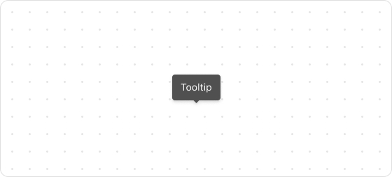
Tooltip
The Tooltip UI component is a floating label that briefly explains the function of a user interface element.
Preview
Code example
render('Checkout::Dynamic::Render', (props) => {
  return (
    <Tooltip title="This product is designated as a special discount item, offered at a reduced price for a limited period.">
      <Icon source="question"></Icon>
    </Tooltip>
  );
});
TooltipProps
tip
Optional properties are marked with a ?. Properties without a ? are required.
title
string
The tooltip text to be displayed.
children
React.ReactNode
UI element that triggers the tooltip (such as a button or icon).
placement?
top
top-start
top-end
right-end
right-start
bottom
bottom-start
bottom-end
left-start
left-end
Default: top
The position where the tooltip text is displayed.
trigger?
hover
click
Default: hover
The method by which the tooltip is triggered.
Was this article helpful to you?

'%3e%3crect%20x='6'%20y='7.13049'%20width='13'%20height='10'%20rx='1'%20fill='black'/%3e%3cpath%20d='M12.4998%2012.936L-3.65042%200.604835L28.65%200.604838L12.4998%2012.936Z'%20stroke='white'%20stroke-linejoin='round'/%3e%3c/g%3e%3cdefs%3e%3cclipPath%20id='clip0_716_14611'%3e%3crect%20x='6'%20y='7.13049'%20width='13'%20height='10'%20rx='1'%20fill='white'/%3e%3c/clipPath%3e%3c/defs%3e%3c/svg%3e)

'%3e%3crect%20x='5.63086'%20y='7.26086'%20width='13'%20height='10'%20rx='1'%20fill='white'/%3e%3cpath%20d='M12.1306%2013.0664L-4.01956%200.735206L28.2809%200.735209L12.1306%2013.0664Z'%20stroke='%231A2C42'%20stroke-linejoin='round'/%3e%3c/g%3e%3cdefs%3e%3cclipPath%20id='clip0_716_14599'%3e%3crect%20x='5.63086'%20y='7.26086'%20width='13'%20height='10'%20rx='1'%20fill='white'/%3e%3c/clipPath%3e%3c/defs%3e%3c/svg%3e)