BlockLayout
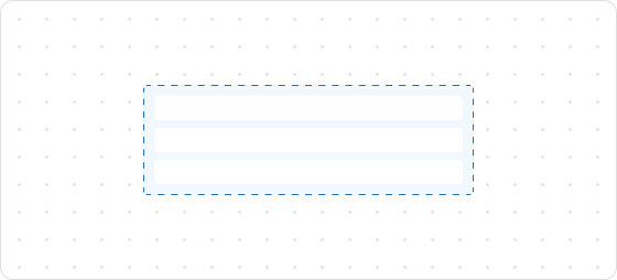
BlockLayout is used to arrange content across multiple lines. By default, all lines will occupy the available block space and share it equally.
Preview
Code example
render('Checkout::Dynamic::Render', (props) => {
  return (
    <View border="base">
      <View>
        <Text size="extraExtraLarge">BlockLayoutDemo</Text>
      </View>
      {/* All implicit rows. */}
      <BlockLayout spacing="loose">
        <Text>BlockLayoutDemo1</Text>
        <Text>BlockLayoutDemo1</Text>
        <Text>BlockLayoutDemo1</Text>
        <Text>BlockLayoutDemo1</Text>
        <Text>BlockLayoutDemo1</Text>
      </BlockLayout>
      {/* Explicit two rows */}
      <BlockLayout rows={['auto', 'auto']}>
        <Text>BlockLayoutDemo2</Text>
        <Text appearance="subdued" size="base">
          BlockLayoutDemo2
        </Text>
      </BlockLayout>
    </View>
  );
});
BlockLayoutProps
tip
Optional properties are marked with a ?. Properties without a ? are required.
rows?
MaybeResponsiveConditionalStyle<Rows>
The number of rows to be displayed.
inlineAlignment?
MaybeResponsiveConditionalStyle<InlineAlignment>
Alignment along the main axis, where the main axis is the inline axis.
blockAlignment?
MaybeResponsiveConditionalStyle<BlockAlignment>
Alignment along the cross axis, where the cross axis is the block axis within the grid area.
spacing?
MaybeResponsiveConditionalStyle<Spacing | [Spacing, Spacing]>
Default: base
Spacing between elements.
padding?
MaybeResponsiveConditionalStyle<MaybeShorthandProperty<Spacing>>
Inner spacing.
Type descriptions
MaybeResponsiveConditionalStyle
T | ConditionalStyle<T, ViewportSizeCondition>
- Example of a plain value:
base - Example of a conditional value:
{ defaultValue: 'tight', conditionals: [{ conditions: { viewportInlineSize: { min: 'medium' } }, value: 'loose' }] }
ConditionalStyle
{ defaultValue?: T; conditionals: ConditionalValue<T, Conditions>[] }
ConditionalValue
{ conditions: Conditions; value: T }
Conditions
AtLeastOne<ViewportSizeCondition>
ViewportSizeCondition
{ viewportInlineSize: { min: T } }
AtLeastOne
Partial<T> & U[keyof U]
ViewportInlineSize
extraSmall
small
medium
large
Refer to Viewport breakpoints.
MaybeShorthandProperty
T | ShorthandProperty<T>
ShorthandProperty
[T, T]
[T, T, T, T]
BlockAlignment
start
center
end
baseline
InlineAlignment
start
center
end
Spacing
none
base
extraTight
tight
loose
extraLoose
Rows
GridItemSize[]
GridItemSize
GridItemSize
auto
fill
number
${number}fr
${number}%
auto: Expands based on the content and does not proactively fill the remaining space.${number}fr: Distributes the remaining space equally, wherenumberindicates the share of space.fill: Fills the space like1frbut can shrink to 0 when the content is too long to prevent overflow.number: Allocates content space according to the specified value. For example, setting30will occupy 30px.${number}%: Occupies content space as a percentage according to the configuration. For example, setting30%will take up 30% of the content space.
Was this article helpful to you?

'%3e%3crect%20x='6'%20y='7.13049'%20width='13'%20height='10'%20rx='1'%20fill='black'/%3e%3cpath%20d='M12.4998%2012.936L-3.65042%200.604835L28.65%200.604838L12.4998%2012.936Z'%20stroke='white'%20stroke-linejoin='round'/%3e%3c/g%3e%3cdefs%3e%3cclipPath%20id='clip0_716_14611'%3e%3crect%20x='6'%20y='7.13049'%20width='13'%20height='10'%20rx='1'%20fill='white'/%3e%3c/clipPath%3e%3c/defs%3e%3c/svg%3e)

'%3e%3crect%20x='5.63086'%20y='7.26086'%20width='13'%20height='10'%20rx='1'%20fill='white'/%3e%3cpath%20d='M12.1306%2013.0664L-4.01956%200.735206L28.2809%200.735209L12.1306%2013.0664Z'%20stroke='%231A2C42'%20stroke-linejoin='round'/%3e%3c/g%3e%3cdefs%3e%3cclipPath%20id='clip0_716_14599'%3e%3crect%20x='5.63086'%20y='7.26086'%20width='13'%20height='10'%20rx='1'%20fill='white'/%3e%3c/clipPath%3e%3c/defs%3e%3c/svg%3e)