Grid
The Grid UI component is used to layout content in a matrix format consisting of rows and columns.
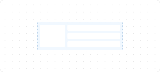
Preview
Code example
render('Checkout::Dynamic::Render', (root) => {
  return <>
    <Grid
      columns={[100, 'fill', '20%']}
      rows={['auto', 100, 'auto']}
      spacing="loose"
      padding="loose"
      >
      <GridItem columnSpan={3}>
        <View> Grid: </View>
      </GridItem>
      <View border="base" padding="base">
        100 / 100
      </View>
      <View border="base" padding="base">
        fill / 100
      </View>
      <View border="base" padding="base">
        20% / 100
      </View>
      <GridItem columnSpan={2}>
        <View border="base" padding="base">
          100 + fill / auto
        </View>
      </GridItem>
      <View border="base" padding="base">
        20% / auto
      </View>
    </Grid>
  </>;
});
GridProps
tip
Optional properties are marked with a ?. Properties without a ? are required.
columns?
MaybeResponsiveConditionalStyle<GridItemSize[] | GridItemSize>
The size of each column in the grid layout.
rows?
MaybeResponsiveConditionalStyle<GridItemSize[] | GridItemSize>
The size of each row in the grid layout.
spacing?
MaybeResponsiveConditionalStyle<Spacing | [Spacing, Spacing]>
The space between child elements.
When two values are provided, the first value is the row spacing and the second value is the column spacing.
border?
MaybeResponsiveConditionalStyle<MaybeShorthandProperty<BorderStyle>>
The border style. This property can be defined using one, two, or four values:
- One Value: Applies the specified style uniformly to all four borders.
- Two Values: The first value sets the style for the vertical borders (top and bottom), and the second value sets the style for the horizontal borders (left and right).
- Four Values: Each value corresponds to an individual border in the following order: top, right, bottom, and left.
cornerRadius?
MaybeResponsiveConditionalStyle<MaybeShorthandProperty<CornerRadius>>
The corner radius size.
padding?
MaybeResponsiveConditionalStyle<MaybeShorthandProperty<Spacing>>
Configures the inner padding.
overflow?
hidden
visible
Default: visible
Configures whether to show or hide overflowing content.
hidden: Hides overflow.visible: Shows overflow.
inlineAlignment?
MaybeResponsiveConditionalStyle<'start' | 'center' | 'end'>
Alignment along the horizontal axis.
blockAlignment?
MaybeResponsiveConditionalStyle<'start' | 'center' | 'end'|'baseline'>
Alignment along the vertical axis.
Type descriptions
GridItemSize
auto
fill
number
${number}fr
${number}%
auto: Expands based on the content and does not proactively fill the remaining space.${number}fr: Distributes the remaining space equally, wherenumberindicates the share of space.fill: Fills the space like1frbut can shrink to 0 when the content is too long to prevent overflow.number: Allocates content space according to the specified value. For example, setting30will occupy 30px.${number}%: Occupies content space as a percentage according to the configuration. For example, setting30%will take up 30% of the content space.
Spacing
none
base
extraTight
tight
loose
extraLoose
BorderStyle
base
dotted
none
CornerRadius
base
small
large
fullyRounded
none
MaybeResponsiveConditionalStyle
T | ConditionalStyle<T, ViewportSizeCondition>
- Example of a plain value:
base - Example of a conditional value:
{ defaultValue: 'tight', conditionals: [{ conditions: { viewportInlineSize: { min: 'medium' } }, value: 'loose' }] }
ConditionalStyle
{ defaultValue?: T; conditionals: ConditionalValue<T, Conditions>[] }
ConditionalValue
{ conditions: Conditions; value: T }
Conditions
AtLeastOne<ViewportSizeCondition>
ViewportSizeCondition
{ viewportInlineSize: { min: T } }
AtLeastOne
Partial<T> & U[keyof U]
ViewportInlineSize
extraSmall
small
medium
large
Refer to Viewport breakpoints.
MaybeShorthandProperty
T | ShorthandProperty<T>
ShorthandProperty
[T, T]
[T, T, T, T]
Was this article helpful to you?

'%3e%3crect%20x='6'%20y='7.13049'%20width='13'%20height='10'%20rx='1'%20fill='black'/%3e%3cpath%20d='M12.4998%2012.936L-3.65042%200.604835L28.65%200.604838L12.4998%2012.936Z'%20stroke='white'%20stroke-linejoin='round'/%3e%3c/g%3e%3cdefs%3e%3cclipPath%20id='clip0_716_14611'%3e%3crect%20x='6'%20y='7.13049'%20width='13'%20height='10'%20rx='1'%20fill='white'/%3e%3c/clipPath%3e%3c/defs%3e%3c/svg%3e)

'%3e%3crect%20x='5.63086'%20y='7.26086'%20width='13'%20height='10'%20rx='1'%20fill='white'/%3e%3cpath%20d='M12.1306%2013.0664L-4.01956%200.735206L28.2809%200.735209L12.1306%2013.0664Z'%20stroke='%231A2C42'%20stroke-linejoin='round'/%3e%3c/g%3e%3cdefs%3e%3cclipPath%20id='clip0_716_14599'%3e%3crect%20x='5.63086'%20y='7.26086'%20width='13'%20height='10'%20rx='1'%20fill='white'/%3e%3c/clipPath%3e%3c/defs%3e%3c/svg%3e)