InlineLayout
InlineLayout is used to manage content layout across multiple columns. By default, all columns share equal width and fill the available inline space. If content exceeds the explicitly set number of columns, it does not wrap. Instead, new columns are dynamically added to occupy the remaining inline space.
Preview
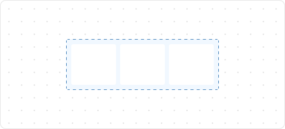
Code example
render('Checkout::Dynamic::Render', (props) => {
  return (
    <View border="base">
      <View>
        <Text size="extraExtraLarge">InlineLayoutDemo</Text>
      </View>
      <InlineLayout spacing="tight" columns={[64, 'fill', 'auto']}>
        <Text>InlineLayoutDemo1</Text>
        <Text>InlineLayoutDemo1</Text>
        <Text>InlineLayoutDemo1</Text>
      </InlineLayout>
      <InlineLayout
        spacing="extraTight"
        blockAlignment="center"
        columns={['auto', 'auto', 'auto', 'auto']}
        >
        <Text>InlineLayoutDemo2</Text>
        <Text>InlineLayoutDemo2</Text>
        <Text>InlineLayoutDemo2</Text>
        <Text>InlineLayoutDemo2</Text>
      </InlineLayout>
      <InlineLayout columns={['fill', 'auto']} blockAlignment="center" spacing="tight">
        <Text>InlineLayoutDemo3</Text>
        <Text>InlineLayoutDemo3</Text>
      </InlineLayout>
      <InlineLayout columns={['auto', 'auto']} blockAlignment="center" spacing="tight">
        <Text>InlineLayoutDemo4</Text>
        <Text>InlineLayoutDemo4</Text>
      </InlineLayout>
    </View>
  );
});
InlineLayoutProps
tip
Optional properties are marked with a ?. Properties without a ? are required.
columns?
MaybeResponsiveConditionalStyle<Columns>
The number of colums to be displayed.
inlineAlignment?
MaybeResponsiveConditionalStyle<InlineAlignment>
Alignment along the main axis, where the main axis is the inline axis.
blockAlignment?
MaybeResponsiveConditionalStyle<BlockAlignment>
Alignment along the cross axis, where the cross axis is the block axis within the grid area.
spacing?
MaybeResponsiveConditionalStyle<Spacing | [Spacing, Spacing]>
Default: base
Spacing between elements.
padding?
MaybeResponsiveConditionalStyle<MaybeShorthandProperty<Spacing>>
Inner spacing.
Type descriptions
BlockAlignment
start
center
end
baseline
InlineAlignment
start
center
end
Spacing
none
base
extraTight
tight
loose
extraLoose
Columns
GridItemSize[]
GridItemSize
GridItemSize
auto
fill
number
${number}fr
${number}%
auto: Expands based on the content and does not proactively fill the remaining space.${number}fr: Distributes the remaining space equally, wherenumberindicates the share of space.fill: Fills the space like1frbut can shrink to 0 when the content is too long to prevent overflow.number: Allocates content space according to the specified value. For example, setting30will occupy 30px.${number}%: Occupies content space as a percentage according to the configuration. For example, setting30%will take up 30% of the content space.
MaybeResponsiveConditionalStyle
T | ConditionalStyle<T, ViewportSizeCondition>
- Example of a plain value:
base - Example of a conditional value:
{ defaultValue: 'tight', conditionals: [{ conditions: { viewportInlineSize: { min: 'medium' } }, value: 'loose' }] }
ConditionalStyle
{ defaultValue?: T; conditionals: ConditionalValue<T, Conditions>[] }
ConditionalValue
{ conditions: Conditions; value: T }
Conditions
AtLeastOne<ViewportSizeCondition>
ViewportSizeCondition
{ viewportInlineSize: { min: T } }
AtLeastOne
Partial<T> & U[keyof U]
ViewportInlineSize
extraSmall
small
medium
large
Refer to Viewport breakpoints.
MaybeShorthandProperty
T | ShorthandProperty<T>
ShorthandProperty
[T, T]
[T, T, T, T]
Was this article helpful to you?

'%3e%3crect%20x='6'%20y='7.13049'%20width='13'%20height='10'%20rx='1'%20fill='black'/%3e%3cpath%20d='M12.4998%2012.936L-3.65042%200.604835L28.65%200.604838L12.4998%2012.936Z'%20stroke='white'%20stroke-linejoin='round'/%3e%3c/g%3e%3cdefs%3e%3cclipPath%20id='clip0_716_14611'%3e%3crect%20x='6'%20y='7.13049'%20width='13'%20height='10'%20rx='1'%20fill='white'/%3e%3c/clipPath%3e%3c/defs%3e%3c/svg%3e)

'%3e%3crect%20x='5.63086'%20y='7.26086'%20width='13'%20height='10'%20rx='1'%20fill='white'/%3e%3cpath%20d='M12.1306%2013.0664L-4.01956%200.735206L28.2809%200.735209L12.1306%2013.0664Z'%20stroke='%231A2C42'%20stroke-linejoin='round'/%3e%3c/g%3e%3cdefs%3e%3cclipPath%20id='clip0_716_14599'%3e%3crect%20x='5.63086'%20y='7.26086'%20width='13'%20height='10'%20rx='1'%20fill='white'/%3e%3c/clipPath%3e%3c/defs%3e%3c/svg%3e)