Style controls
Style controls are visual configuration tools within theme editors, allowing merchants to conveniently modify CSS style values through interactive methods such as clicking and inputting. These controls support multi-screen breakpoint configurations, enabling adaptation across various devices such as mobile and PC, thereby enhancing responsive design efficiency. The style controls include the following types:
- Layout controls
- Spacing controls
- Size controls
Note: We plan to continually expand the range of style control types in the future to meet personalized design needs and further enhance the flexibility of theme customization.
Standard control attributes
The following table lists the standard control attributes. For specific specialized attributes of different style controls, see the following control descriptions.| Attribute | Description | Required or not |
|---|---|---|
| type | The control type | Yes |
| id | The configuration item ID, used to access the configuration value | Yes |
| label | The configuration label, displayed in the theme editor | Yes |
| default | The configuration default value | No |
| info | The configuration remarks | No |
Control types
Layout control
Thetype attribute value is style.layout.
This control is used for configuring element alignment, wrapping, spacing, and more.
Example
{{#schema}}
{
  "name": "My Section",
  "settings": [
    {
      "type": "style.layout",	// The typography control
      "id": "layout",
      "label": "Layout",
      "default": {
        "flex-direction": "row",
        "flex-wrap": "nowrap",
        "align-items": "flex-start",
        "justify-content": "space-between",
        "row-gap": "40px",
        "column-gap": "60px"
      }
    }
  ],
  "presets": [
    {
      "name": "My Section"
    }
  ]
}
{{/schema}}
The corresponding output effect in the theme editor is as follows:
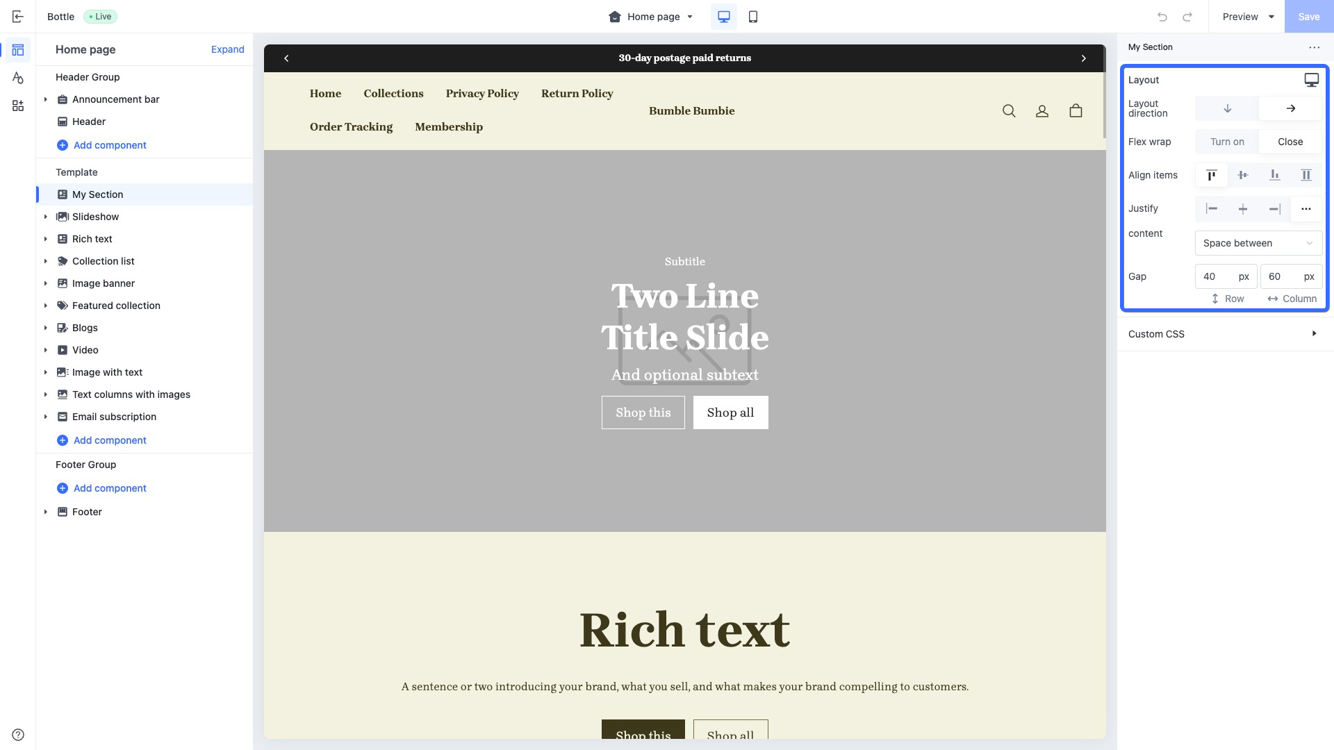
Supported configuration attributes
| Attribute | Description | Value type | Default value |
|---|---|---|---|
| flex-direction | Layout direction | row: horizontal layoutcolumn: vertical layout | row |
| flex-wrap | Line wrapping | wrap: wrapno-wrap: no wrap | no-wrap |
| align-items | Alignment | flex-start: Align topflex-end: Align bottomcenter: Center alignstretch: Stretch Align | flex-start |
| justify-content | Display position | flex-start: Align leftcenter: Center alignflex-end: Align rightspace-around: Distribute aroundspace-between: Distribute betweenspace-evenly: Distribute evenly | flex-start |
| row-gap | Row gap | px | 0px |
| column-gap | Column gap | px | 0px |
Access the layout control configuration
You can add layout controls in any code that includes a schema tag, such as in the theme global configuration, section configuration, and block configuration. This allows you to access the values of layout controls as shown in the code below:{{ settings.layout }} // Theme global layout style configuration
{{ section.settings.layout }} // Section layout style configuration
{{ block.settings.layout }} // Block layout style configuration
Apply the layout control configuration
You can apply style configurations to elements using the class_list filter. Based on the example code above, the following is an example of applying layout styles to a section:<div class="my-section {{section.settings.layout | class_list()}}"> <!-- Apply the layout control configuration -->
...
</div>
{{#schema}}
{
"name": "My Section",
"settings": [
{
"type": "style.layout",
"id": "layout",
"label": "Layout",
"default": {
"flex-direction": "row",
"flex-wrap": "nowrap",
"align-items": "flex-start",
"justify-content": "space-between",
"row-gap": "40px",
"column-gap": "60px"
}
}
],
"presets": [
{
"name": "My Section"
}
]
}
{{/schema}}
Spacing controls
Thetype attribute value is style.spacing.
This control is used for configuring the top, bottom, left, and right padding.
Example
{{#schema}}
{
  "name": "My Section",
  "settings": [
    {
      "type": "style.spacing",	// The spacing control
      "id": "spacing",
      "label": "Spacing",
      "default": {
        "padding-top": "40px",
        "padding-right": "0px",
        "padding-bottom": "40px",
        "padding-left": "0px"
      }
    }
  ],
  "presets": [
    {
      "name": "My Section"
    }
  ]
}
{{/schema}}
The corresponding output effect in the theme editor is as follows:
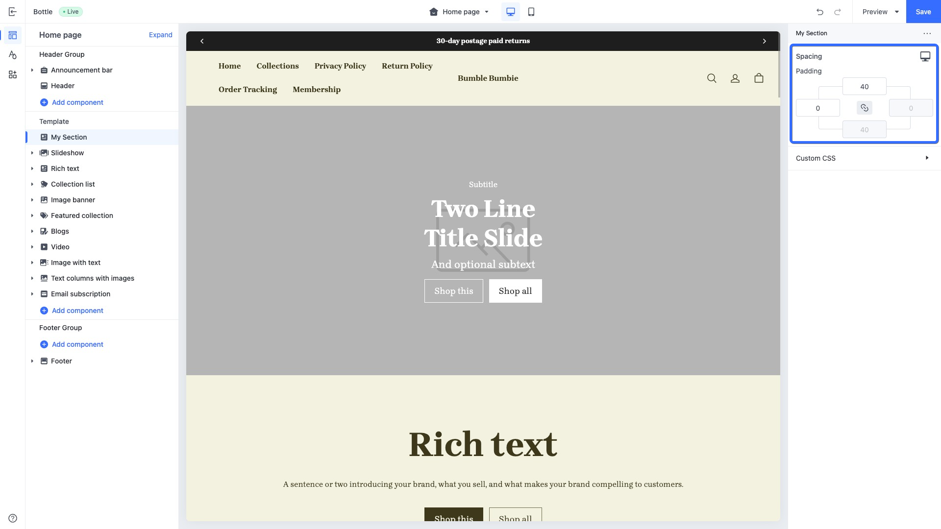
Supported configuration attributes
| Attribute | Description | Value type | Default value |
|---|---|---|---|
| padding-top padding-block-start | Top margin | px | 0px |
| padding-right padding-inline-end | Right margin | px | 0px |
| padding-bottom padding-block-end | Bottom margin | px | 0px |
| padding-left padding-inline-start | Left margin | px | 0px |
Access the layout control configuration
You can add spacing controls in any code that includes a schema tag, such as in the theme global configuration, section configuration, and block configuration. This allows you to access the values of spacing controls as shown in the code below:{{ settings.layout }} // Theme global spacing style configuration
{{ section.settings.layout }} // Section spacing style configuration
{{ block.settings.layout }} // Block spacing style configuration
Apply the layout control configuration
You can apply style configurations to elements using the class_list filter. Based on the example code above, the following is an example of applying spacing styles to a section:<div class="my-section {{section.settings.spacing | class_list()}}"> <!-- Apply the spacing control configuration -->
...
</div>
{{#schema}}
{
"name": "My Section",
"settings": [
{
"type": "style.spacing",
"id": "spacing",
"label": "Spacing",
"default": {
"padding-top": "40px",
"padding-right": "0px",
"padding-bottom": "40px",
"padding-left": "0px"
}
}
],
"presets": [
{
"name": "My Section"
}
]
}
{{/schema}}
Size controls
Thetype attribute value is style.size.
This control is used for configuring the width and height of an element.
Example
{{#schema}}
{
  "name": "My Section",
  "settings": [
    {
      "type": "style.size",	// The size control
      "id": "size",
      "label": "Size",
      "default": {
        "width": "100%",
        "height": "auto"
      }
    }
  ],
  "presets": [
    {
      "name": "My Section"
    }
  ]
}
{{/schema}}
The corresponding output effect in the theme editor is as follows:
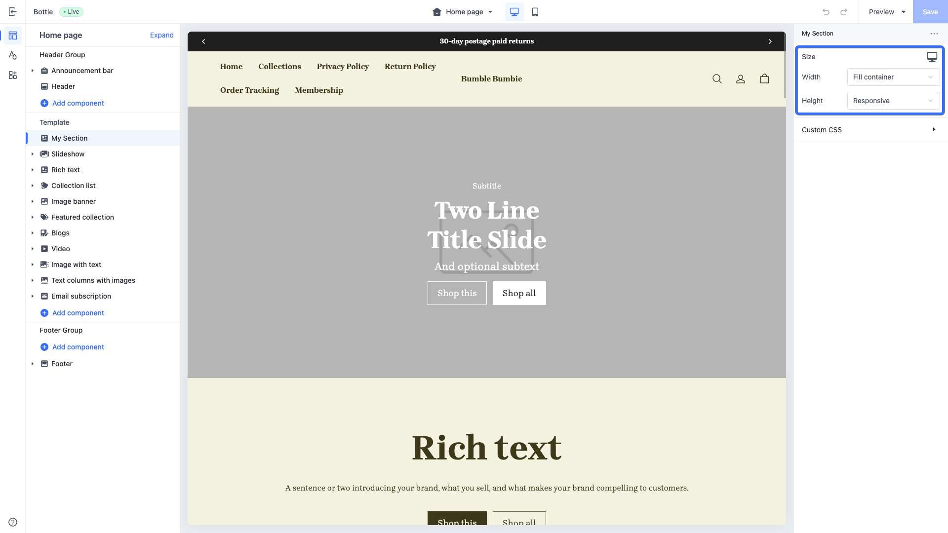
Supported configuration attributes
| Attribute | Description | Value type | Default value |
|---|---|---|---|
| width | width | px%auto | auto |
| height | height | px%auto | auto |
Access the layout control configuration
You can add size controls in any code that includes a schema tag, such as in the theme global configuration, section configuration, and block configuration. This allows you to access the values of size controls as shown in the code below:{{ settings.layout }} // Theme global size style configuration
{{ section.settings.layout }} // Section size style configuration
{{ block.settings.layout }} // Block size style configuration
Apply the layout control configuration
You can apply style configurations to elements using the class_list filter. Based on the example code above, the following is an example of applying size styles to a section:<div class="my-section {{section.settings.spacing | class_list()}}"> <!-- Apply the size control configuration -->
...
</div>
{{#schema}}
{
"name": "My Section",
"settings": [
{
"type": "style.spacing",
"id": "spacing",
"label": "Spacing",
"default": {
"padding-top": "40px",
"padding-right": "0px",
"padding-bottom": "40px",
"padding-left": "0px"
}
}
],
"presets": [
{
"name": "My Section"
}
]
}
{{/schema}}
Best practices
Apply multiple style configurations quickly
When various types of style configurations are present in the schema, you may opt to apply them to elements at simultaneously using the following approach:<div
class="my-section
{{section.settings.layout | class_list()}} <!-- Apply the layout style -->
{{section.settings.spacing | class_list()}} <!-- Apply the spacing style -->
{{section.settings.size | class_list()}} <!-- Apply the size style -->
">
...
</div>
{{#schema}}
{
"name": "My Section",
"settings": [
{
"type": "style.layout",
...
},
{
"type": "style.spacing",
...
},
{
"type": "style.size",
...
}
],
"presets": [
{
"name": "My Section"
}
]
}
{{/schema}}
However, we offer a more straightforward method to help you quickly apply all style configurations to an element. You simply need to pass the settings object to the class_list filter for binding. The following is an example of a section applying all style configurations at once:
<div
  class="my-section
  {{section.settings | class_list()}}	<!-- Apply all style configurations simultaneously -->
">
  ...
</div>
{{#schema}}
{
  "name": "My Section",
  "settings": [
    {
      "type": "style.layout",
      ...
    },
    {
      "type": "style.spacing",
      ...
    },
    {
      "type": "style.size",
      ...
    }
  ],
  "presets": [
    {
      "name": "My Section"
    }
  ]
}
{{/schema}}
Set specific style values for certain breakpoints
Style controls support storing different style configuration values based on various breakpoints. You can add@media () tags in the default attribute of style controls to identify different breakpoints.
Note: Currently, the theme only supports the --mobile mobile breakpoint.
The following is an example of adding specific spacing style configurations for mobile devices:
<div class="my-section {{section.settings | class_list()}}">
...
</div>
{{#schema}}
{
  "name": "My Section",
  "settings": [
    {
      "type": "style.spacing",		// The spacing control
      "id": "spacing",
      "label": "Spacing",
      "default": {
        "padding-top": "40px",
        "padding-bottom": "20px",
        "@media (--mobile)": {		// Specify the breakpoint configuration for mobile devices
          "padding-top": "10px",
          "padding-bottom": "5px"
        }
      }
    }
  ],
  "presets": [
    {
      "name": "My Section"
    }
  ]
}
{{/schema}}
When the page switches to the mobile breakpoint, the top and bottom padding of the element will be set to 10px and 5px respectively.
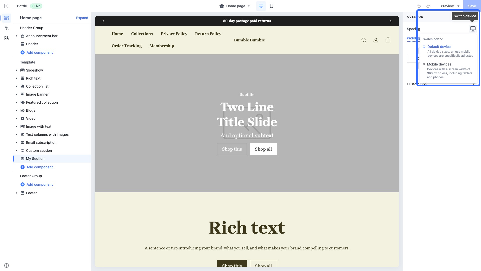
You can also configure different style values for different breakpoints using the theme editor. The theme editor interface shown in the following image demonstrates the access point for adjusting spacing style settings at different breakpoints.
Retrieve an attribute value from a style configuration
Generally, style configurations are applied to container elements to better coordinate the display among child elements. However, in certain cases, you can use the css_var filter to retrieve a specific attribute value from a style configuration, allowing for personalized customization. The following is an example of a child block accessing a parent block's style configuration value:In the product information block, to enable the child block of multi-attribute selectors to get the parent block's product information layout style row-gap value, a CSS variable needs to be defined in the product information block file to store the row-gap value. Here is an example of the code:
<!-- sections/featured-product/blocks/product-info.html -->
<div
  class="product-detail__info product-detail__col {{block.settings | class_list()}}"
  style="
    --info-row-gap: {{block.settings.layout | css_var(`row-gap`)}};	// Assign the layout style row-gap value to the CSS variable --info-row-gap
  "
  {{{block.shopline_attributes}}}
>
  {{#blocks}}
    {{#block product=props.product /}}
  {{/blocks}}
</div>
{{#schema}}
{
  "name": "Product information",
  "settings": [
    {
      "type": "style.layout",
      "id": "layout",
      "label": "Layout",
      "default": {
        "flex-wrap": "nowrap",
        "flex-direction": "column",
        "row-gap": "20px",	// Layout style row-gap attribute
        "column-gap": "20px"
      }
    }
  ],
  "blocks": [
    ...
    {
      "type": "product/detail-variant-picker",	// Multiple-attribute selector block
      "limit": 1
    },
    ...
  ],
  "presets": [
    ...
  ]
}
{{/schema}}
The value of the layout style row-gap attribute is stored in the CSS variable --info-row-gap. This CSS variable can be used by the product information block and all its child elements. The following is a code example for a multi-attribute selector block using the parent block's product information CSS variable:
/** blocks/product/detail-variant-picker.css **/
.product-detail__variant-picker {
  display: flex;
  flex-direction: column;
  gap: var(--info-row-gap);	// Use the CSS variable defined in the parent block product information
}
Caution: The style configuration values stored in CSS variables will also vary with different breakpoints. On different screen sizes, these breakpoint-specific style configuration values will dynamically manifest in the CSS variables, thereby adapting to devices such as phones, tablets, and computers.

'%3e%3crect%20x='6'%20y='7.13049'%20width='13'%20height='10'%20rx='1'%20fill='black'/%3e%3cpath%20d='M12.4998%2012.936L-3.65042%200.604835L28.65%200.604838L12.4998%2012.936Z'%20stroke='white'%20stroke-linejoin='round'/%3e%3c/g%3e%3cdefs%3e%3cclipPath%20id='clip0_716_14611'%3e%3crect%20x='6'%20y='7.13049'%20width='13'%20height='10'%20rx='1'%20fill='white'/%3e%3c/clipPath%3e%3c/defs%3e%3c/svg%3e)

'%3e%3crect%20x='5.63086'%20y='7.26086'%20width='13'%20height='10'%20rx='1'%20fill='white'/%3e%3cpath%20d='M12.1306%2013.0664L-4.01956%200.735206L28.2809%200.735209L12.1306%2013.0664Z'%20stroke='%231A2C42'%20stroke-linejoin='round'/%3e%3c/g%3e%3cdefs%3e%3cclipPath%20id='clip0_716_14599'%3e%3crect%20x='5.63086'%20y='7.26086'%20width='13'%20height='10'%20rx='1'%20fill='white'/%3e%3c/clipPath%3e%3c/defs%3e%3c/svg%3e)