Input settings
A value can be saved and configured by the merchant. The input configuration is divided into two categories based on standard attributes:
To add information elements to the settings display, such as titles, refer to Sidebar Settings.
Standard Attributes
Below are the standard attributes for input configurations. However, depending on the input type, there may be additional attributes or some attributes may not be applicable:
| Attribute | Description | Required |
|---|---|---|
type | Control type, can be any basic or specialized input control type. | Yes |
id | Configuration ID, used to access the configuration value. | Yes |
label | Control label, displayed in the theme editor. | Yes |
default | Default value of the configuration. | No |
info | Tip text for this configuration. | No |
Basic Input Settings
Below are the basic input control types:
switch
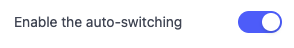
Set type to switch to display a switch control. This control can be used to toggle features on and off, such as displaying the language selector.
Example code:
{
  "type": "switch",
  "id": "enable_auto_switching",
  "label": {
    "en": "Enable the auto-switching"
  },
  "info": {
  },
  "default": true
}
The return value of the switch control is of boolean type.
Effect in the theme editor:
If the default value is not configured, it defaults to false.
checkbox
Set type to checkbox to display a single checkbox control. This control can be used to toggle features on and off, such as displaying the search entrance.
Example code:
{
  "type": "checkbox",
  "id": "outline_style",
  "label": {
    "en": "Use outline button style"
  },
  "default": true
}
Effect in the theme editor:
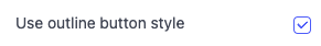
The return value of the checkbox control is of boolean type.
If the default value is not configured, it defaults to false.
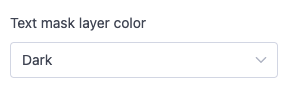
radio
Set type to radio to display a radio button control. In addition to the standard attributes, the radio control requires the options attribute, which accepts an array defined by value and label.
This control can be used for single selections among multiple options, such as the alignment of a title logo.
Example code:
{
  "type": "radio",
  "id": "mask_color",
  "label": {
    "en": "Text mask layer color"
  },
  "default": "dark",
  "options": [
    {
      "value": "dark",
      "label": {
        "en": "Dark"
      }
    },
    {
      "value": "light",
      "label": {
        "en": "Light"
      }
    }
  ]
}
Effect in the theme editor:
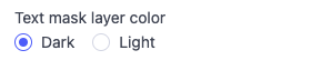
The return value of the radio control is of string type.
If the default value is not configured, it defaults to false.
range
Set type to range to display a slider control. It displays the current value and the selectable range. In addition to the standard attributes, the range control has the following configurations:
| Attribute | Description | Required |
|---|---|---|
| min | Minimum value | Yes |
| max | Maximum value | Yes |
| step | Slider step, must be greater than 0 and divisible by (max - min). | Yes |
| unit | Unit of the input value. For example, you can set the px unit for a width slider. | No |
This control can be used for multiple numeric inputs, such as the logo width on a PC.
Example code:
{
  "type": "range",
  "id": "mask_opacity",
  "label": {
    "en": "Layer mask opacity"
  },
  "default": 32,
  "min": 0,
  "max": 100,
  "step": 1,
  "unit": "%"
}
Effect in the theme editor:
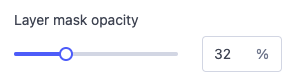
The return value of the range control is of number type.
The default attribute is required. The min, max, step, and default attributes must not be string values. Non-compliance will result in errors.
select
Set type to select to display a dropdown menu control. A dropdown menu is displayed for the user to select an option. In addition to the standard attributes, the select control requires the options attribute, which accepts an array defined by value and label.
This control can be used for single selections among multiple options, such as image size.
Example code:
{
  "type": "select",
  "id": "mask_color",
  "label": {
    "en": "Text mask layer color"
  },
  "default": "dark",
  "options": [
    {
      "value": "dark",
      "label": {
        "en": "Dark"
      }
    },
    {
      "value": "light",
      "label": {
        "en": "Light"
      }
    }
  ]
}
Effect in the theme editor:
The return value of the select control is of string type.
text
Set type to text to display a single-line text control. In addition to the standard attributes, the text control has the following configuration:
| Attribute | Description | Required |
|---|---|---|
| placeholder | Default text in the input box | No |
This control can be used for single-line text input, such as a component title.
Example code:
{
  "type": "text",
  "id": "button_text",
  "default": "Shop this",
  "label": {
    "en": "Button text"
  }
}
Effect in the theme editor:
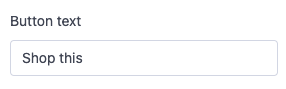
The return value of the text control is of string type.
textarea
Set type to textarea to display a multi-line text control. In addition to the standard attributes, the textarea control has the following configurations:
| Attribute | Description | Required |
|---|---|---|
| placeholder | Default text in the input box | No |
| limit | Maximum length of text input | No |
This control can be used for multi-line text input, such as a main title display.
Example code:
{
  "type": "textarea",
  "id": "title",
  "label": {
    "en": "Main title"
  },
  "default": "Two Line\nTitle Slide",
  "limit": 500
}
Effect in the theme editor:
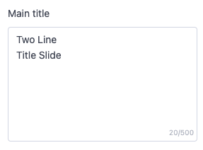
The return value of the text control is of string type.
Specialized Input Settings
Below are the specialized input control types:
- richtext
- text_Align
- vertical_align
- horizontal_align
- url
- color
- image_picker
- font
- blog
- collection_picker
- product_picker
- page_picker
- menu_picker
- padding
- video
- video_url
- html
- product_list
richtext
Set type to richtext to display a rich text control, outputting text in the following basic formats:
- Bold text
- Italic text
- Hyperlinks
- Paragraphs
This control can be used to display body text with multiple content elements, such as image size.
Example code:
{
  "type": "richtext",
  "id": "content",
  "label": {
    "en": "Main text"
  },
  "default": "A sentence or two introducing your brand, what you sell, and what makes your brand compelling to customers."
}
Effect in the theme editor:
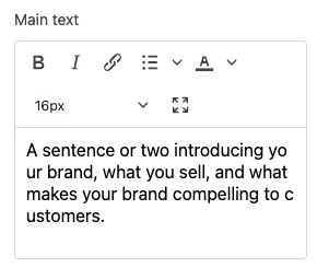
The return value of the richtext control is of string type.
text_align
Set type to text_align to display a text alignment control on the x-axis. This control can be used to select the text alignment, such as the alignment of a title.
Example code:
{
  "type": "text_align",
  "id": "text_align",
  "label": {
    "en": "Text alignment",
  }
}
Effect in the theme editor:
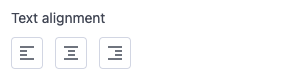
The return value of the text_align control is of string type with the following enumerations:
- left
- center
- right
vertical_align
Set type to vertical_align to display a vertical alignment control. This control can be used to control the alignment of components along the vertical cross-axis, such as the alignment of elements in each row.
Example code:
{
  "type": "vertical_align",
  "id": "vertical_align",
  "label": {
    "en": "Alignment",
  }
}
Effect in the theme editor:
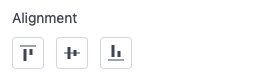
The return value of the vertical_align control is of string type with the following enumerations:
- top
- middle
- bottom
horizontal_align
Set type to horizontal_align to display a horizontal alignment control. This control is used to control the alignment of components along the horizontal main axis, such as the alignment of elements in each row.
Example code:
{
  "type": "horizontal_align",
  "id": "horizontal_align",
  "label": {
    "en": "Alignment",
  }
}
Effect in the theme editor:
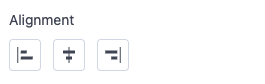
The return value of the horizontal_align control is of string type with the following enumerations:
- left
- center
- right
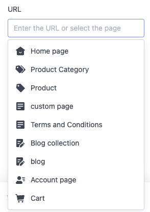
url
Set type to url to display a URL input control. You can manually enter external URLs and relative paths in the input box. There is also a selector to automatically fill in the following available resources from the current store:
- Home page
- Collection page
- Product page
- Custom page
- Policy page
- Blog collection page
- Blog article page
- Customer center page
- Cart page
Example code:
{
  "type": "url",
  "id": "image_link",
  "label": {
    "en": "URL"
  }
}
Effect in the theme editor:
The return value of the URL type setting is returned as one of the following:
- A string containing the selected URL.
- A string type that has been JSON.stringify() of an object.
This data format may exist in OS2.0 theme components that already have URL controls. For new URL control components, the URL link can be directly obtained using the data method in point 1 above.
- If no input is made, it returns an empty string.
For the above URL return value in point 2, the following attributes can be obtained:
- value, with the following scenarios:
- If a collection page is selected, the collection ID is saved.
- If a product page is selected, the product ID is saved.
- If a custom page is selected, the page ID is saved.
- If a policy page is selected, the page path is saved.
- If a blog collection page is selected, the blog collection ID is saved.
- If a blog page is selected, the page ID and the blog collection ID to which the page belongs are saved.
- label, the page title
- pageType, with the following enumerations:
- 10 - Product page
- 12 - Collection page
- 3 - Custom page
- 0 - Preset page (policy page)
- 4 - Blog page
- 11 - Blog collection page
- -1 - Manually entered link
- linkType, with the following enumerations:
- select - Page selected through the selector
- input - Page entered by the user
The URL control does not support the
defaultfield.
color
Set type to color to display a color selection control. You can manually enter the color value in the input box. There is also a color palette selector for quick color selection by dragging the shader.
This control can be used to control the UI color of elements, such as the global background color.
Example code:
{
  "id": "color_page_background",
  "type": "color",
  "label": {
    "en": "Background",
  },
  "default": "#FFFFFF"
}
Effect in the theme editor:
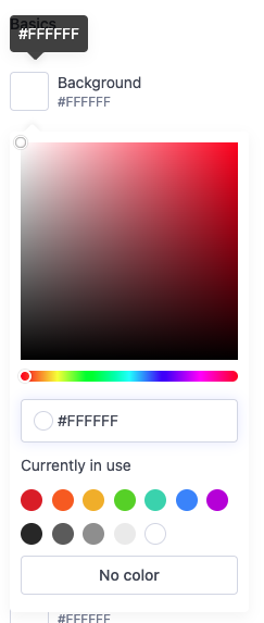
The return value of the color control is returned as one of the following: 2. A string containing the selected hexadecimal color code, such as #FFFFFF. 3. If no selection is made, it returns empty.
When configuring the
defaultvalue, the string must include#. Non-compliance will result in errors.
image_picker
Set type to image_picker to display an image selection control. This control allows direct selection of available images from the SHOPLINE admin backend image library and allows uploading new images. This control can be used for image selection, such as choosing carousel images.
Example code:
{
  "type": "image_picker",
  "id": "image",
  "label": {
    "en": "Image on PC"
  }
}
Effect in the theme editor:
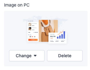
The return value of the image_picker control is of object type with the following attributes:
- alt, alt text of the image
- height, height of the image
- paddingBottom, aspect ratio of the image
- scale, scale of the image
- url, URL of the image
- width, width of the image
The image_picker control does not support the
defaultfield.
font
Set type to font to display a font selection control. This control allows direct selection of fonts from the Google Fonts Library.
This control can be used for font selection of various theme elements, such as global title fonts.
Example code:
{
  "id": "type_title_font",
  "type": "font",
  "label": {
    "en": "Typography",
  },
  "default": "Arimo:700"
}
Effect in the theme editor:
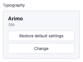
The return value of the font control is returned as one of the following:
2. A string containing the selected font, such as Arimo:700, only supported in OS2.0 theme versions.
In OS2.1 and above theme versions, the font object can only be obtained. Getting the data in the format of point 2 above is invalid.
- If no selection is made, it returns empty.
blog
Set type to blog to display a blog collection selection control. This control allows selecting available blogs from the store for display, such as a blog to be shown in the sidebar.
Example code:
{
  "id": "blog_collection",
  "type": "blog",
  "label": {
    "en": "Blogs"
  }
}
Effect in the theme editor:
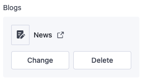
The return value of the blog type setting is returned as one of the following: 2. If no selection is made or the selection no longer exists, it returns empty.
The blog type control is only available for themes of OS2.1 and above. To use it in OS2.0 themes, use blogs_picker type control.
When accessing the value of a control set to blogs_picker, the data is returned as one of the following:
- The ID string of the selected blog collection. For compatibility with the old value retrieval method, refer to the following code:
{{assign "blog_id" section.settings.blog_collection}}
{{assign "blogData" (get blog_id all_blogs) }}
{{#for blogData.blogs.list as |blog|}}
  {{ blog.title }}
{{/for}}
collection_picker
Set type to collection_picker to display a collection selection control. This control allows direct selection of all available collections in the store.
This control can be used to select collections for display, such as showing the top 20 products of a collection on the homepage.
Example code:
{
  "id": "product_categories",
  "type": "collection_picker",
  "label": {
    "en": "Collection list"
  },
  "default": ""
}
Effect in the theme editor:
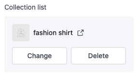
The return value of the collection_picker control is of string type, which is the collection ID.
product_picker
Set type to product_picker to display a product selection control. This control allows direct selection of all available products in the store.
This control can be used to select products for display, such as showing a single product detail on the homepage.
Example code:
{
  "type": "product_picker",
  "id": "product_id",
  "label": {
    "en": "Product"
  }
}
Effect in the theme editor:
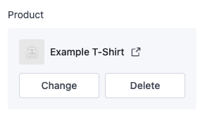
The return value of the product_picker control is of string type, which is the product ID.
page_picker
Set type to page_picker to display a page selection control. This control allows direct selection of all available custom pages in the store. This control can be used to select custom pages, such as a custom tab page in the product detail page.
Example code:
{
  "id": "custom_page",
  "type": "page_picker",
  "label": {
    "en": "Custom page",
  }
}
Effect in the theme editor:
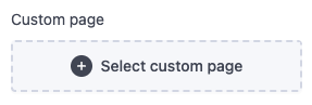
The return value of the page_picker control is of string type, which is the page ID.
menu_picker
Set type to menu_picker to display a menu selection control. This control allows direct selection of all available navigation menus in the store. This control can be used to select navigation menus for display, such as the navigation menu links in the header.
Example code:
{
  "type": "menu_picker",
  "id": "main_menu_link_list",
  "label": {
    "en": "Navigation menu"
  },
  "default": "main-menu"
}
Effect in the theme editor:
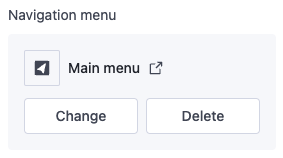
The return value of the menu_picker control is of string type, which is the navigation ID.
The
headandfooternavigation menus are created by default when the store is set up and cannot be deleted. Regardless of how these menus are renamed, the keys point toheaderandfooter. Therefore, the default value can directly usehead.
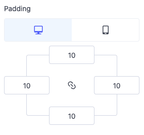
padding
Set type to padding to display a layout control. This control can be used to store values for the top, bottom, left, and right margins on both PC and mobile. It is mainly used to input the inner or outer margins of a container.
Example code:
{
  "type": "padding",
  "id": "padding_info",
  "label": {
    "en": "Padding"
  },
  "default": {
    "pc":{
      "left":10,
      "right":10,
      "top":10,
      "bottom":10
    },
    "mobile":{
      "left":10,
      "right":10,
      "top":10,
      "bottom":10
    }
  }
}
Effect in the theme editor:
video
Set type to video to output a video picker. This picker automatically fills in the available videos from the SHOPLINE admin backend's file library. Merchants can also upload new videos.
For example, the following setting generates the following output:
{
  "type": "video",
  "id": "video",
  "label": "Local video"
}
Effect in the theme editor:
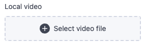
The video type setting also accepts the file_reference meta-field as a dynamic source.
The return value of the video type setting is returned as one of the following:
- video object.
- null if no selection has been made or the selection does not exist.
video_url
Set type to video_url to output a URL input field. In addition to the standard attributes of input settings, the video_url type setting also has the following attributes:
| Attribute | Description | Required |
|---|---|---|
| format | Validate a series of accepted video providers. Valid value is video. | No |
| placeholder | Placeholder value of the input | No |
These fields can be used to capture video URLs from YouTube and/or Vimeo, such as static video URLs to be displayed in product descriptions.
For example, the following setting generates the following output:
{
  "type": "video_url",
  "id": "external_video",
  "format": "video",
  "label": "External video link",
  "placeholder": "https://www.youtube.com/watch?v=V7BEzkRBp_g",
  "info": "Enter the embedded link from YouTube or Vimeo"
}
Effect in the theme editor:
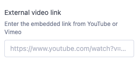
The return value of the video_url type setting is returned as one of the following:
external_videoobject.- null if no input is made.
For example, suppose you use this video through the above setting. In that case, SHOPLINE will generate the following output:
ID: {{ settings.external_video.external_id }}
Host: {{ settings.external_video.host }}
html
Set type to html to output HTML strings. In addition to the standard attributes of input settings, the HTML type setting also has the following attribute:
| Attribute | Description | Required |
|---|---|---|
| placeholder | Placeholder text in the input box. | No |
For example, the following setting generates the following output:
{
  "type": "html",
  "id": "html",
  "label": "html"
}
Effect in the theme editor:
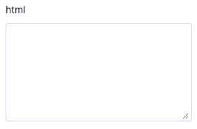
The return value of the HTML type setting is returned as one of the following:
- HTML string.
- null if no input is made.
The following tags are not supported: <html>, <head>, <body>
For example, suppose you render HTML using this control as configured above. In that case, SHOPLINE will generate the following output by entering triple braces for rendering:
{{settings.html}}
product_list
Set type to product_list to output an array of product objects. In addition to the standard attributes of input settings, the product_list type setting also has the following attribute:
| Attribute | Description | Required |
|---|---|---|
| limit | Limit on the number of selectable products, default is 12. | No |
For example, the following setting generates the following output:
{
  "type": "product_list",
  "id": "product_list",
  "label": "Products",
  "limit": 12
}
Effect in the theme editor:
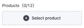
The return value of the product_list type setting is returned as one of the following:
- An array of product objects.
- null if no input is made.
For example, suppose you use this control through the above setting. In that case, SHOPLINE will generate the following output:
{{#paginate section.settings.product_list by=2}}
  {{#for section.settings.product_list as |product|}}
    {{product}}
    <div>{{product.title}}</div>
  {{/for}}
{{/paginate}}
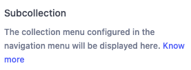
Using Links in Text
You can add hyperlinks to the info attribute in each configuration.
Example code:
{
  "type": "group_header",
  "label": {
    "en": "Subcollection"
  },
  "info": {
    "en": "The collection menu configured in the navigation menu will be displayed here. [Know more](https://shoplineapphelp.zendesk.com/hc/articles/4404860397977)"
  }
}
Effect in the theme editor:

'%3e%3crect%20x='6'%20y='7.13049'%20width='13'%20height='10'%20rx='1'%20fill='black'/%3e%3cpath%20d='M12.4998%2012.936L-3.65042%200.604835L28.65%200.604838L12.4998%2012.936Z'%20stroke='white'%20stroke-linejoin='round'/%3e%3c/g%3e%3cdefs%3e%3cclipPath%20id='clip0_716_14611'%3e%3crect%20x='6'%20y='7.13049'%20width='13'%20height='10'%20rx='1'%20fill='white'/%3e%3c/clipPath%3e%3c/defs%3e%3c/svg%3e)

'%3e%3crect%20x='5.63086'%20y='7.26086'%20width='13'%20height='10'%20rx='1'%20fill='white'/%3e%3cpath%20d='M12.1306%2013.0664L-4.01956%200.735206L28.2809%200.735209L12.1306%2013.0664Z'%20stroke='%231A2C42'%20stroke-linejoin='round'/%3e%3c/g%3e%3cdefs%3e%3cclipPath%20id='clip0_716_14599'%3e%3crect%20x='5.63086'%20y='7.26086'%20width='13'%20height='10'%20rx='1'%20fill='white'/%3e%3c/clipPath%3e%3c/defs%3e%3c/svg%3e)