编辑器控件
编辑器控件是指在主题内通过 schema tag 定义的 settings 属性,这些属性定义的控件类型会展示在主题编辑器中。
基础控件类型
标准属性
以下是每个编辑器控件的标准属性。根据控件类型的不同,会有额外的专有属性。
| 属性 | 描述 | 是否必填 |
|---|---|---|
| type | 控件类型 | 是 |
| id | 配置 ID,用于访问配置值 | 是 |
| label | 配置标签,将呈现在主题编辑器中 | 是 |
| default | 配置的默认值 | 否 |
| info | 配置的提示信息 | 否 |
text
此类型的控件会输出一个单行文本输入框。
额外属性:
| 属性 | 描述 | 是否必填 |
|---|---|---|
| placeholder | 输入框的占位文本 | 否 |
此控件可用于单行文本的输入,例如组件的标题。
示例代码:
{
  "name": "My Section",
  "settings": [
    {
      "type": "text",
      "id": "title",
      "label": "Title",
      "default": "my section title",
      "placeholder": "please enter title"
    }
  ],
  "presets": [
    {
      "name": "My Section"
    }
  ]
}
输出:
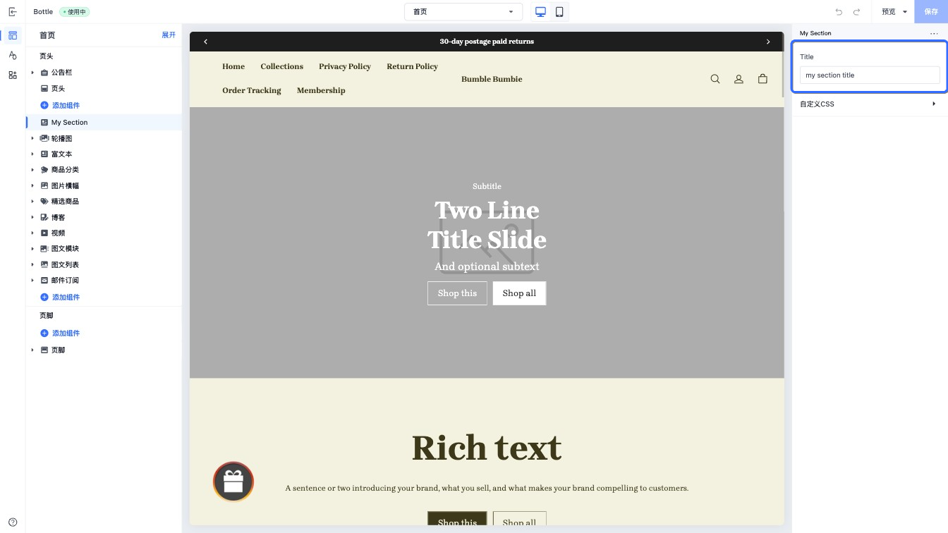
当访问此控件的配置值时,数据以 string 类型的形式返回。
textarea
此类型的控件会输出一个多行文本输入框。
额外属性:
| 属性 | 描述 | 是否必填 |
|---|---|---|
| placeholder | 输入框占位文本 | 否 |
| limit | 文本输入最大长度 | 否 |
此控件可用于多行文本的输入,例如组件的内容。
示例代码:
{
  "name": "My Section",
  "settings": [
    {
      "type": "textarea",
      "id": "content",
      "label": "Content",
      "default": "my section content",
      "placeholder": "please enter content",
      "limit": 500
    }
  ],
  "presets": [
    {
      "name": "My Section"
    }
  ]
}
输出:
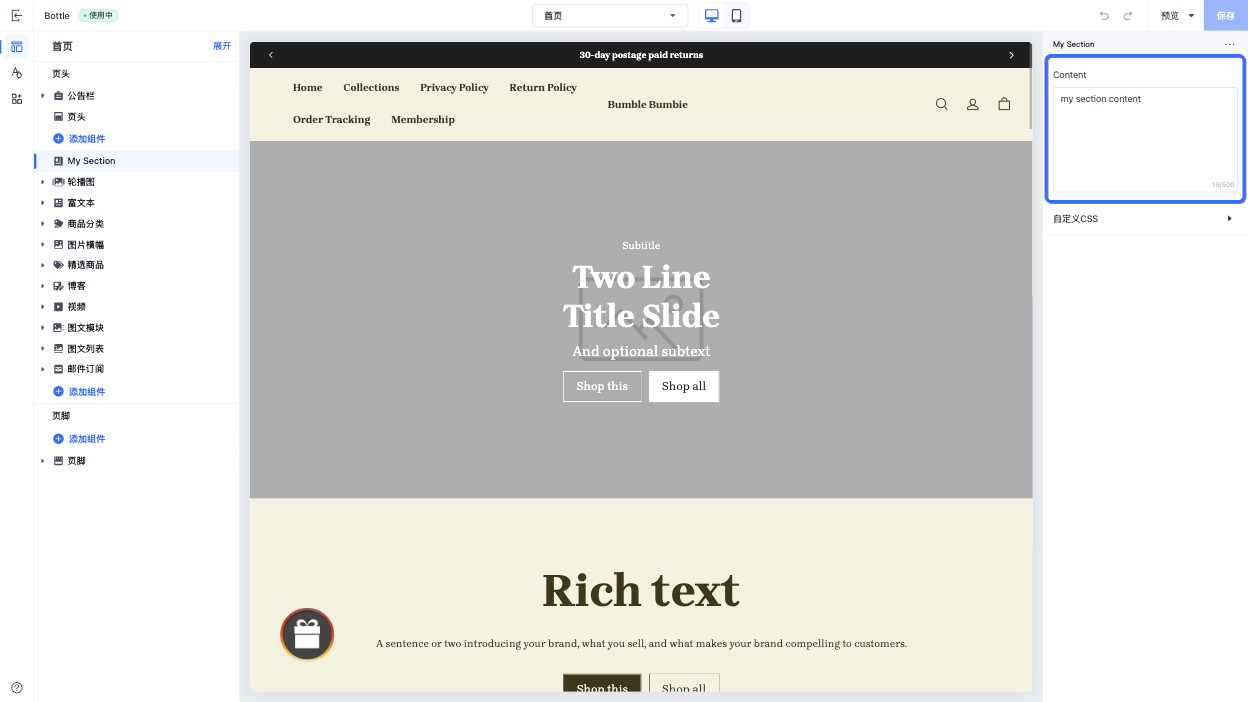
当访问此控件的配置值时,数据以 string 类型的形式返回。
richtext
此类型的控件会输出一个富文本输入框。会输出具有以下基本格式的文本:
- 加粗文本
- 斜体文本
- 超链接
- 段落
此控件可用于多类型内容的正文文本展示,例如博客文章的正文。
示例代码:
{
  "name": "My Section",
  "settings": [
    {
      "type": "richtext",
      "id": "content",
      "label": "Content",
      "default": "content"
    }
  ],
  "presets": [
    {
      "name": "My Section"
    }
  ]
}
输出:
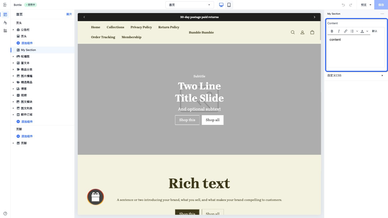
当访问此控件的配置值时,数据以 string 类型的形式返回。
range
此控件会输出一个滑动控制器。
额外属性:
| 属性 | 描述 | 是否必填 |
|---|---|---|
| min | 最小值 | 是 |
| max | 最大值 | 是 |
| step | 滑块步长,设置的值必须大于 0,并且可被最大值和最小值的差值整除。 | 是 |
| unit | 输入值的单位。此单位将展示在控件上 | 否 |
- default 属性是必填的。
- min、max、step 和 unit 属性必须是数字类型。
此控件可用于调整多个数值,例如组件的宽度。
示例代码:
{
  "name": "My Section",
  "settings": [
    {
      "type": "range",
      "id": "width",
      "label": "Width",
      "default": 100,
      "min": 100,
      "max": 1000,
      "step": 10,
      "unit": "px"
    }
  ],
  "presets": [
    {
      "name": "My Section"
    }
  ]
}
输出:
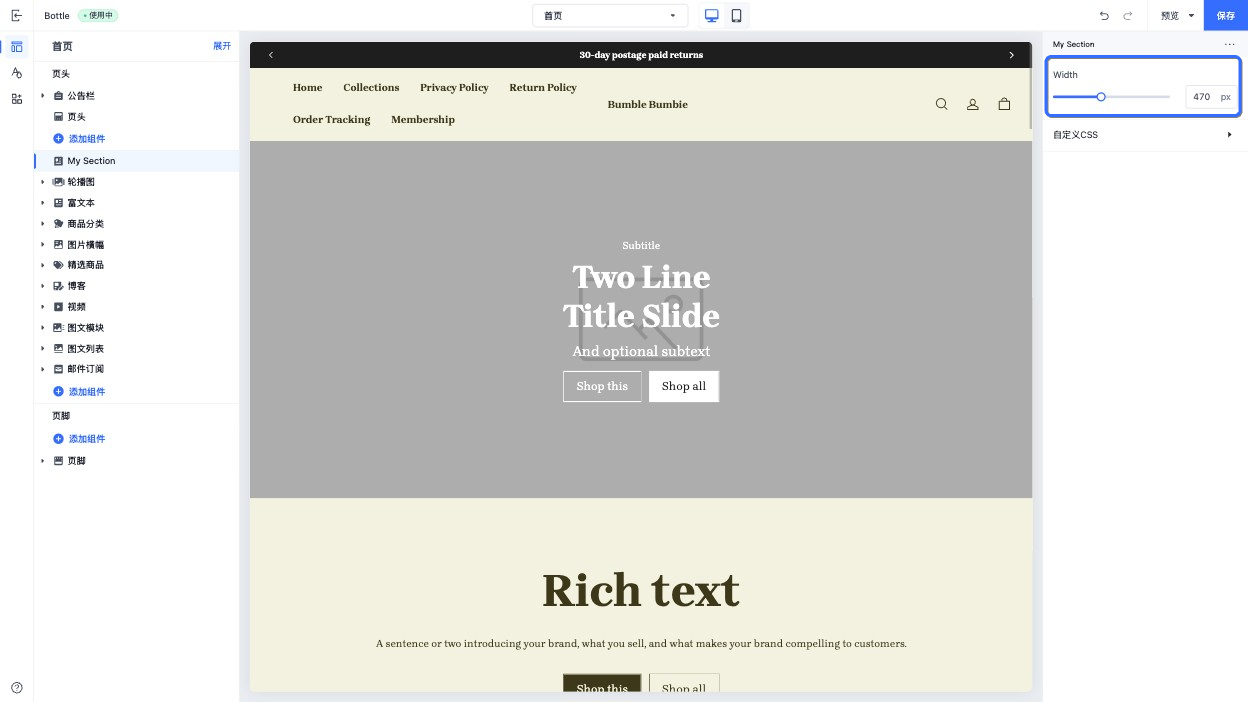
当访问此控件的配置值时,数据以 string 类型的形式返回。
select
此控件会输出一个下拉选择框。
额外属性:
| 属性 | 描述 | 是否必填 |
|---|---|---|
| options | 选项数组,数组的每项包括 • label:名称• value:值 | 是 |
此控件可用于选项数量多的单选场景,例如图标选择。
示例代码:
{
  "name": "My Section",
  "settings": [
    {
      "type": "select",
      "id": "icon",
      "label": "Icon",
      "default": "none",
      "options": [
        {
          "label": "none",
          "value": "none"
        },
        {
          "label": "pay",
          "value": "pay"
        },
        {
          "label": "package",
          "value": "package"
        },
        {
          "label": "email",
          "value": "email"
        },
        {
          "label": "position",
          "value": "position"
        },
        {
          "label": "customer",
          "value": "customer"
        },
        {
          "label": "chat",
          "value": "chat"
        },
        {
          "label": "gift",
          "value": "gift"
        },
        {
          "label": "phone",
          "value": "phone"
        },
        {
          "label": "faq",
          "value": "faq"
        },
        {
          "label": "logistics",
          "value": "logistics"
        },
        {
          "label": "discount",
          "value": "discount"
        }
      ]
    }
  ],
  "presets": [
    {
      "name": "My Section"
    }
  ]
}
输出:
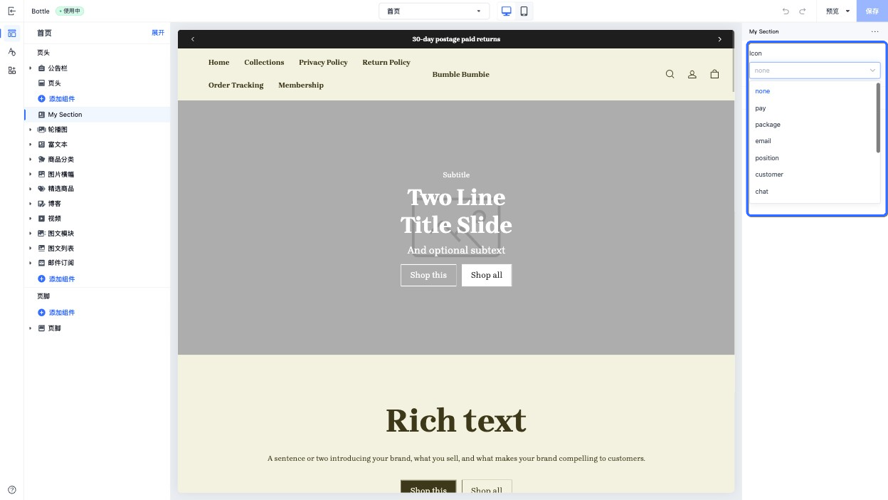
当访问此控件的配置值时,数据以 string 类型的形式返回。
switch
此控件会输出一个开关控件。
此控件可用于切换功能的开启和关闭,例如是否展示国家选择器。
如果没有指定 default 的值,则默认为 false。
示例代码:
{
  "name": "My Section",
  "settings": [
    {
      "type": "switch",
      "id": "show_country_selector",
      "label": "Show country selector",
      "default": true
    }
  ],
  "presets": [
    {
      "name": "My Section"
    }
  ]
}
输出:
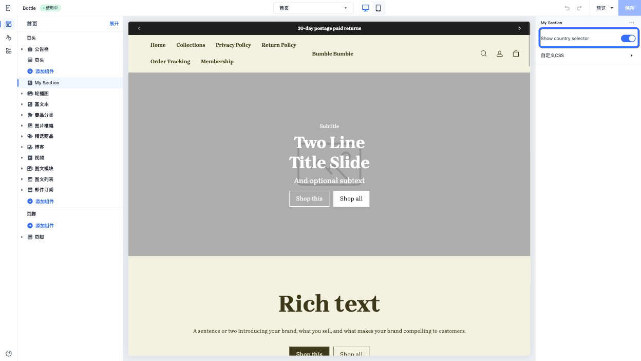
当访问此控件的配置值时,数据以 boolean 类型的形式返回。
text_align
此控件会输出一个文本在水平方向上对齐方式的选择控件。
此控件可用于文本对齐方式,例如标题在水平方向上的对齐方式。
示例代码:
{
  "name": "My Section",
  "settings": [
    {
      "type": "text_align",
      "id": "text_align",
      "label": "Text align",
      "default": "left"
    }
  ],
  "presets": [
    {
      "name": "My Section"
    }
  ]
}
输出:
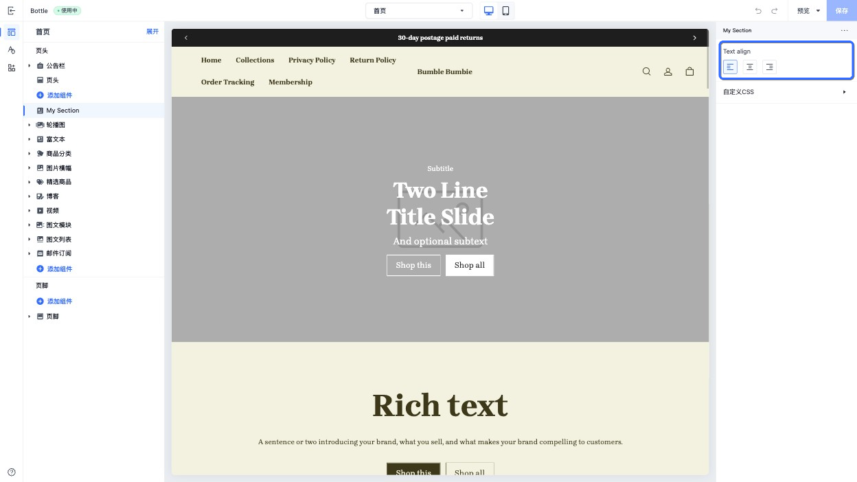
当访问此控件的配置值时,数据以 string 类型的形式返回。
此控件返回的枚举值如下,也是 default 属性可以设置的值:
- left
- center
- right
vertical_align
此控件会输出一个垂直方向上对齐方式的选择控件。
此控件可用于垂直交叉轴上元素的对齐方式,例如组件区块之间的对齐方式。
示例代码:
{
  "name": "My Section",
  "settings": [
    {
      "type": "vertical_align",
      "id": "vertical_align",
      "label": "Vertical align",
      "default": "top"
    }
  ],
  "presets": [
    {
      "name": "My Section"
    }
  ]
}
输出:
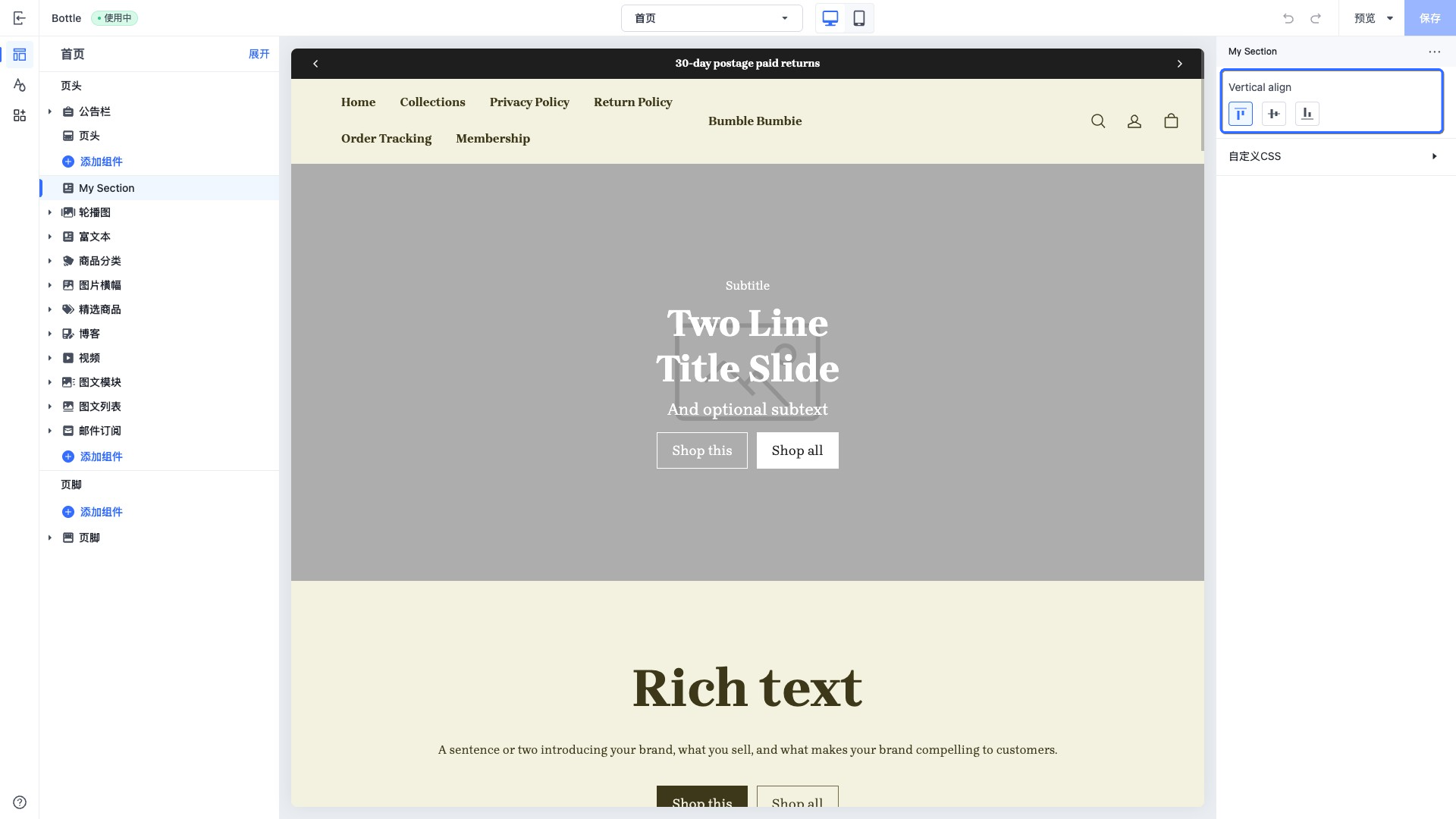
当访问此控件的配置值时,数据以 string 类型的形式返回。
此控件返回的枚举值如下,也是 default 属性可以设置的值:
- top
- middle
- bottom
horizontal_align
此控件会输出一个水平方向上对齐方式的选择控件。
此控件可用于水平主轴上元素的对齐方式,例如组件区块之间的对齐方式。
示例代码:
{
  "name": "My Section",
  "settings": [
    {
      "type": "horizontal_align",
      "id": "horizontal_align",
      "label": "Horizontal align",
      "default": "left"
    }
  ],
  "presets": [
    {
      "name": "My Section"
    }
  ]
}
输出:
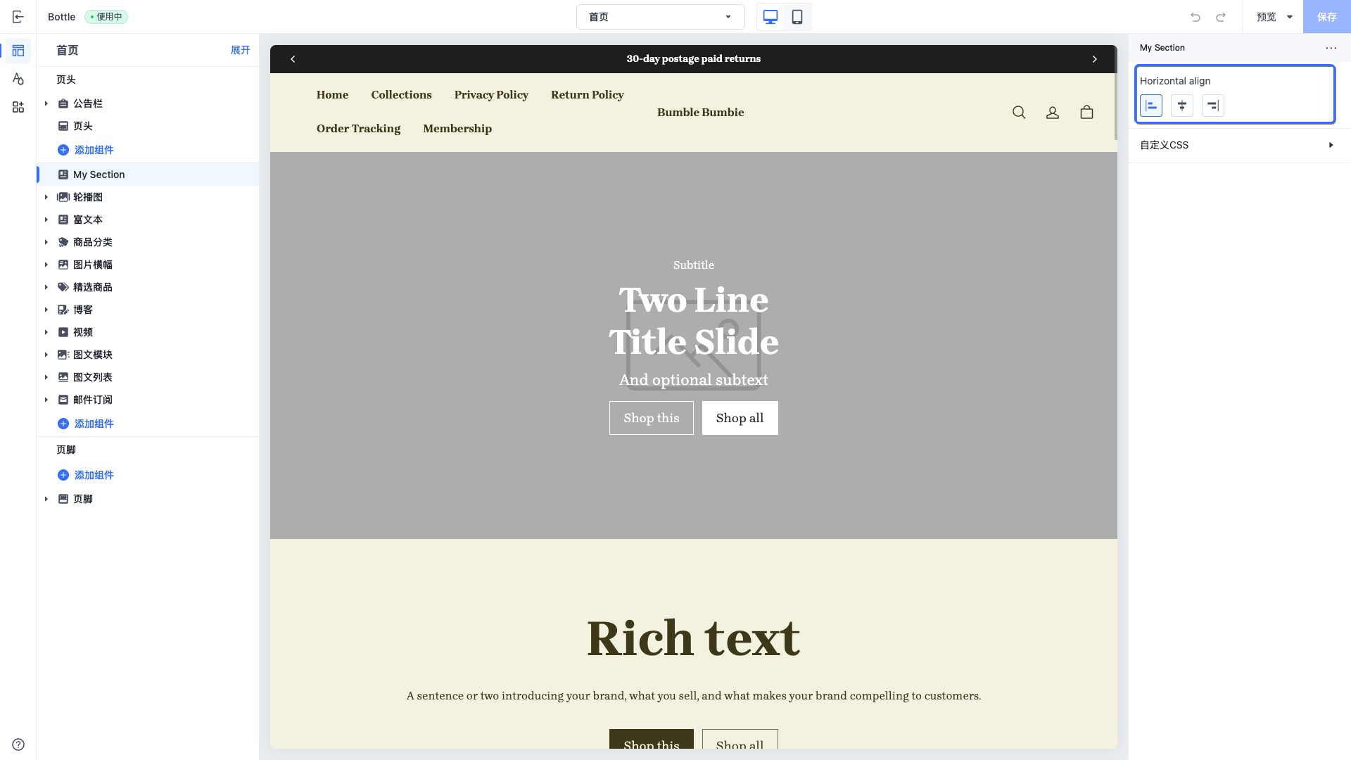
当访问此控件的配置值时,数据以 string 类型的形式返回。
此控件返回的枚举值如下,也是 default 属性可以设置的值:
- left
- center
- right
url
此类型的控件会输出一个统一的 URL 配置器,供商家在构建在线商店时配置跳转目标。
商家可以在输入框中输入外部的 URL、相对路径,或是一个电话拨号。同时,商家也可以在下拉选择器中选择其网站内的预设页面。
支持页面的枚举如下:
- 首页
- 商品分类页
- 商品详情页
- 自定义页面
- 政策页
- 博客集合页面
- 博客文章页
- 个人中心页
- 购物车页
示例代码:
{
  "name": "My Section",
  "settings": [
    {
      "type": "url",
      "id": "url",
      "label": "Url"
    },
    {
      "type": "url",
      "id": "tel",
      "label": "Tel"
    }
  ],
  "presets": [
    {
      "name": "My Section",
      "settings": {
        "tel": "tel:+86123456789"
      }
    }
  ]
}
输出:
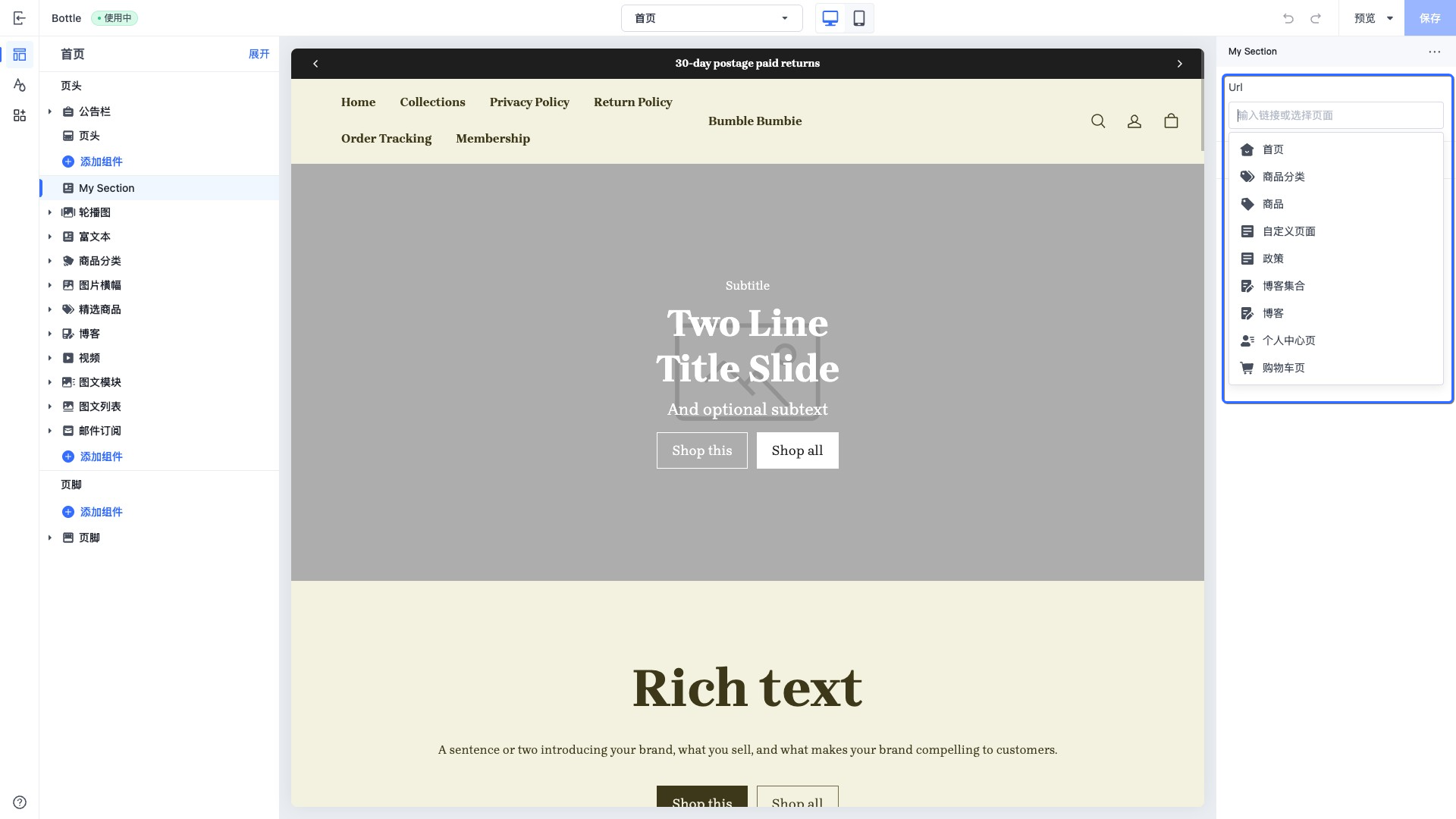
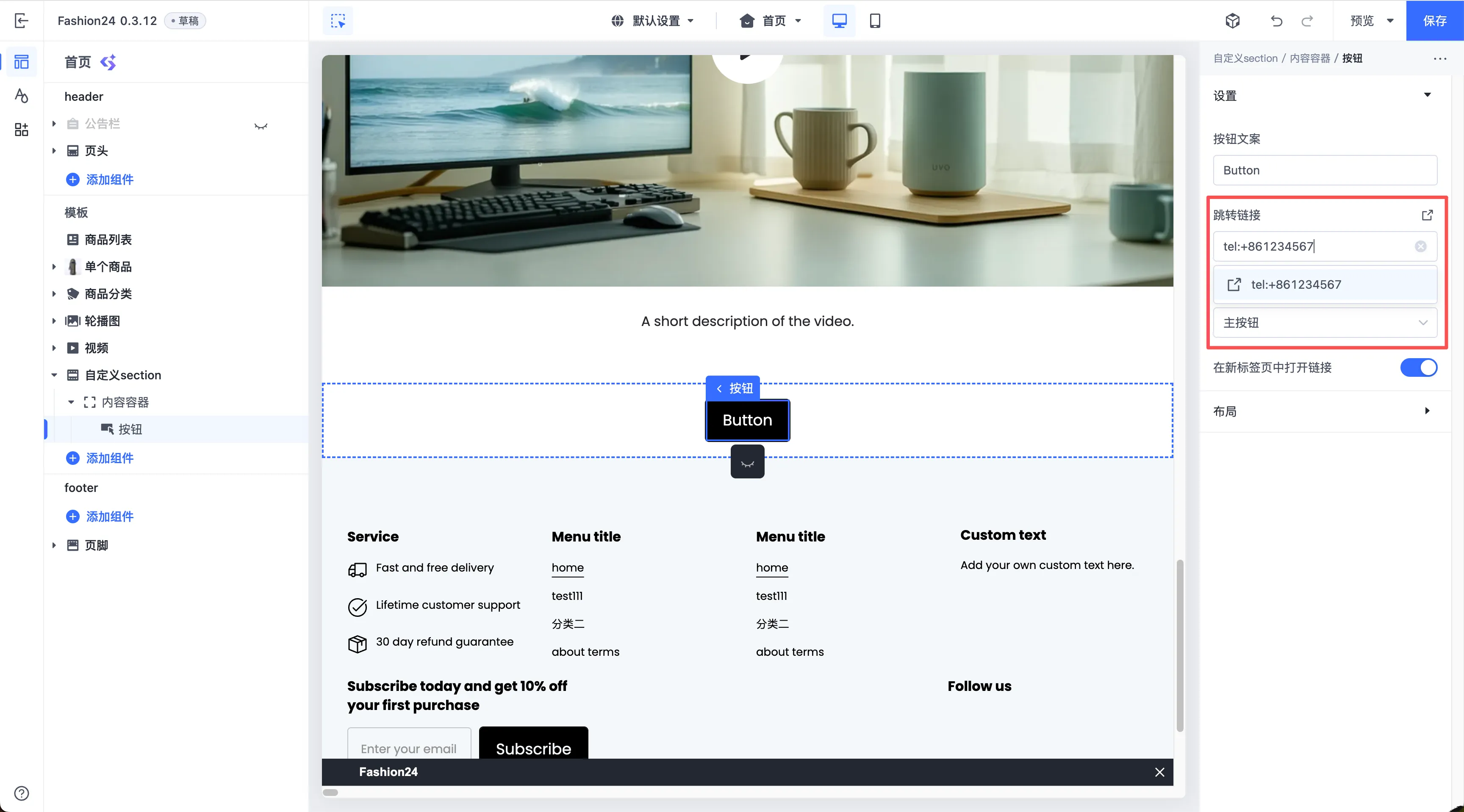
当访问此控件的配置值时,数据会以以下形式之一返回:
- 字符串 (String):商家直接在输入框中填写的 URL 字符串。例如,
tel:+1123-***-7890或https://example.com。 - 资源对象 (Resource object):商家在下拉选择器中选择预设页面时,系统会返回一个包含页面类型和 ID 的结构化对象。
- 空字符串 (Empty string):如果商家没有输入任何内容或选择任何页面,则返回空字符串。
color
此类型的控件会输出一个颜色选择器控件。
你可以在输入框中输入颜色色值,或者使用颜色面板选择器来选择所需要的颜色。
此控件可用于控制元素的各种颜色,例如页面背景颜色。
示例代码:
{
  "name": "My Section",
  "settings": [
    {
      "type": "color",
      "id": "text_color",
      "label": "Text color",
      "default": "#ffffff"
    }
  ],
  "presets": [
    {
      "name": "My Section"
    }
  ]
}
输出:
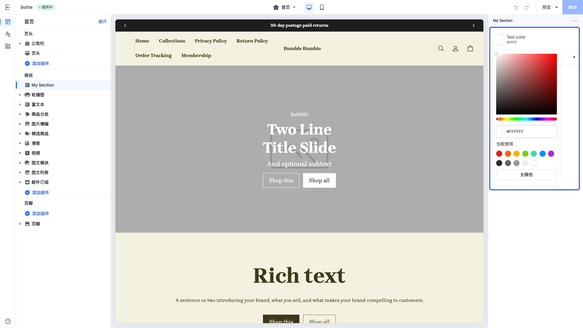
当访问此控件的配置值时,数据会以以下形式之一返回:
- color object
- 如果未进行选择,则返回空。
color_background
此类型的控件会输出一个渐变颜色选择器控件。
你可以在控件中选择预设的渐变颜色方案,也可以自行调整渐变颜色方案。
此控件可用于控制元素的渐变背景颜色,例如页面背景颜色。
示例代码:
{
  "name": "My Section",
  "settings": [
    {
      "type": "color_background",
      "id": "color_background",
      "label": "Background color",
      "default": ""
    }
  ],
  "presets": [
    {
      "name": "My Section"
    }
  ]
}
此控件的 default 属性设置为空字符串,会以无颜色的进行展示。
输出:
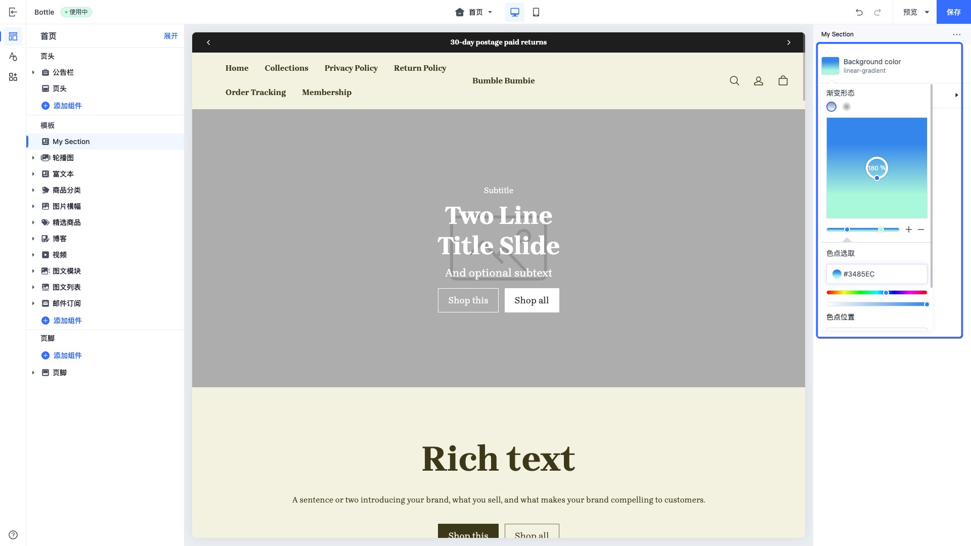
当访问此控件的配置值时,数据会以 CSS 代码中的线性渐变或者径向渐变返回:
color_scheme
此类型的控件会输出一个包含所有可用主题配色方案的选择器,并展示所选配色方案的预览效果。
选择器中的主题配色方案通过 color_scheme_group 设置项进行定义。
你可以将配色方案应用到全局主题配置、组件和区块中。
示例代码:
{
  "name": "My Section",
  "settings": [
    {
      "type": "color_scheme",
      "id": "color_scheme",
      "label": "Color scheme",
      "default": "scheme-1"
    }
  ],
  "presets": [
    {
      "name": "My Section"
    }
  ]
}
输出:
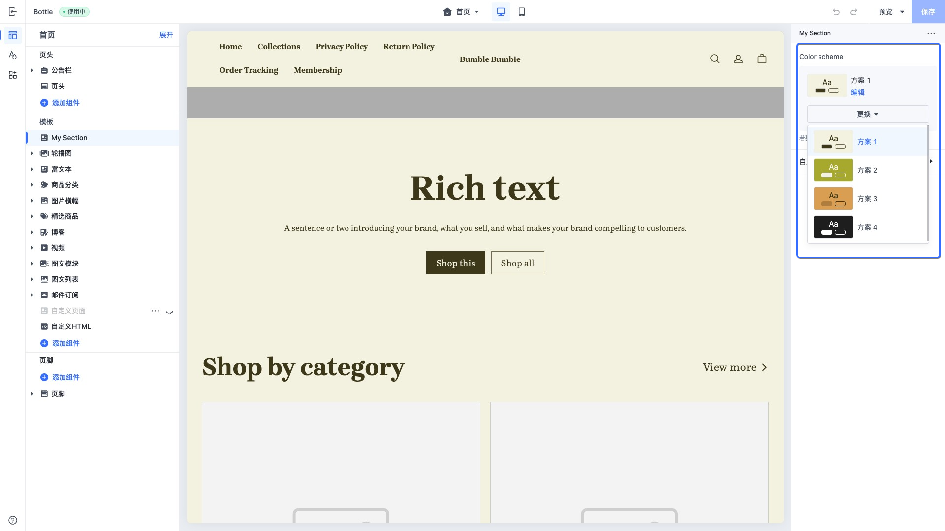
在访问此控件设置的值时,SHOPLINE 会从 color_scheme_group 中返回选中的 color_scheme object。
color_scheme_group
此类型的控件会输出一个颜色方案,你可以通过此控件修改主题的配色方案。
颜色方案中定义的颜色只能在 settings.schema.json 中添加。
{
  "type": "color_scheme_group",
  "id": "color_schemes",
  "definition": [
    {
      "type": "color_background",
      "id": "color_background",
      "label": "t:settings_schema.color.settings.color_schemes.definition_0.label",
      "default": "#F3F2E0"
    },
    {
      "type": "color",
      "id": "color_text",
      "label": "t:settings_schema.color.settings.color_schemes.definition_1.label",
      "default": "#3D3819"
    },
    {
      "type": "color",
      "id": "color_light_text",
      "label": "t:settings_schema.color.settings.color_schemes.definition_2.label",
      "default": "#726C4A"
    },
    {
      "type": "color",
      "id": "color_entry_line",
      "label": "t:settings_schema.color.settings.color_schemes.definition_3.label",
      "default": "#DDDDDD"
    },
    {
      "type": "color",
      "id": "color_button_background",
      "label": "t:settings_schema.color.settings.color_schemes.definition_4.label",
      "default": "#3D3819"
    },
    {
      "type": "color",
      "id": "color_button_text",
      "label": "t:settings_schema.color.settings.color_schemes.definition_5.label",
      "default": "#F3F2E0"
    },
    {
      "type": "color",
      "id": "color_button_secondary_background",
      "label": "t:settings_schema.color.settings.color_schemes.definition_6.label",
      "default": "#F3F2E0"
    },
    {
      "type": "color",
      "id": "color_button_secondary_text",
      "label": "t:settings_schema.color.settings.color_schemes.definition_7.label",
      "default": "#3D3819"
    },
    {
      "type": "color",
      "id": "color_button_secondary_border",
      "label": "t:settings_schema.color.settings.color_schemes.definition_8.label",
      "default": "#726C4A"
    },
    {
      "type": "color",
      "id": "color_button_text_link",
      "label": "t:settings_schema.color.settings.color_schemes.definition_9.label",
      "default": "#3D3819"
    }
  ],
  "role": {
    "text": "color_text",
    "background": {
      "solid": "color_background"
    },
    "primary_button": "color_button_background",
    "primary_button_border": "color_entry_line",
    "secondary_button": "color_button_secondary_background",
    "secondary_button_border": "color_button_secondary_border"
  }
}
输出:
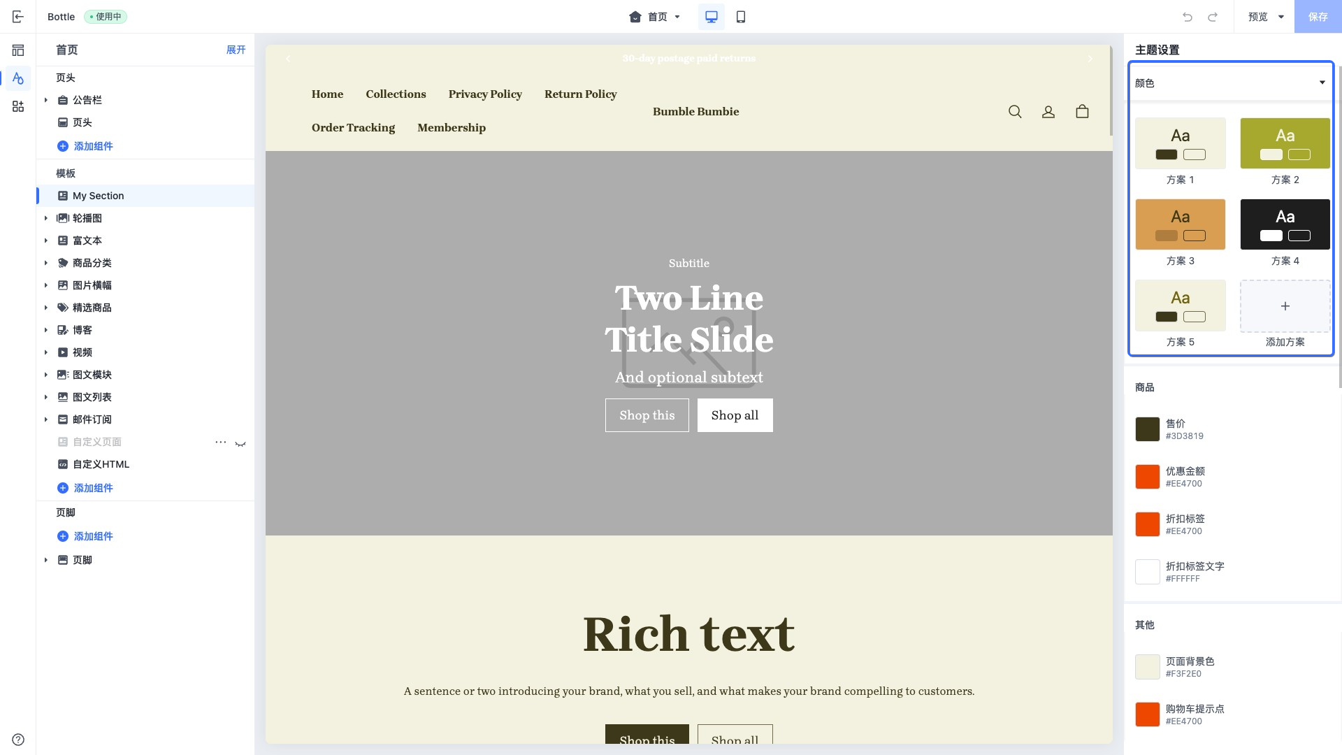
在 definition 中定义颜色控件,颜色控件的类型仅支持以下类型:
- color
- color_background
role 字段会输出配色方案的预览。每个字段代表预览图上的位置,每个字段的值是在 definition 里面定义控件的 id 值。
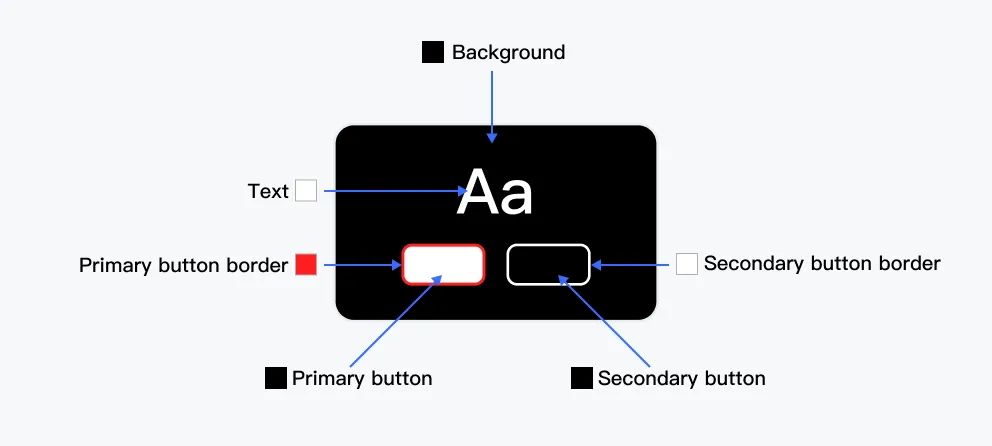
role 字段定义规则:
| Role 字段 | 类型 | 描述 | 是否必填 |
|---|---|---|---|
| background | • string • { solid: string; gradient: string; } | 渲染背景颜色 | 是 |
| text | string | 渲染文本颜色 | 是 |
| primary_button | string | 渲染文本下方第一个按钮颜色 | 是 |
| secondary_button | string | 渲染文本下方第二个按钮颜色 | 是 |
| primary_button_border | string | 渲染文本下方第一个按钮的边框颜色 | 是 |
| secondary_button_border | string | 渲染文本下方第二个按钮的边框颜色 | 是 |
image
此类型的控件会输出一个图片选择器。
此控件可以直接选择 SHOPLINE 商家后台图片库内的图片,并且可以选择上传新的图片。
示例代码:
{
  "name": "My Section",
  "settings": [
    {
      "type": "image",
      "id": "image",
      "label": "Image"
    }
  ],
  "presets": [
    {
      "name": "My Section"
    }
  ]
}
输出:
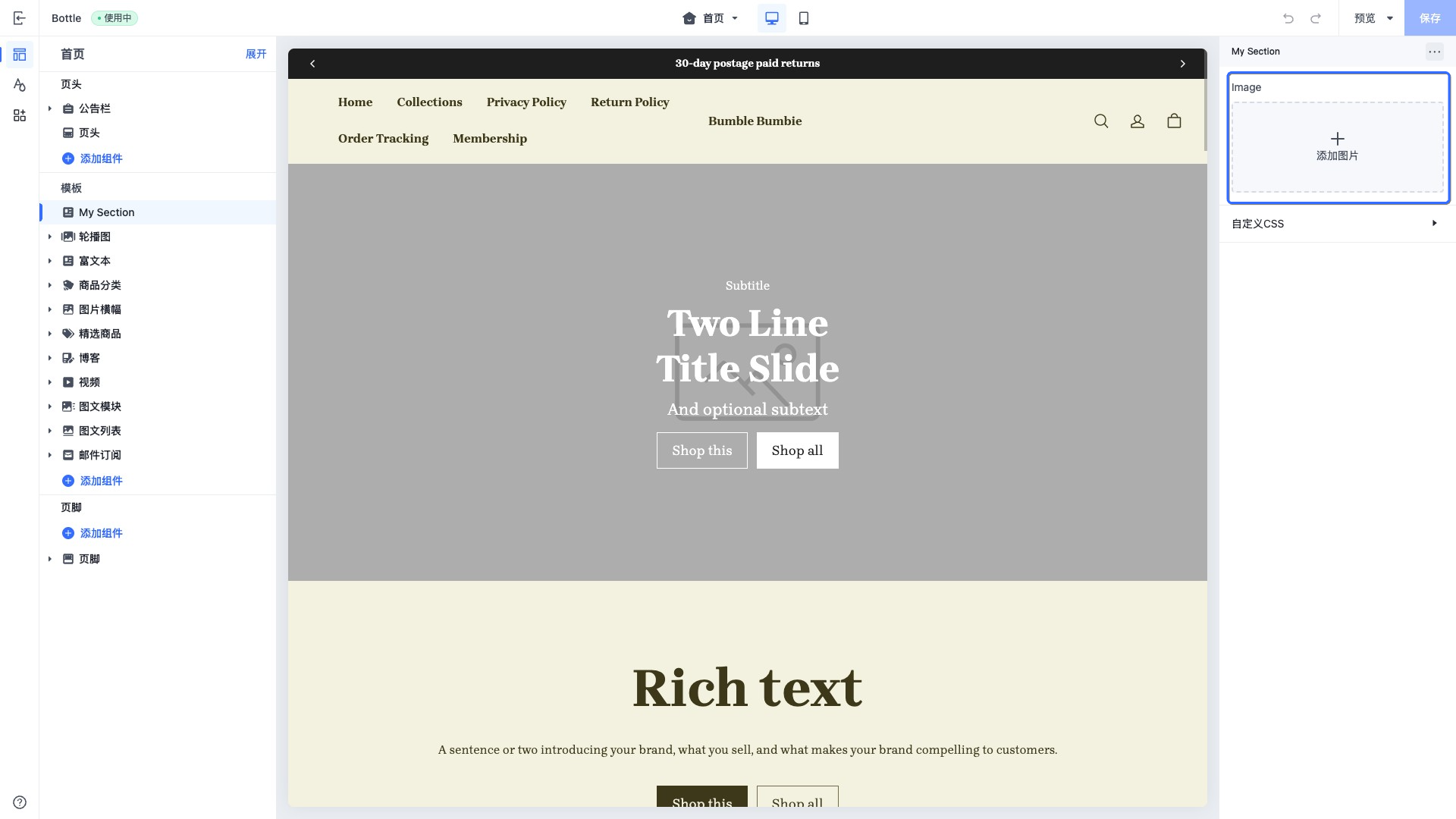
当访问此控件的配置值时,数据会以 image object 的形式返回。
font
此类型的控件会输出一个字体选择器。
你可以使用此控件来给页面注入不同的字体,例如页面的标题字体。
示例代码:
{
  "name": "My Section",
  "settings": [
    {
      "type": "font",
      "id": "title_font",
      "label": "Title font",
      "default": "Brygada 1918:400"
    }
  ],
  "presets": [
    {
      "name": "My Section"
    }
  ]
}
此控件的 default 属性规则为:字体:字重
输出:
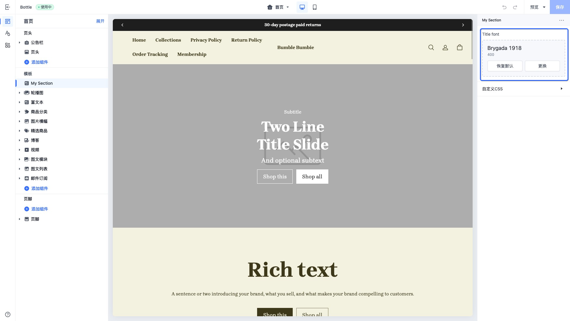
当访问此控件的配置值时,数据以 font object 类型的形式返回。可与 font_modify 和 font_face 等字体相关的 filter 进行搭配使用。
article
此类型的控件会输出一个博客文章选择器。
此控件可以用于选择需要的博客文章进行展示。
示例代码:
{
  "name": "My Section",
  "settings": [
    {
      "type": "article",
      "id": "article",
      "label": "Article"
    }
  ],
  "presets": [
    {
      "name": "My Section"
    }
  ]
}
输出:
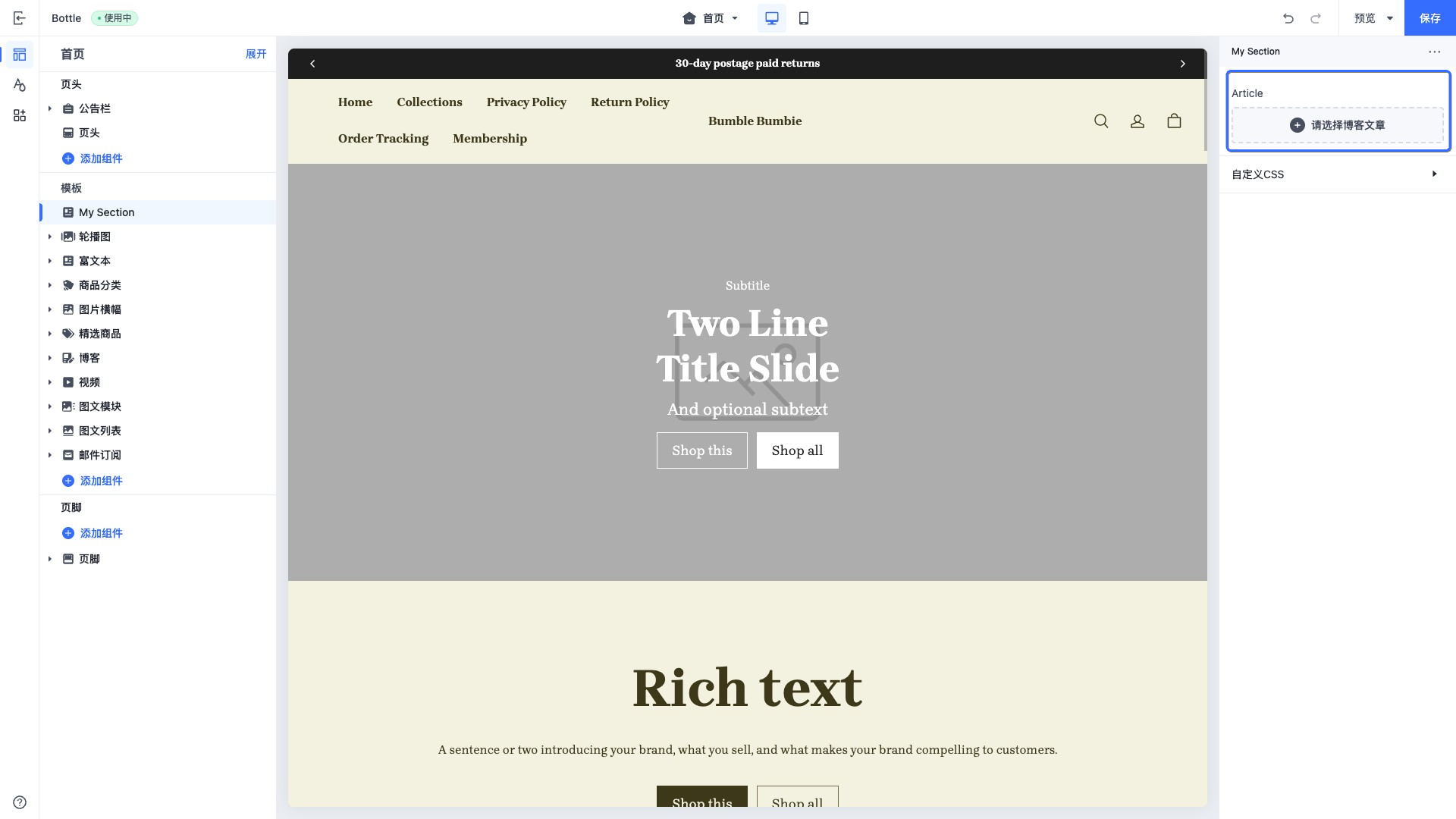
当访问此控件的配置值时,数据会以 article object 的形式进行返回。
blog
此类型的控件会输出一个博客集合选择器。
此控件可以用于选择需要的博客集合进行展示。
示例代码:
{
  "name": "My Section",
  "settings": [
    {
      "type": "blog",
      "id": "blog",
      "label": "blog"
    }
  ],
  "presets": [
    {
      "name": "My Section"
    }
  ]
}
输出:
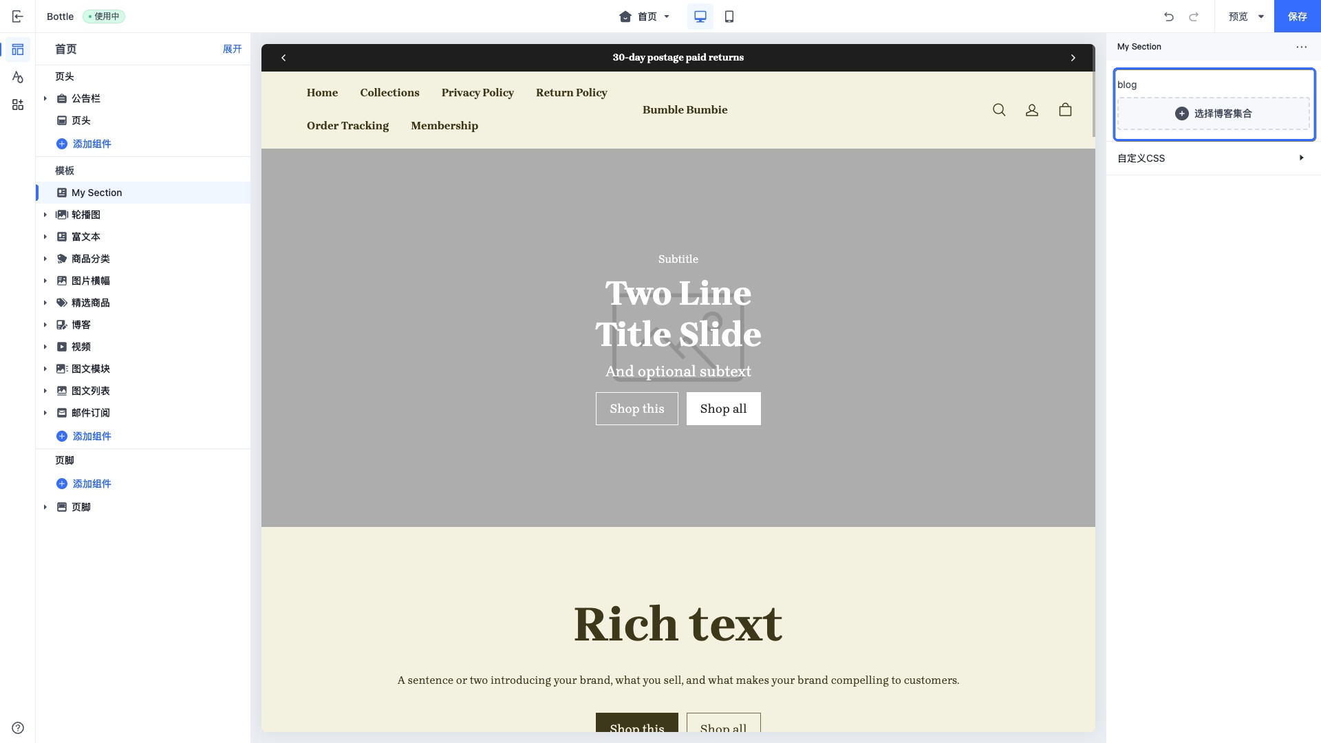
当访问此控件的配置值时,数据会以 blog object 的形式进行返回。
collection
此类型的控件会输出一个商品集合选择器。
你可以选择店铺里面所有可用的商品的集合。
此控件可以用于选择需要展示的商品集合,例如在首页展示指定商品集合的前 10 个商品。
示例代码:
{
  "name": "My Section",
  "settings": [
    {
      "type": "collection",
      "id": "collection",
      "label": "Collection"
    }
  ],
  "presets": [
    {
      "name": "My Section"
    }
  ]
}
输出:
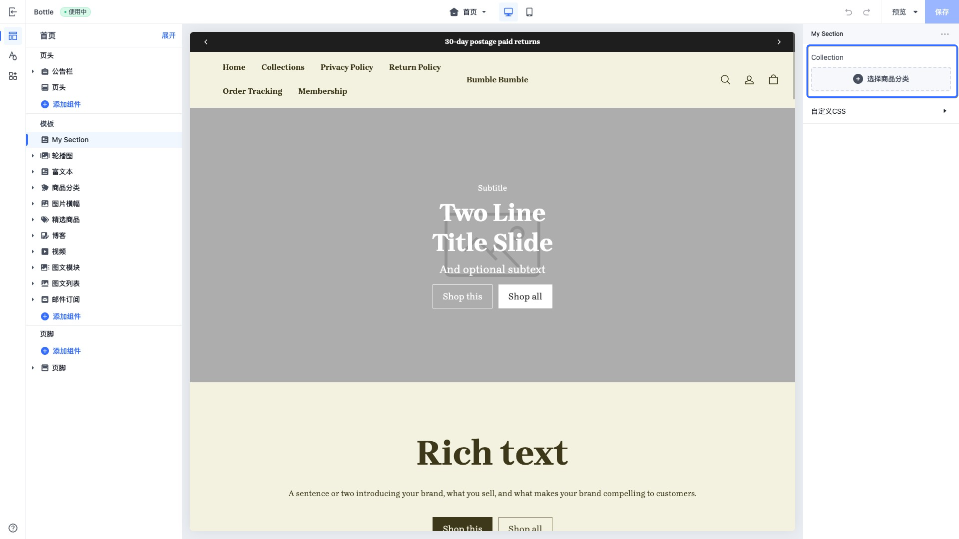
当访问此控件的配置值时,数据会以 collection object 的形式进行返回。
product
此类型的控件会输出一个商品选择器。
此控件可以用于选择需要的商品进行展示,例如在首页展示单个商品的详情。
示例代码:
{
  "name": "My Section",
  "settings": [
    {
      "type": "product",
      "id": "product",
      "label": "Product"
    }
  ],
  "presets": [
    {
      "name": "My Section"
    }
  ]
}
输出:
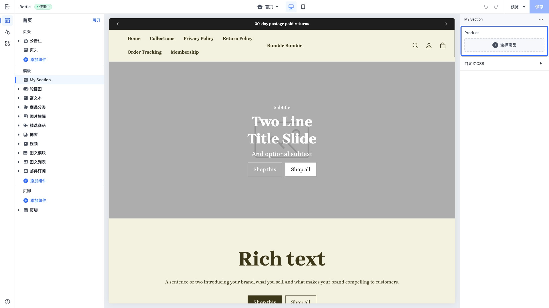
当访问此控件的配置值时,数据会以 product object 的形式进行返回。
product_id
此类型的控件会输出一个商品选择器。
此控件可以用于选择需要的商品进行展示,例如在首页展示单个商品的详情。
该控件主要用于 CSR 场景,可使用 product_id 获取对应的商品详情以进行渲染。
示例代码:
{
  "name": "My Section",
  "settings": [
    {
      "type": "product_id",
      "id": "product_id",
      "label": "Product ID"
    }
  ],
  "presets": [
    {
      "name": "My Section"
    }
  ]
}
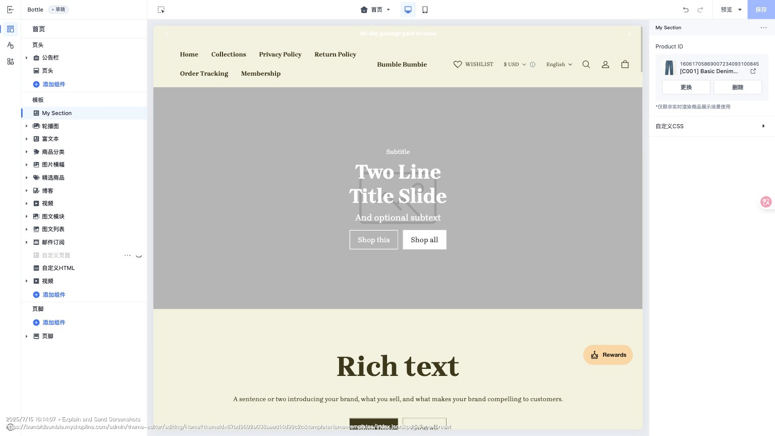
当访问此控件的配置值时,数据会以实际存储值返回,为 product_id。
product_list
此类型的控件会输出一个商品列表选择器。
此控件可用于直接选择多个指定商品,组成一个商品列表,用于展示如首页商家推荐的多款商品。
示例代码:
{
  "name": "My Section",
  "settings": [
    {
      "type": "product_list",
      "id": "product_list",
      "label": "Product list"
    }
  ],
  "presets": [
    {
      "name": "My Section"
    }
  ]
}
输出:
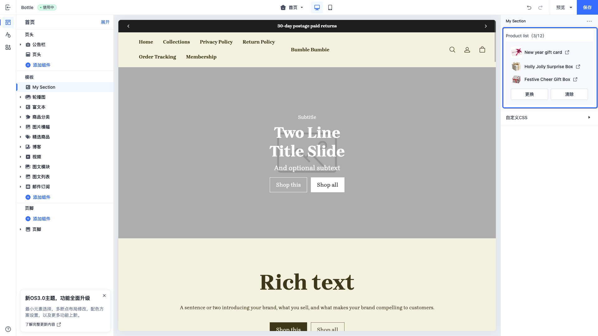
当访问此控件的配置值时,数据会以 product object 的数组形式进行返回。
page
此类型的控件会输出一个自定义页面选择器。
此控件可以用于选择需要的自定义页面进行展示,例如在首页展示自定义页面的信息。
示例代码:
{
  "name": "My Section",
  "settings": [
    {
      "type": "page",
      "id": "page",
      "label": "Page"
    }
  ],
  "presets": [
    {
      "name": "My Section"
    }
  ]
}
输出:
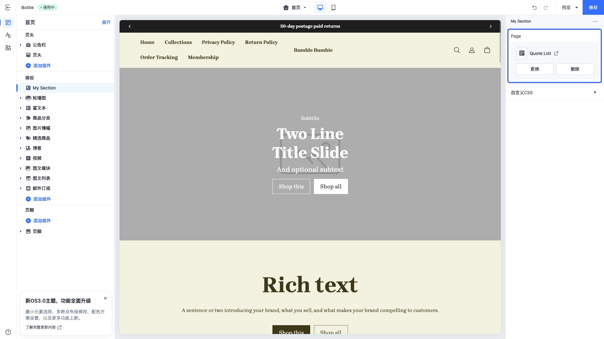
当访问此控件的配置值时,数据会以 page object 的形式进行返回。
menu
此类型的控件会输出一个菜单导航选择器。
此控件可以直接选择店铺内所有可用的菜单导航。
此控件可用于菜单导航的展示,例如页头上展示的菜单导航。
示例代码:
{
  "name": "My Section",
  "settings": [
    {
      "type": "menu",
      "id": "menu",
      "label": "Menu"
    }
  ],
  "presets": [
    {
      "name": "My Section"
    }
  ]
}
输出:
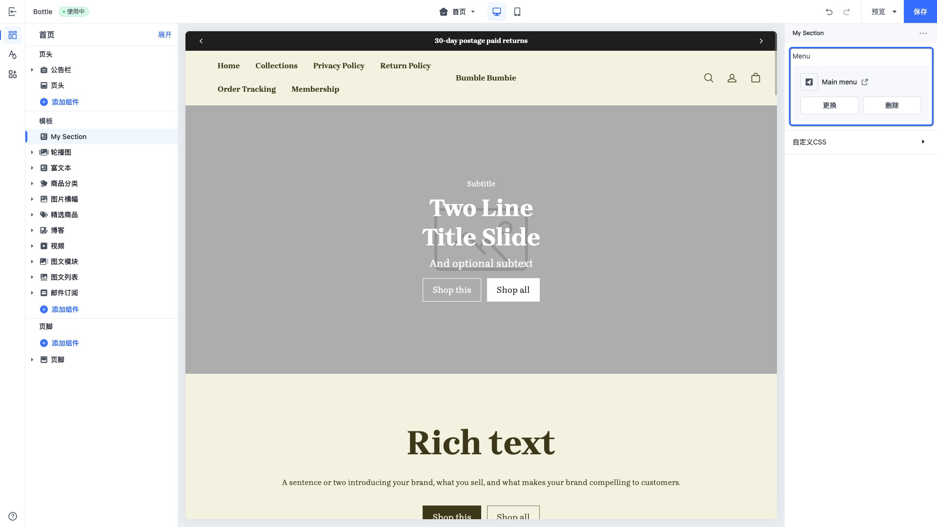
当访问此控件的配置值时,数据会以 menu object 的形式进行返回。
video
此类型的控件会输出一个视频选择器。
此控件可直接选择 SHOPLINE 商家后台文件库中的可用视频或上传视频,用于如首页展示商品视频等场景。
示例代码:
{
  "name": "My Section",
  "settings": [
    {
      "type": "video",
      "id": "video",
      "label": "Video"
    }
  ],
  "presets": [
    {
      "name": "My Section"
    }
  ]
}
输出:
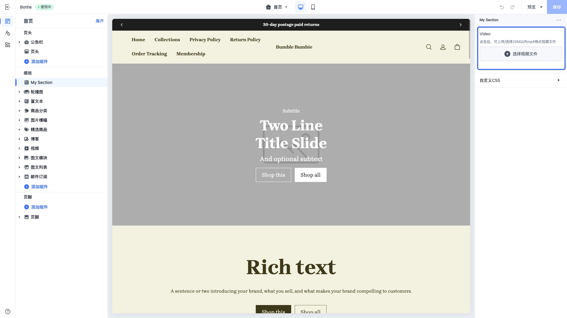
当访问此控件的配置值时,数据会以 video object 的形式进行返回。
external_video
此类型的控件会输出一个 URL 输入框。
额外属性:
| 属性 | 描述 | 是否必填 |
|---|---|---|
| format | 若添加此属性,则会校验输入的文本是否为此控件支持的视频提供商。 支持的视频提供商列表 • youtube • vimeo 枚举值为 • video | 否 |
| placeholder | 输入框的占位文本 | 否 |
此控件可用于获取来自 YouTube 或 Vimeo 视频的信息,一般与 external_video_tag tag 和 external_video_url filter 进行搭配使用:
{{#external_video_tag section.settings.external_video | external_video_url() /}}
示例代码:
{
  "name": "My Section",
  "settings": [
    {
      "type": "external_video",
      "id": "external_video",
      "label": "External video"
    }
  ],
  "presets": [
    {
      "name": "My Section"
    }
  ]
}
输出:
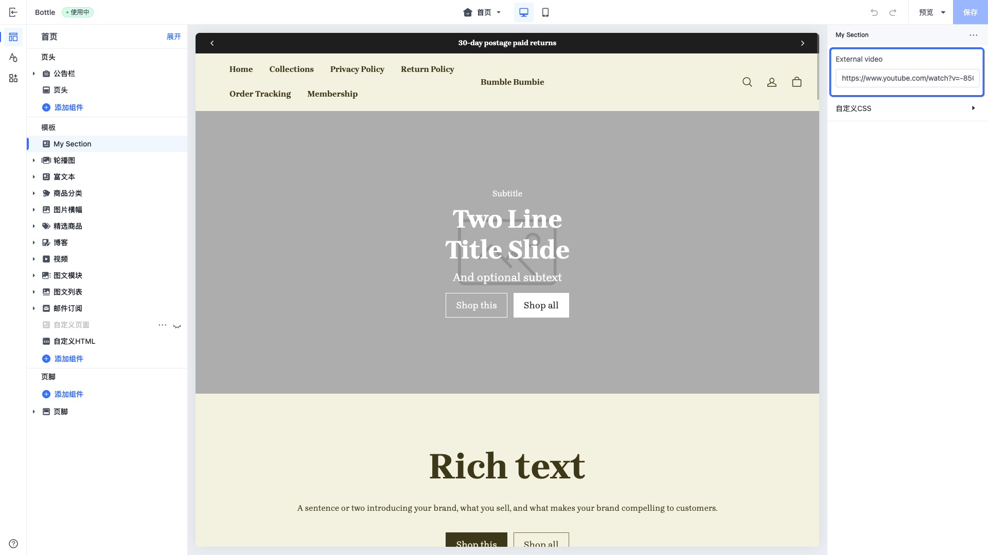
当访问此控件的配置值时,数据会以 external_video object 的形式进行返回。
padding
此类型的控件会输出一个边距输入框。
此控件可用于存储桌面端以及移动端的上、下、左、右四个方向的数值。一般用于设置容器元素的内边距。
此控件的 default 值的结构是一个对应桌面端和移动端的对象,每个对象都有四个方向的属性。
示例代码:
{
  "name": "My Section",
  "settings": [
    {
      "type": "padding",
      "id": "padding",
      "label": "Padding",
      "default": {
        "pc":{
          "left":10,
          "right":10,
          "top":10,
          "bottom":10
        },
        "mobile":{
          "left":10,
          "right":10,
          "top":10,
          "bottom":10
        }
      }
    }
  ],
  "presets": [
    {
      "name": "My Section"
    }
  ]
}
输出:
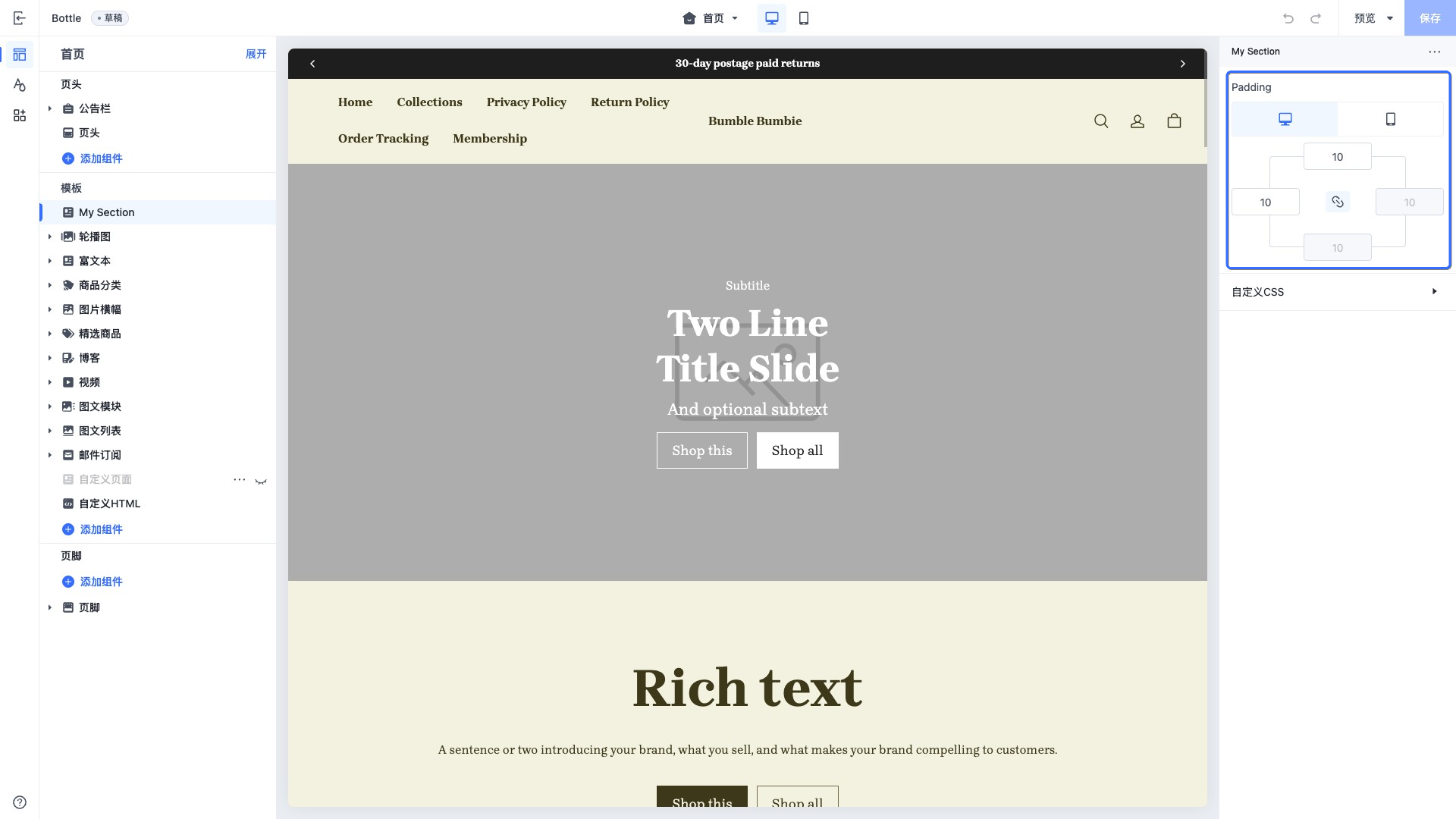
当访问此控件的配置值时,数据会以 default 值的数据结构形式进行返回。
sline
此类型的控件会输出一个接受 Sline 模板语言的代码输入框。
此控件可让商家使用 sline 语法输入自定义的内容,例如在首页特定组件里面注入额外信息。
额外属性:
| 属性 | 描述 | 是否必填 |
|---|---|---|
| limit | 文本输入最大长度 | 否 |
示例代码:
{
  "name": "My Section",
  "settings": [
    {
      "type": "sline",
      "id": "sline",
      "label": "Sline"
    }
  ],
  "presets": [
    {
      "name": "My Section"
    }
  ]
}
输出:
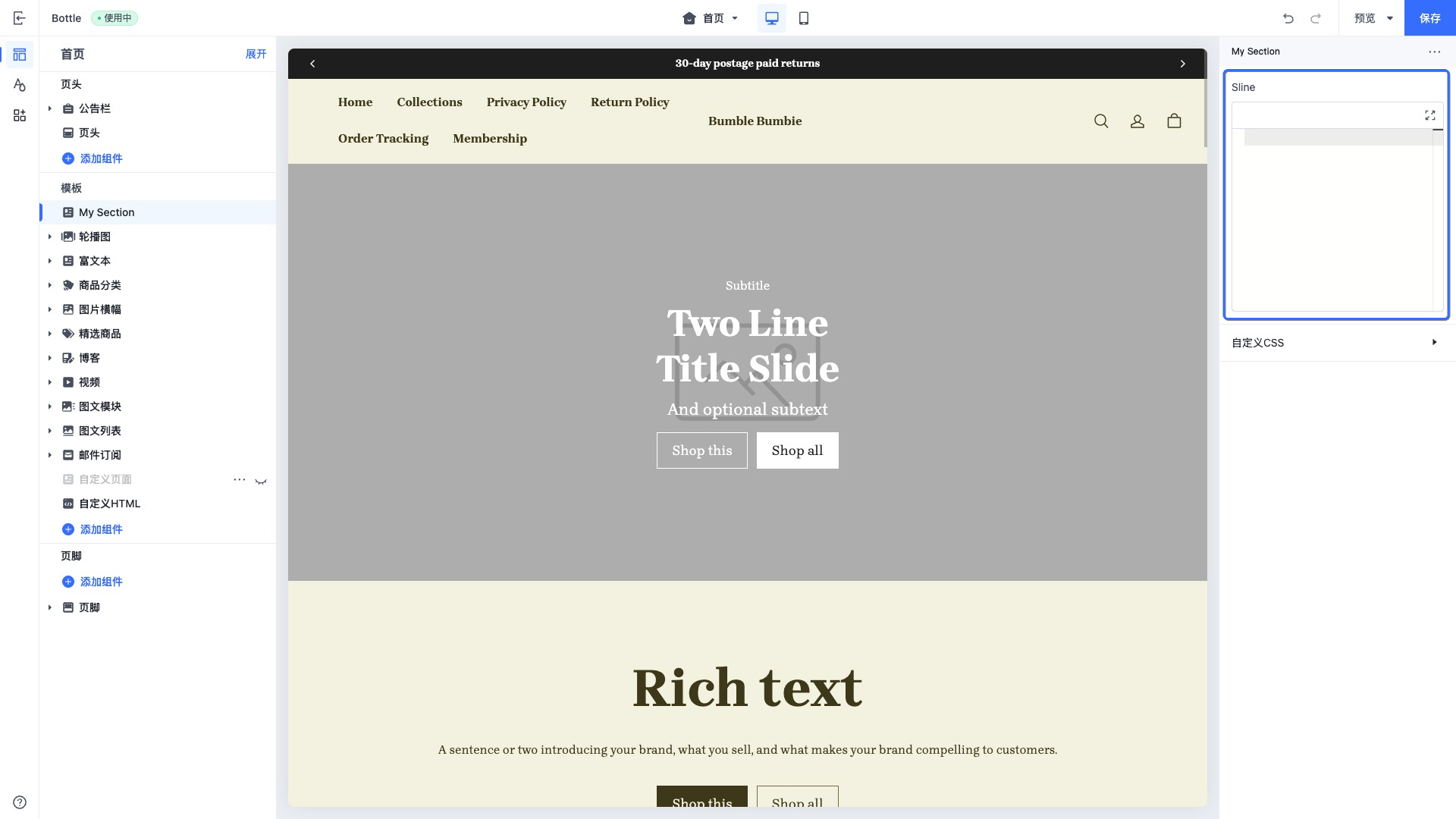
当访问此控件的配置值时,数据会以 string 形式进行返回。
html
此类型的控件会输出一个接受 HTML 语言的多行文本输入框。
额外属性:
| 属性 | 描述 | 是否必填 |
|---|---|---|
| placeholder | 输入框的占位文本 | 否 |
| limit | 文本输入最大长度 | 否 |
此控件可让商家使用 HTML 语法输入自定义的内容,例如在首页特定组件里面编写 HTML。
示例代码:
{
  "name": "My Section",
  "settings": [
    {
      "type": "html",
      "id": "html",
      "label": "HTML"
    }
  ],
  "presets": [
    {
      "name": "My Section"
    }
  ]
}
输出:
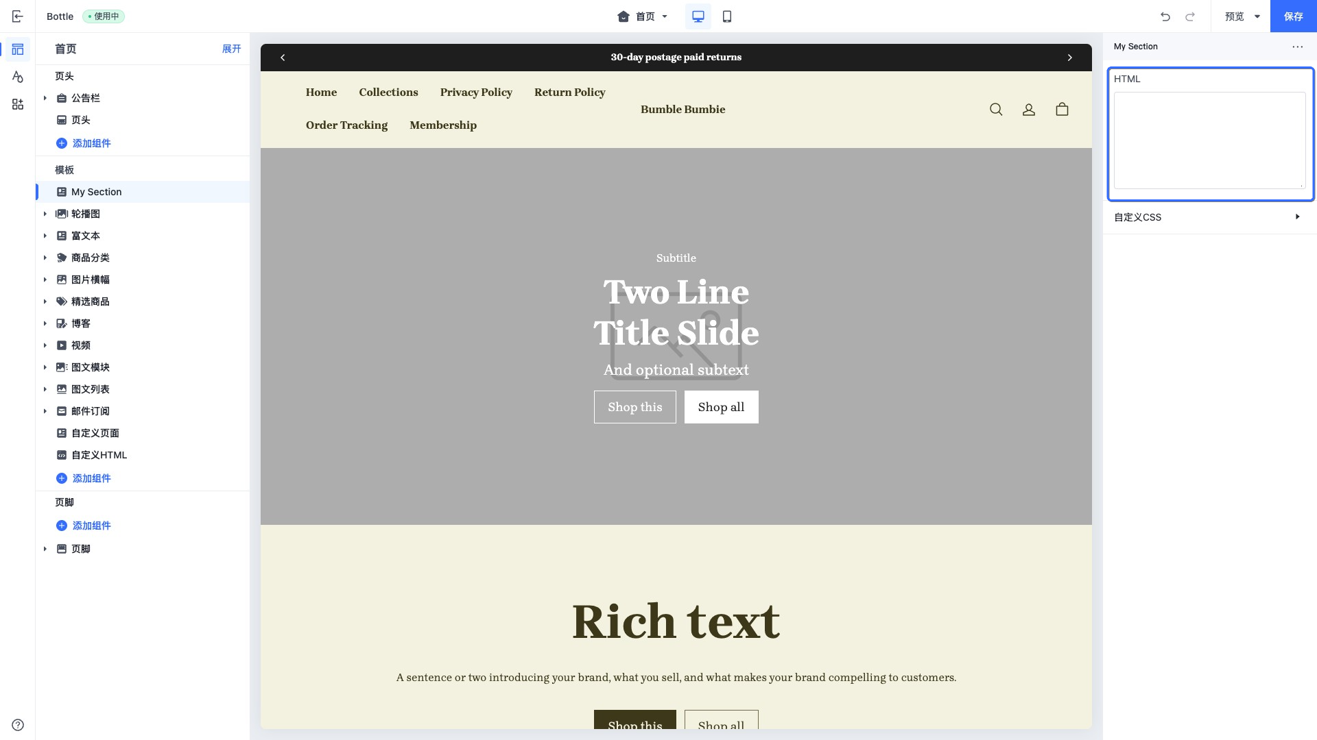
当访问此控件的配置值时,数据会以 string 形式进行返回。
payment_icon
此类型的控件会输出一个支付图标的列表。
此控件可用于选择展示当前店铺所支持的支付方式。
此控件的 default 属性值的一个 JSON 结构,用于在主题编辑器中展示默认选择的 icon 列表。
| default 属性名 | default 属性值 | 描述 |
|---|---|---|
| show | • true:展示• false:不展示 | 是否展示支付图标 |
| pay_channel_list | [ { "type": <Type>, "show": <Boolean> } ] | 包含支付类型图标的列表 |
示例代码:
{
  "name": "My Section",
  "settings": [
    {
      "type": "payment_icon",
      "id": "payment_icon",
      "label": "Payment icon",
      "default": {
        "show": true,
        "pay_channel_list": [
          {
            "type": "visa",
            "show": true
          },
          {
            "type": "master-card",
            "show": true
          },
          {
            "type": "master-card2",
            "show": true
          },
          {
            "type": "visa-electron",
            "show": true
          }
        ]
      }
    }
  ],
  "presets": [
    {
      "name": "My Section"
    }
  ]
}
输出:
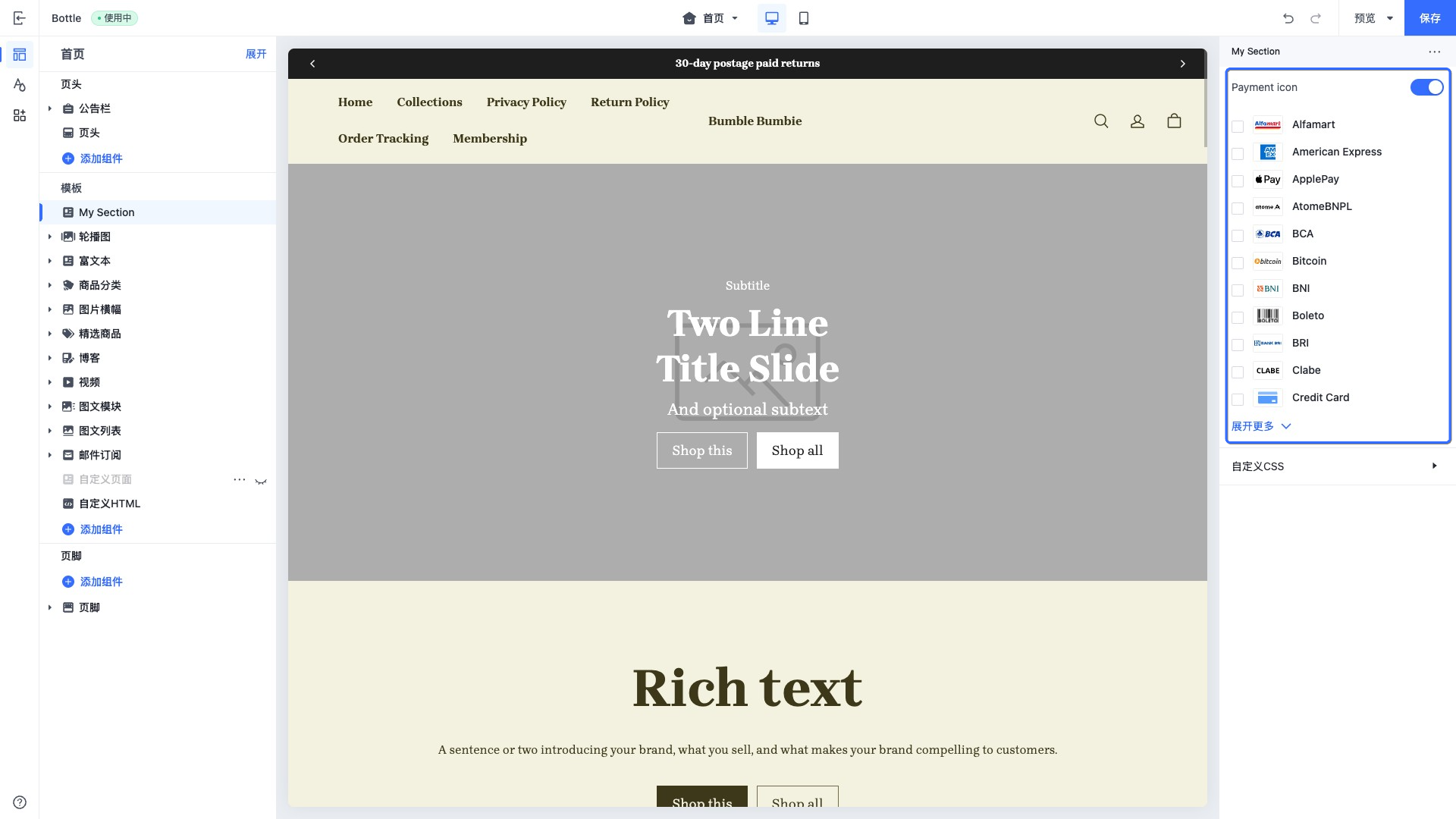
当访问此控件的配置值时,一般需要和 payment_type_svg tag 搭配使用:
<div class="footer__payment-icons">
  {{#for pay_channel in block.settings.payment_icons.pay_channel_list}}
    {{#payment_type_svg pay_channel.type /}}
  {{/for}}
</div>
favicon
此类型的控件会输出一个上传网站图标控件。
此控件可用于选择展示网站的图标,一般在 theme.schema.json 进行设置:
{
  ...
  "schemas": [
    {
      "name": "website icon",
      "settings": [
        {
          "type": "favicon",
          "id": "favicon_image",
          "label": "website icon",
        }
      ]
    }
  ]
}
输出:
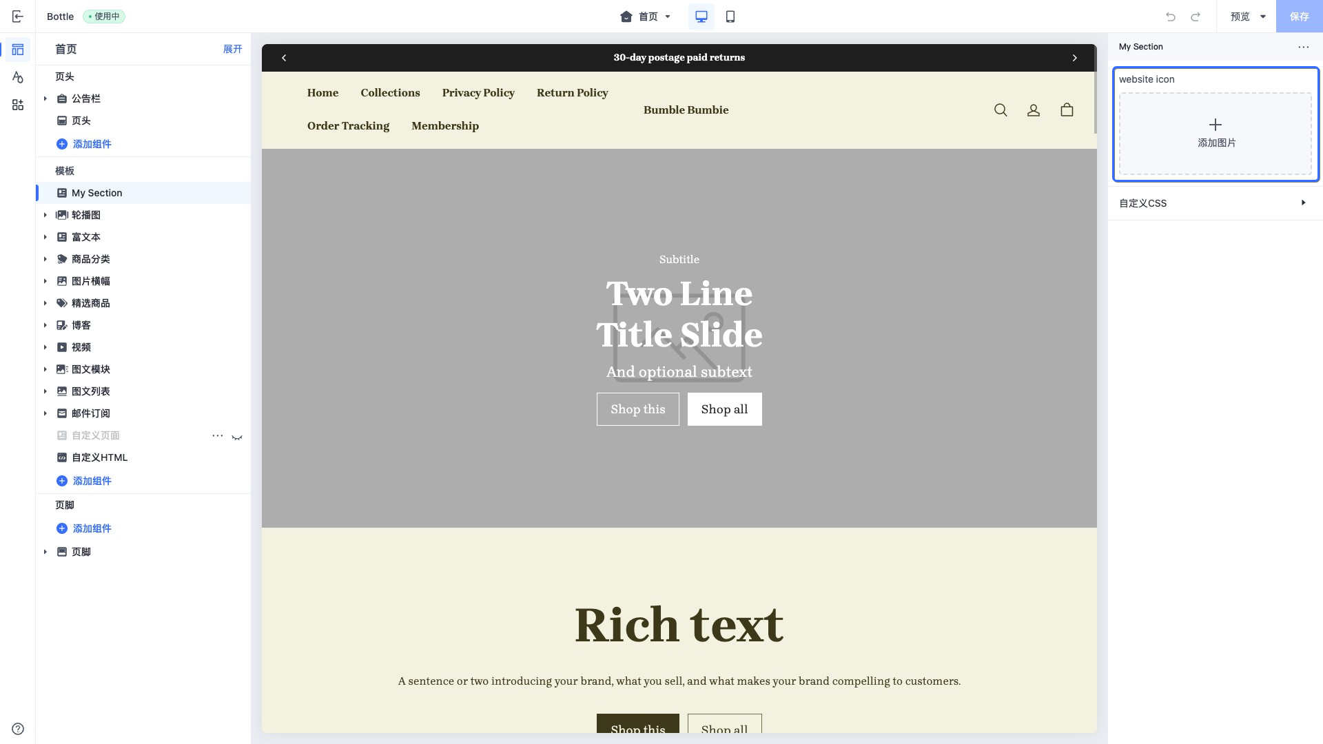
在 layout/theme.html 设置网站图标:
<!DOCTYPE html>
<html>
  <head>
    {{#if settings.favicon_image}}
      <link rel="icon" type="image/png" href="{{settings.favicon_image}}" />
    {{/if}}
  </head>
  <body>
    ...
  </body>
</html>
输出:

date
此类型控件用于展示或选择日期信息,适用于所有与日期相关的配置场景。
输出采用美式日期格式:MM-DD-YYYY。
示例代码:
{
  "name": "countdown-date",
  "tag": "",
  "settings": [
    {
      "type": "date",
      "id": "deadline",
      "label": "Deadline"
    }
  ]
}
输出:
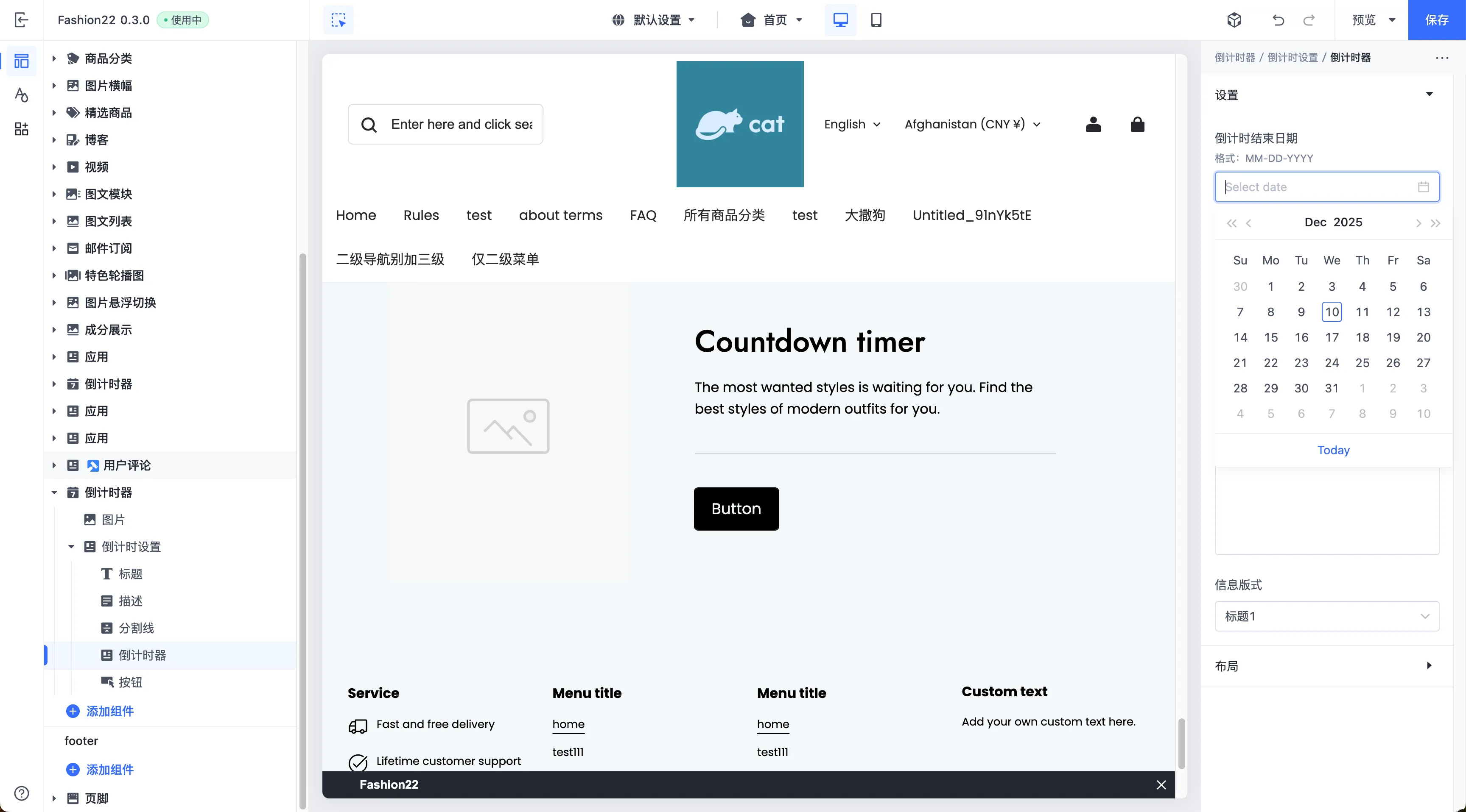
datetime
此类型控件用于展示或选择完整的日期与时间信息,适用于所有需要精确到分钟的配置场景。
输出采用美式日期时间格式:MM-DD-YYYY HH:mm 。例如:12-25-2023 14:30 。
示例代码:
{
  "name": "countdown-datetime",
  "tag": "",
  "settings": [
    {
      "type": "datetime",
      "id": "deadline",
      "label": "Deadline"
    }
  ]
}
输出:
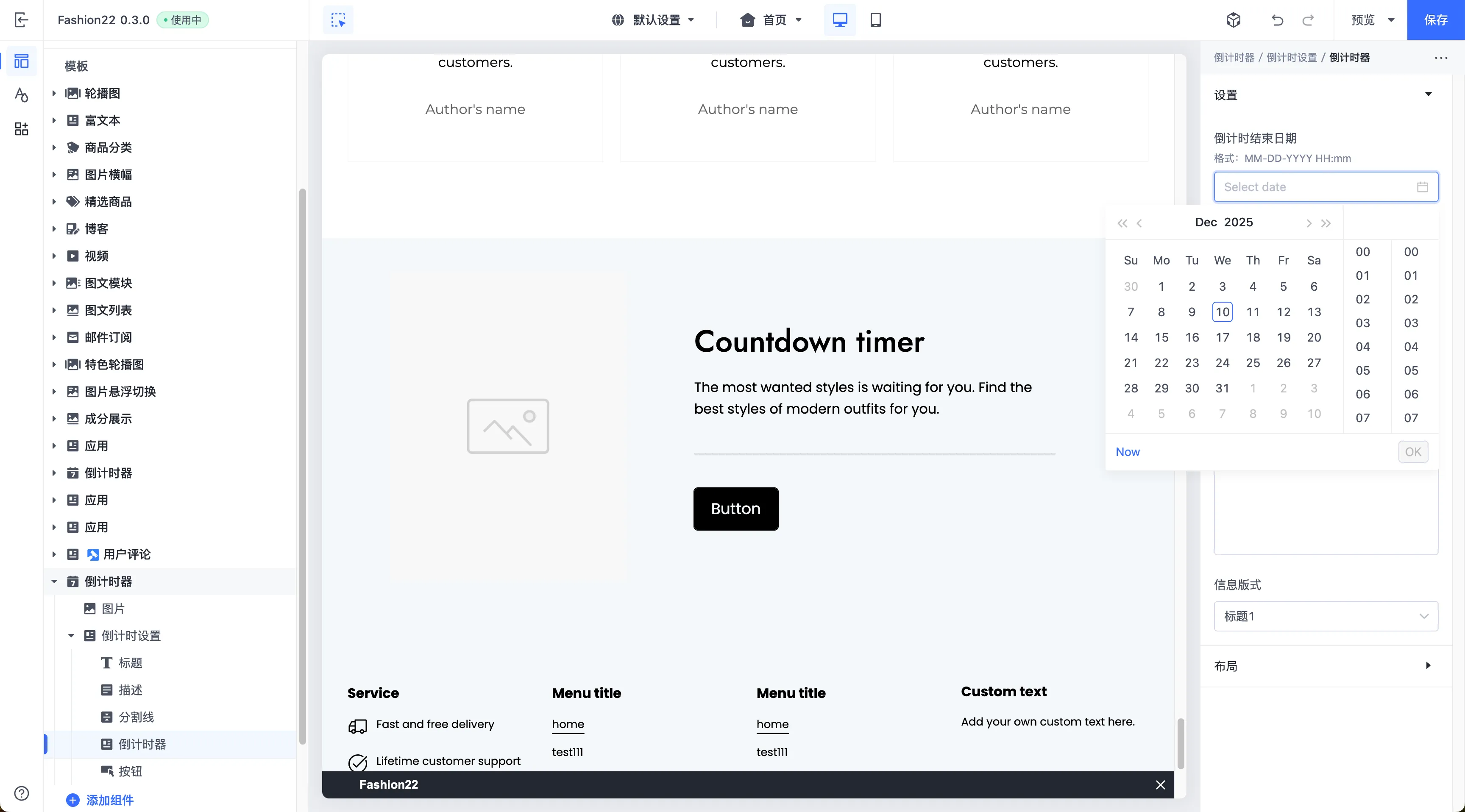
展示控件类型
展示类型的控件只能用于展示信息,一般用于组织分组展示基础控件。
group_header
此类型的控件会新增一个标题元素,并之后的配置项设置为一组。
此控件的配置属性:
| 属性 | 描述 | 是否必填 |
|---|---|---|
| type | 控件类型 | 是 |
| label | 配置标签,将呈现在主题编辑器中 | 是 |
| info | 配置的提示信息 | 否 |
例如将以下配置进行分组:
{
  "name": "My Section",
  "settings": [
    {
      "type": "group_header",
      "label": "Desktop"
    },
    {
      "type": "range",
      "label": "desktop columns",
      "id": "desktop_columns",
      "default": 2,
      "min": 1,
      "max": 8,
      "step": 1
    },
    {
      "type": "group_header",
      "label": "Mobile"
    },
    {
      "type": "range",
      "label": "mobile columns",
      "id": "mobile_columns",
      "default": 2,
      "min": 1,
      "max": 8,
      "step": 1
    },
  ],
  "presets": [
    {
      "name": "My Section"
    }
  ]
}
输出:
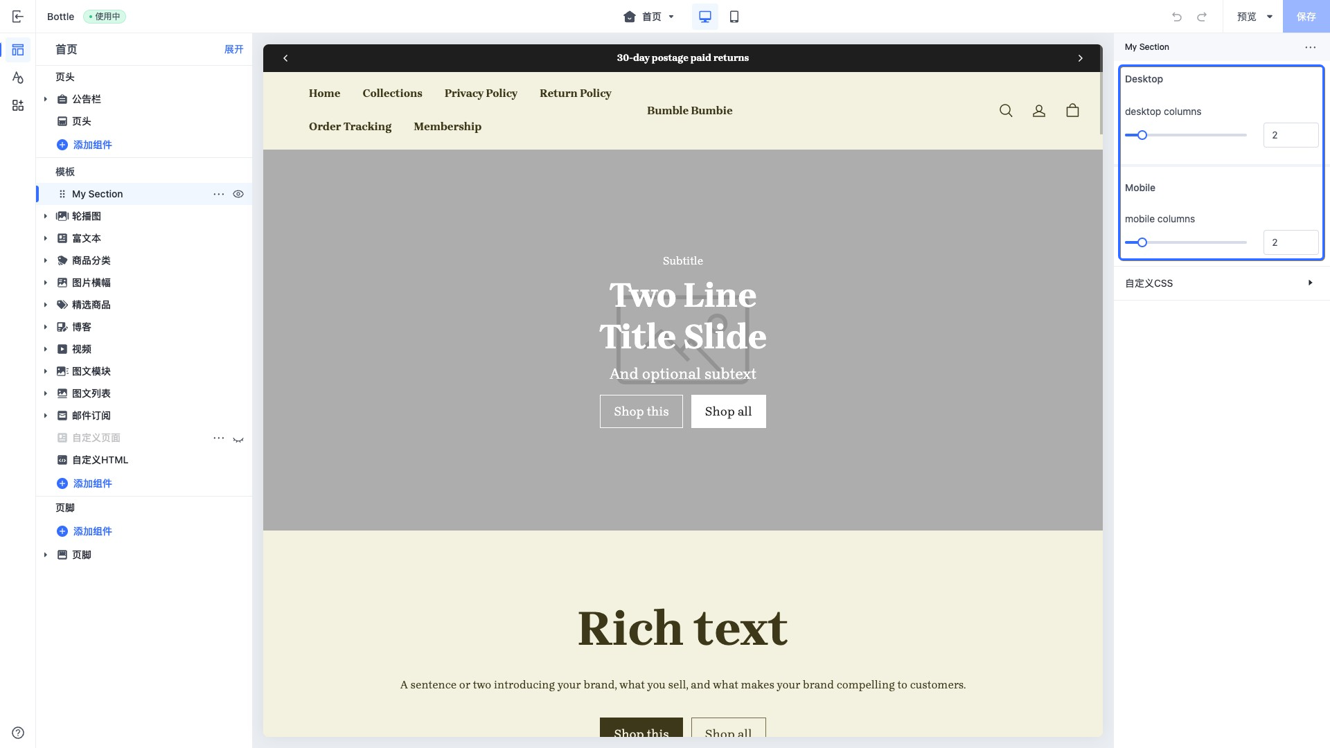
group_header 的分组逻辑:按顺序渲染,当类型为 group_header 时,接下来的配置项都会在此分组下,直到遇到下一个 group_header 类型的配置。

'%3e%3crect%20x='6'%20y='7.13049'%20width='13'%20height='10'%20rx='1'%20fill='black'/%3e%3cpath%20d='M12.4998%2012.936L-3.65042%200.604835L28.65%200.604838L12.4998%2012.936Z'%20stroke='white'%20stroke-linejoin='round'/%3e%3c/g%3e%3cdefs%3e%3cclipPath%20id='clip0_716_14611'%3e%3crect%20x='6'%20y='7.13049'%20width='13'%20height='10'%20rx='1'%20fill='white'/%3e%3c/clipPath%3e%3c/defs%3e%3c/svg%3e)

'%3e%3crect%20x='5.63086'%20y='7.26086'%20width='13'%20height='10'%20rx='1'%20fill='white'/%3e%3cpath%20d='M12.1306%2013.0664L-4.01956%200.735206L28.2809%200.735209L12.1306%2013.0664Z'%20stroke='%231A2C42'%20stroke-linejoin='round'/%3e%3c/g%3e%3cdefs%3e%3cclipPath%20id='clip0_716_14599'%3e%3crect%20x='5.63086'%20y='7.26086'%20width='13'%20height='10'%20rx='1'%20fill='white'/%3e%3c/clipPath%3e%3c/defs%3e%3c/svg%3e)