sections
sections 目录中包含了主题所有的组件。组件是页面模版搭建的核心元素,用于定义页面模块的结构和功能。商家可以在可视化编辑器中自由添加、删除、移动、或编辑组件内容。
目录结构
在 sections 目录下,每个组件必须有一个目录,且该目录下有一个与目录名同名的 .html 文件。
组件可以由三种文件类型组成,支持.html .css和.js文件后缀格式。
- .html(必须):用于定义 section 的 HTML 布局。
- .css(可选):用于定义 section 的样式。
- .js(可选):用于定义 section 的行为交互。
sections
├── announcement-bar
│   ├── announcement-bar.css
│   ├── announcement-bar.js
│   └── announcement-bar.html
├── blog
│   ├── blog.css
│   └── blog.html
创建组件
每个组件的 .html 文件中,通常包含两个部分:
- HTML:用于定义组件的布局。
- schema:用于定义组件的配置,此配置将在可视化编辑器中展示为商家可自定义的配置。
如下以精选商品(featured-collection)为例,展示创建一个组件的步骤。
1. 添加组件文件
在 sections 目录下新建一个 featured-collection 的目录,再新建一个同名的 .html 文件。
sections
└── featured-collection
    └── featured-collection.html
2. 定义组件 schema 配置
在 featured-collection.html 文件下添加 schema tag。
<!-- sections/featured-collection/featured-collection.html -->
{{#schema}}
{
  "name": "featured-collection",
  "settings": [
    {
      "type": "collection",
      "id": "collection",
      "label": "collection"
    }
  ]
}
{{/schema}}
3. 渲染组件 schema 配置
使用组件 schema 配置,需要在 HTML 中通过 section.settings获取配置。
通过 collection 控件获取商家选中分类的标题。
获取组件配置的 id 为 collection。
以下例子说明了如何获取商家配置分类的标题:
<!-- sections/featured-collection/featured-collection.html -->
<section>
  title: {{section.settings.collection.title}}
</section>
{{#schema}}
{
  "name": "featured-collection",
  "settings": [
    {
      "type": "collection",
      "id": "collection",
      "label": "collection"
    }
  ]
}
{{/schema}}
输出:
<section>
  title: /collections/foo
</section>
注意:schema tag 是一个 Sline tag,它不会输出内容。
创建私有区块
在组件中支持使用区块,可以把功能模块拆分成区块,然后在组件进行组装。
提示:更多与区块相关的内容请参阅 blocks。
1. 添加私有区块文件
组件的私有区块必须存放在组件的 blocks 目录下。
在 sections/featured-collection 目录中,创建私有 blocks 目录:
sections
└── featured-collection
    ├── featured-collection.html
    └── blocks
        ├── heading.html          # 标题区块
        └── product-list.html     # 商品列表区块
2. 定义区块 HTML 布局
在 heading.html内使用 props object 获取在组件传入的text字段:
提示:props下的所有字段都是由区块内部定义的需要外部传入的参数,比如 text 字段,表明使用此区块时,需要传入 text 字段的参数。
<!-- sections/featured-collection/blocks/heading.html -->
<div class="heading">
  <div>{{props.text}}</div>
</div>
在 product-list.html 文件中:
- 使用 props object 获取在组件中传入的
collection字段。 - 使用 get_product_pagination filter 获取商品分页数据。
- 使用 for tag 渲染商品的内容。
<!-- sections/featured-collection/blocks/product-list.html -->
{{#var products_pagination = props.collection | get_product_pagination(4) /}}
{{#var products = products_pagination.list /}}
<ul>
  {{#for product in products}}
    <li>
      <div>{{product.title}}</div>
    </li>
  {{/for}}
</ul>
3. 渲染区块
创建完区块后,即可以在组件中引入使用。
在 HTML 的 div 标签里面使用 blocks tag 和 block tag 渲染区块。
在 schema 字段添加所需要的 blocks 字段:
<div>
  {{#blocks}}
    {{#if forblock.type == "$heading"}}
      <!-- 给 heading block 传入 section.settings.collection.title -->
      {{#block text=section.settings.collection.title /}}
    {{#else if forblock.type == "$product-list" /}}
      <!-- 给 product-list block 传入 section.settings.collection -->
      {{#block collection=section.settings.collection/}}
    {{/if}}
  {{/blocks}}
</div>
{{#schema}}
{
  "name": "featured-collection",
  "settings": [
    {
      "type": "collection",
      "id": "collection",
      "label": "collection"
    }
  ],
  "blocks": [
    {
      "type": $heading",
      "limit": 1
    },
    {
      "type": "$product-list",
      "limit": 1
    }
  ]
}
{{/schema}}
组件集
组件集是相关组件的集合,用于组合要渲染的组件及其相关配置。组件集由 sections 下的 .json 文件表示,组件集类型文件必须存放在组件的根目录下。目录结构样例如下:
sections
├── header-group.json
└── footer-group.json
以下是一个组件集的 JSON 数据规范:
{
  name: <SectionGroupName>,
  type: <SectionGroupType>,
  sections: {
    <SectionID>: {
      "type": <SectionType>,
      "disabled": <SectionDisabled>,
      "settings": {
        <SettingID>: <SettingValue>
      },
      "blocks": {
        <BlockID>: {
          "type": <BlockType>,
          "settings": {
            <SettingID>: <SettingValue>
          },
          "blocks": {
            <BlockID>: {
              "type": <BlockType>,
              "settings": {
                <SettingID>: <SettingValue>
              }
            }
          }
        }
      },
      "block_order": <BlockOrder>
    }
  },
  "order": <SectionOrder>
}
schema 字段
| 字段 | 数据类型 | 是否必填 | 描述 |
|---|---|---|---|
| <SectionGroupName> | String | 是 | 组件集的名称。 |
| <SectionGroupType> | String | 是 | 组件集的类型,枚举值为: • header:应用在页头的组件集类型。• footer:应用在页脚的组件集类型。 |
| <SectionID> | String | 是 | 用于识别组件的全局唯一随机 hash 字符串。 |
| <SectionType> | String | 是 | 组件文件名。 |
| <SectionDisabled> | Boolean | 否 | 组件显示或隐藏 • true:隐藏。• false(默认):显示。 |
| <BlockID> | String | 否 | 用于识别区块的全局唯一随机 hash 字符串。 |
| <BlockType> | String | 否 | 区块的 HTML 文件名。 |
| <BlockOrder> | String | 否 | <BlockID> 列表,决定区块的渲染顺序。 |
| <SectionOrder> | String | 否 | <SectionID> 列表,决定组件的渲染顺序。 |
| <SettingID> | String | 否 | 配置项 ID,其在 schema tag 中自定义。 |
| <SettingValue> | String | 否 | 配置项值,由商家自定义。 |
以下是一个 header-group.json 的例子:
{
  "name": "Header Group",
  "type": "header",
  "sections": {
    "announcement-bar": {
      "type": "announcement-bar",
      "blocks": {
        "announcement-bar__item1": {
          "type": "$item"
        }
      },
      "block_order": ["announcement-bar__item1"]
    },
    "header": {
      "type": "header"
    }
  },
  "order": ["announcement-bar", "header"]
}
组件集的使用
使用组件集的方式是通过 sections tag 引入,以下是在 layout/theme.html 引入 header-group.json 的例子:
<!DOCTYPE html>
<html lang="{{request.locale.iso_code}}">
  <head>
    ...
  </head>
  <body>
    ...
    {{#sections "header-group" /}}
    ...
  </body>
</html>
在主题编辑器内,可以在此组件集内添加、删除和排序组件。
提示:一般情况下,sections 目录下只有 header-group.json 和 footer-group.json。
header-group.json 表示应用在页头的组件集,footer-group.json 表示应用在页头的组件集。
固定组件
固定组件,是指不可通过可视化编辑器添加、删除、移动,只能修改组件配置的组件。一般适用于固定且不想被商家移除的页面模块,如页头、页脚。必须在 布局文件 中引用固定组件。
固定组件的使用
你可以通过 section tag 引用固定组件,并且该引用代码,必须放在布局文件中。
以下是 Bottle 主题中,店铺密码页使用了固定组件的代码示例:
<!-- layout/password.html -->
<!DOCTYPE html>
<html>
<head>
{{#content "header" /}}
</head>
<body class="password-page">
{{#section "main-password-header" /}} <!-- 引用固定组件 main-password-header -->
...
{{#content "layout" /}}
...
{{#section "main-password-footer" /}} <!-- 引用固定��组件 main-password-footer -->
{{#content "footer" /}}
</body>
</html>
异步组件渲染
你可以使用异步组件渲染能力,通过 AJAX 请求获取到指定的组件 HTML 片段,然后动态替换页面元素来更新页面内容,而无需加载整个页面。
详情请参阅 异步组件渲染 API。
schema
组件支持添加 schema tag,在此 tag 内,允许你定义一个组件的各种属性,例如组件名称。
schema 由以下属性组成:
提示:schema tag 是一个 Sline tag,它不会输出内容。
name
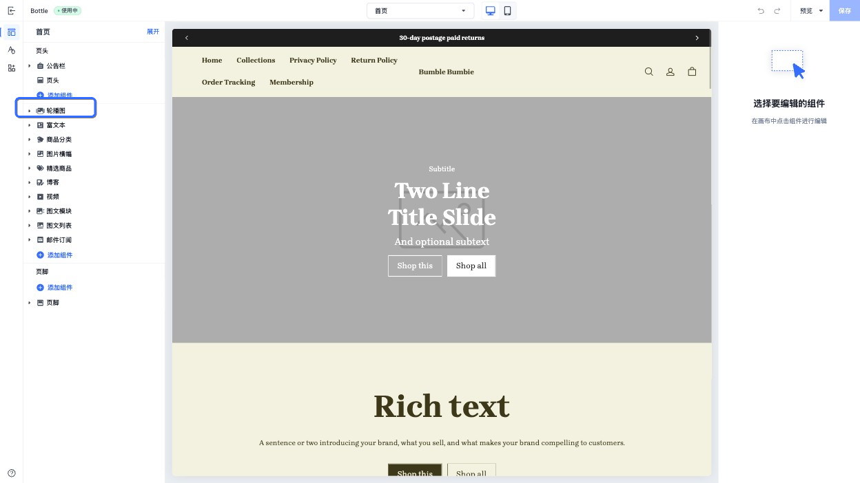
name 属性决定了此组件默认在可视化编辑器中显示的组件标题。
输入以下的 schema:
{{#schema}}
{
  "name": "轮播图"
}
{{/schema}}
在主题编辑器中呈现组件名:
class
在主题页面渲染一个组件时,组件会被包裹在一个 HTML 元素中,并且带有 shopline-section的 class 属性,你可以使用 class 属性追加定义这个 HTML 元素的 class 值,例如:
{{#schema}}
{
  "name": "Slideshow",
  "class": "slideshow"
}
{{/schema}}
输出以下 HTML:
<section id="shopline-section-[id]" class="shopline-section slideshow">
  // ...
</section>
settings
提示:settings 的内容请参阅 控件配置。
你可以创建组件的特定配置项来允许商家在可视化编辑器自定义组件:
注意:所有组件的 setting id 必须在每个组件内是唯一的。
{{#schema}}
{
  "name": "富文本",
  "settings": [
    {
      "type": "richtext",
      "id": "title",
      "label": "标题",
      "default": "请输入内容"
    }
  ]
}
{{/schema}}
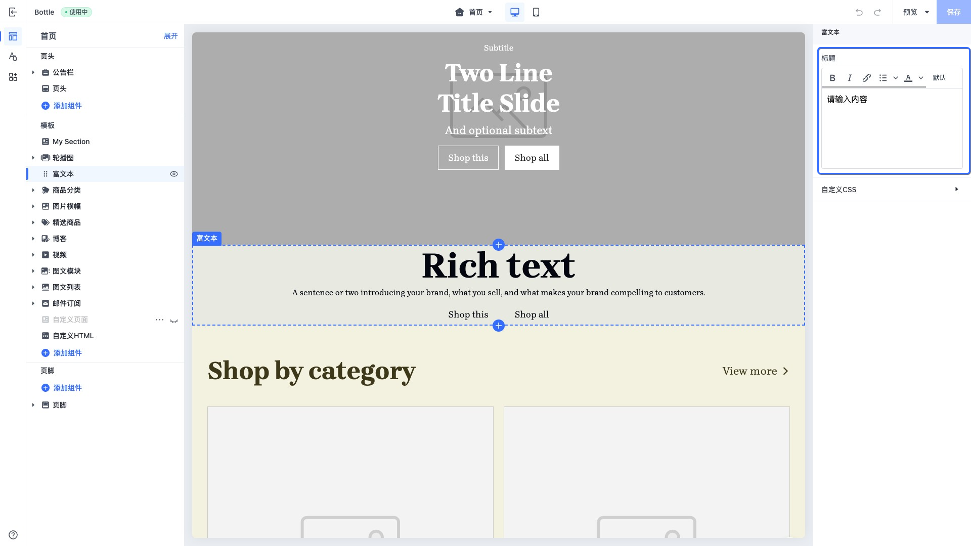
访问组件的配置
组件的配置可以通过 section.settings 访问:
<div>{{ section.settings.title }}</div>
{{#schema}}
{
  "name": "Slideshow",
  "settings": [
    {
      "type": "richtext",
      "id": "title",
      "label": "Title",
      "default": "Rich text"
    }
  ]
}
{{/schema}}
blocks
你可以为一个组件创建可复用的区块,区块可以在一个组件内添加、删除和排序。
blocks 字段具有以下属性:
| 属性 | 值类型 | 是否必填 | 描述 |
|---|---|---|---|
| type | string | 是 | 区块的类型。根据区块的不同,该值有如下区别: • 公有区块:区块对应的 HTML 文件名。例如,公有区块的文件名为 blocks/heading.html,那么 type 的值为 heading。• 私有区块:区块对应的 HTML 文件名,以 $符号开始。例如,私有区块的文件名为 sections/blog/blocks/articles.html,那么 type 的值为 $articles。• App Block:值固定为 @app,表示是可以添加 App Block 的区块。 |
| limit | number | 否 | 可以使用该类型的区块的数量。 |
{{#schema}}
{
  "name": "Slideshow",
  "blocks": [
    {
      "type": "heading-with-link/heading-with-link",
      "limit": 1
    },
    {
      "type": "product-list/list",
      "limit": 1
    }
  ]
}
{{/schema}}
max_blocks
max_blocks 属性表示此组件可以在主题编辑器中添加区块的最大数量。例如:
{{#schema}}
{
  "name": "Slideshow",
	"max_blocks": 5
}
{{/schema}}
presets
presets 属性用于定义在可视化编辑器中,点击添加组件时,该组件的预设配置。
该属性是一个数组,数组中的元素数量代表此组件的预设配置数量。每个组件应至少包含一份预设配置。
当商家在可视化编辑器中添加组件时,所选中组件的预设配置将会被添加到相应的JSON Template 中。
注意:如果没有显式声明 presets 属性,则在可视化编辑器中添加组件时,无法添加这个组件。
presets 的每项有以下属性:
| 属性 | 描述 | 是否必填 |
|---|---|---|
| name | 预设名称,将显示在可视化编辑器的添加组件的名称上。 | 是 |
| settings | 预设的配置,以对象的形式在存储预设值。 | 否 |
| category | 预设的分类,将在可视化编辑器添加组件的时候的将该预设分组。 | 否 |
| blocks | 预设的 blocks,用于在主题编辑器添加此组件的时候,默认添加的区块以及其配置。每个区块都拥有两个字段: • type: 区块的 HTML 文件名。例如:heading.html• settings: 区块的预设配置。与组件的预设配置形式一致 | 否 |
下面是一个组件中包括预设的例子:
{{#schema}}
{
  "name": "Slideshow",
  "settings": [
    {
      "type": "text",
      "id": "title",
      "label": "Title"
    }
  ],
  "presets": [
  	{
      "name": "Image slideshow",
    	"settings": {
      	"title": "Image"
      },
      "blocks": [
        {
          "type": "$image",
          "settings": {
            "text": "image item"
          }
        }
      ]
    }
  ]
}
{{/schema}}
icon
icon 用于展示此组件在主题编辑器中拖拽区展示的图标,以下是可用的枚举值:
| 枚举值 | 展示的图标 |
|---|---|
| footer |  |
| header |  |
| testimonials |  |
| orderPlacement |  |
| products |  |
| collection |  |
| collectionList |  |
| productThumbnail |  |
| filter |  |
| featuredProduct |  |
| productHighlightWithCover |  |
| content |  |
| image |  |
| slideshow |  |
| heroImageWithTextBox |  |
| textWithImage |  |
| textColumnsWithIcons |  |
| video |  |
| logoList |  |
| imageTextGrid |  |
| timeline |  |
| campaignPromotion |  |
| footerPromotion |  |
| announcementBar |  |
| discountBanner |  |
 | |
| navigation |  |
| frequentlyAskedQuestions |  |
| code |  |
| brandList |  |
| sideColumnFilter |  |
| socialMedia |  |
| sideColumn |  |
| inquiryForm |  |
| externalLink |  |
| generalSection |  |
| company |  |
| marketSelector |  |
| cardComponent |  |
| blog |  |
| title |  |
| button |  |
| general |  |
| checkoutPage |  |
| homePage |  |
| additionalPages |  |
| shoppingCart |  |
| loyaltyPoints |  |
| toggleSwitch |  |
| starRating |  |
| date |  |
| measurement |  |
| dataReference |  |
| colorPicker |  |
| fileUpload |  |
| number |  |
| addCustomField |  |
| linkCustomField |  |
| customer |  |
| currency |  |
| productSku |  |
| vector |  |
| addButton |  |
| divider |  |
| socialMedia |  |
| gallery |  |
| discountTag |  |
| orderNotes |  |
| addToCart |  |
| abandonedCart |  |
| favoriteStar |  |
| storeIcon |  |
| groupIcon |  |
| dropdownSelect |  |
| upgradeOption |  |
| cartTotal |  |
| giftCard |  |
| userLevel |  |
图标展示的位置:

'%3e%3crect%20x='6'%20y='7.13049'%20width='13'%20height='10'%20rx='1'%20fill='black'/%3e%3cpath%20d='M12.4998%2012.936L-3.65042%200.604835L28.65%200.604838L12.4998%2012.936Z'%20stroke='white'%20stroke-linejoin='round'/%3e%3c/g%3e%3cdefs%3e%3cclipPath%20id='clip0_716_14611'%3e%3crect%20x='6'%20y='7.13049'%20width='13'%20height='10'%20rx='1'%20fill='white'/%3e%3c/clipPath%3e%3c/defs%3e%3c/svg%3e)

'%3e%3crect%20x='5.63086'%20y='7.26086'%20width='13'%20height='10'%20rx='1'%20fill='white'/%3e%3cpath%20d='M12.1306%2013.0664L-4.01956%200.735206L28.2809%200.735209L12.1306%2013.0664Z'%20stroke='%231A2C42'%20stroke-linejoin='round'/%3e%3c/g%3e%3cdefs%3e%3cclipPath%20id='clip0_716_14599'%3e%3crect%20x='5.63086'%20y='7.26086'%20width='13'%20height='10'%20rx='1'%20fill='white'/%3e%3c/clipPath%3e%3c/defs%3e%3c/svg%3e)