Section Schema
Sections support a Handlebars helper designed for sections, the {{#schema}} tag. This tag lets you define different attributes of a section, such as the section name, section blocks, and settings that allow customization in the theme editor.
Schema
Each section can have only one {{#schema}} tag, and it must contain valid JSON data. It cannot be nested within other Handlebars tags. The schema consists of the following properties:
{{#schema}} is a Handlebars helper. However, it does not output its contents or render any included Handlebars.
Content
The content within {{#schema}} can include the following properties:
Name
The name property determines the section title displayed in the theme editor. For example, the following schema will display the output below:
Output: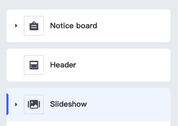
Class
When SHOPLINE renders a section, it is wrapped in an HTML element with the shopline-section class. You can define this element's class value using the class property, such as:
This will output the following HTML snippet:
Settings
You can create section specific configuration options using the settings object, allowing merchants to customize the section:
All section setting IDs must be distinct within each section. Repeated IDs within a section will cause errors.
Accessing Section Settings
Section settings can be accessed via the section Handlebars object. Refer to Access Settings for more information.
If a section is statically rendered, it will only have one instance in all static renders, meaning they share the same section settings values.
Blocks
You can create blocks within a section. Blocks are reusable content units that can be added, removed, and rearranged within a section.
Blocks have the following properties:
| Property | Description | Required |
|---|---|---|
name | The name of the block, displayed as the block title in the theme editor. | Yes |
type | The type of block. This is a free-form string used as an identifier and can be accessed via the Handlebars block object’s type property. | Yes |
settings | Any settings you want to apply to the block. Some settings may be used as the block title in the theme editor. | No |
limit | The amount of blocks of this type that can be used. | No |
icon | The icon displayed to the left of the block drag area in the design panel. If not configured, the default icon is:  . Supported icons include: . Supported icons include:- comment:  - navigation:  - email:  - image:  - imageText:  - post:  - product:  - productCategories:  - text:  - video:  - title:  - paragraph:  - button:  - normal:  | No |
Below is an example of a section with blocks.
All block names and types must be distinct within each section, and all setting IDs within each block must be unique. Duplicates will cause errors.
Accessing Block Settings
Block settings can be accessed via the Handlebars block object. Refer to Access Settings for more information.


Error loading component.