Button
The Button UI component is used to perform actions such as Add, Continue, Pay Now, or Save when clicked.
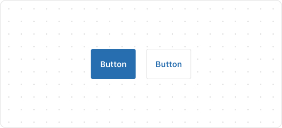
Preview
Code example
render('Checkout::Dynamic::Render', () => {
  return <Button onPress={() => console.log('onPress event')}>Pay now</Button>;
});
ButtonProps
Optional properties are marked with a ?. Properties without a ? are required.
kind?
primary
secondary
Default: primary
The type of the button. Valid values are:
primary: Main buttonsecondary: Secondary button
size?
large
small
Default: large
The size of the button.
to?
string
The URL where the customer is redirected to after clicking the button. If you specify this property, the button will be rendered as a link.
loading?
boolean
Default: false
Indicates whether to render the loading indicator. Valid values are:
true: Indicates rendering the loading indicator.false: Indicates not rendering the loading indicator.
accessibilityLabel?
string
A label for this component. Configuring this feature directly sets the aria-label attribute, providing accessibility information for screen readers.
accessibilityRole?
button
submit
Default: button
Set the button role.
disabled?
boolean
Default: false
Indicates whether the button is disabled for any interaction. Valid values are:
true: Indicates the button is disabled.false: Indicates the button is interactive.
onPress?
() => void
The callback triggered when the button is pressed.
onMouseEnter?
() => void
The callback triggered when a mouse enters the button.
appearance?
critical
The appearance style of the button.

'%3e%3crect%20x='6'%20y='7.13049'%20width='13'%20height='10'%20rx='1'%20fill='black'/%3e%3cpath%20d='M12.4998%2012.936L-3.65042%200.604835L28.65%200.604838L12.4998%2012.936Z'%20stroke='white'%20stroke-linejoin='round'/%3e%3c/g%3e%3cdefs%3e%3cclipPath%20id='clip0_716_14611'%3e%3crect%20x='6'%20y='7.13049'%20width='13'%20height='10'%20rx='1'%20fill='white'/%3e%3c/clipPath%3e%3c/defs%3e%3c/svg%3e)

'%3e%3crect%20x='5.63086'%20y='7.26086'%20width='13'%20height='10'%20rx='1'%20fill='white'/%3e%3cpath%20d='M12.1306%2013.0664L-4.01956%200.735206L28.2809%200.735209L12.1306%2013.0664Z'%20stroke='%231A2C42'%20stroke-linejoin='round'/%3e%3c/g%3e%3cdefs%3e%3cclipPath%20id='clip0_716_14599'%3e%3crect%20x='5.63086'%20y='7.26086'%20width='13'%20height='10'%20rx='1'%20fill='white'/%3e%3c/clipPath%3e%3c/defs%3e%3c/svg%3e)