Button
Button 组件用于执行操作,例如“添加”、“继续”、“立即付款”或“保存”。
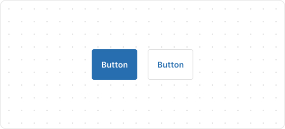
预览
示例代码
render('Checkout::Dynamic::Render', () => {
  return <Button onPress={() => console.log('onPress event')}>Pay now</Button>;
});
ButtonProps
提示
标注 ? 的属性为可选,未标注 ? 的属性为必选。
kind?
primary
secondary
默认值:primary
Button 的类型。primary 为主要 Button,secondary 为二级 Button。
size?
large
small
默认值:large
Button 大小。
to?
string
要跳转的 URL。如果设置了此值,则 Button 将呈现为链接。
loading?
boolean
默认值:false
是否展示 loading 状态。true 为展示,false 为不展示。
accessibilityLabel?
string
设置该组件的标签,将用于屏幕阅读器用户理解组件功能。配置该功能等同设置 aria-label 属性。
accessibilityRole?
button
submit
默认值:button
设置 Button 的 role 角色。
disabled?
boolean
默认值:false
禁用 Button。true 为禁止,false 为可交互。
onPress?
() => void
按下 Button 时运行的回调函数。
onMouseEnter?
() => void
鼠标进入 Button 组件时运行的回调函数。
appearance?
critical
Button 外观样式。
这篇文章对你有帮助吗?

'%3e%3crect%20x='6'%20y='7.13049'%20width='13'%20height='10'%20rx='1'%20fill='black'/%3e%3cpath%20d='M12.4998%2012.936L-3.65042%200.604835L28.65%200.604838L12.4998%2012.936Z'%20stroke='white'%20stroke-linejoin='round'/%3e%3c/g%3e%3cdefs%3e%3cclipPath%20id='clip0_716_14611'%3e%3crect%20x='6'%20y='7.13049'%20width='13'%20height='10'%20rx='1'%20fill='white'/%3e%3c/clipPath%3e%3c/defs%3e%3c/svg%3e)

'%3e%3crect%20x='5.63086'%20y='7.26086'%20width='13'%20height='10'%20rx='1'%20fill='white'/%3e%3cpath%20d='M12.1306%2013.0664L-4.01956%200.735206L28.2809%200.735209L12.1306%2013.0664Z'%20stroke='%231A2C42'%20stroke-linejoin='round'/%3e%3c/g%3e%3cdefs%3e%3cclipPath%20id='clip0_716_14599'%3e%3crect%20x='5.63086'%20y='7.26086'%20width='13'%20height='10'%20rx='1'%20fill='white'/%3e%3c/clipPath%3e%3c/defs%3e%3c/svg%3e)