GridItem
GridItem is a sub-container component within the Grid layout system, used to control the positioning and span of child elements within the grid. With GridItem, you can easily achieve layout effects that allow elements to span multiple columns or rows.
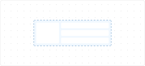
Preview
Code example
render('Checkout::Dynamic::Render', (root) => {
  return <>
    <Grid
      columns={[100, 'fill', '20%']}
      rows={['auto', 100, 'auto']}
      spacing="loose"
      padding="loose"
    >
      <GridItem columnSpan={3}>
        <View> Grid: </View>
      </GridItem>
      <View border="base" padding="base">
        100 / 100
      </View>
      <View border="base" padding="base">
        fill / 100
      </View>
      <View border="base" padding="base">
        20% / 100
      </View>
      <GridItem columnSpan={2}>
        <View border="base" padding="base">
          100 + fill / auto
        </View>
      </GridItem>
      <View border="base" padding="base">
        20% / auto
      </View>
    </Grid>
  </>;
});
GridItemProps
Optional properties are marked with a ?. Properties without a ? are required.
columnSpan?
MaybeResponsiveConditionalStyle<number>
The number of columns to span.
rowSpan?
MaybeResponsiveConditionalStyle<number>
The number of rows to span.
border?
MaybeResponsiveConditionalStyle<MaybeShorthandProperty<BorderStyle>>
The border style. This property can be defined using one, two, or four values:
- One Value: Applies the specified style uniformly to all four borders.
- Two Values: The first value sets the style for the vertical borders (top and bottom), and the second value sets the style for the horizontal borders (left and right).
- Four Values: Each value corresponds to an individual border in the following order: top, right, bottom, and left.
cornerRadius?
MaybeResponsiveConditionalStyle<MaybeShorthandProperty<CornerRadius>>
The corner radius size.
padding?
MaybeResponsiveConditionalStyle<MaybeShorthandProperty<Spacing>>
Configures the inner padding.
overflow?
hidden
visible
Default: visible
Configures whether to show or hide overflowing content.
hidden: Hides overflow.visible: Shows overflow.
accessibilityRole?
string
Sets the semantic meaning of the component content. Once set, assistive technologies such as screen readers will use ARIA roles to help customers navigate the page.
id?
string
A unique identifier for the UI component.
If this property is not set, the system will automatically generate a globally unique ID for this component.
Type descriptions
Spacing
none
base
extraTight
tight
loose
extraLoose
BorderStyle
base
dotted
none
CornerRadius
base
small
large
fullyRounded
none
MaybeResponsiveConditionalStyle
T | ConditionalStyle<T, ViewportSizeCondition>
- Example of a plain value:
base - Example of a conditional value:
{ defaultValue: 'tight', conditionals: [{ conditions: { viewportInlineSize: { min: 'medium' } }, value: 'loose' }] }
ConditionalStyle
{ defaultValue?: T; conditionals: ConditionalValue<T, Conditions>[] }
ConditionalValue
{ conditions: Conditions; value: T }
Conditions
AtLeastOne<ViewportSizeCondition>
ViewportSizeCondition
{ viewportInlineSize: { min: T } }
AtLeastOne
Partial<T> & U[keyof U]
ViewportInlineSize
extraSmall
small
medium
large
Refer to Viewport breakpoints.
MaybeShorthandProperty
T | ShorthandProperty<T>
ShorthandProperty
[T, T]
[T, T, T, T]

'%3e%3crect%20x='6'%20y='7.13049'%20width='13'%20height='10'%20rx='1'%20fill='black'/%3e%3cpath%20d='M12.4998%2012.936L-3.65042%200.604835L28.65%200.604838L12.4998%2012.936Z'%20stroke='white'%20stroke-linejoin='round'/%3e%3c/g%3e%3cdefs%3e%3cclipPath%20id='clip0_716_14611'%3e%3crect%20x='6'%20y='7.13049'%20width='13'%20height='10'%20rx='1'%20fill='white'/%3e%3c/clipPath%3e%3c/defs%3e%3c/svg%3e)

'%3e%3crect%20x='5.63086'%20y='7.26086'%20width='13'%20height='10'%20rx='1'%20fill='white'/%3e%3cpath%20d='M12.1306%2013.0664L-4.01956%200.735206L28.2809%200.735209L12.1306%2013.0664Z'%20stroke='%231A2C42'%20stroke-linejoin='round'/%3e%3c/g%3e%3cdefs%3e%3cclipPath%20id='clip0_716_14599'%3e%3crect%20x='5.63086'%20y='7.26086'%20width='13'%20height='10'%20rx='1'%20fill='white'/%3e%3c/clipPath%3e%3c/defs%3e%3c/svg%3e)