Build an extension
A Checkout UI Customizer is an extension that allows you to customize and enhance the checkout process for online stores. Merchants can integrate the extension at specific extension points on the checkout page to add features such as product recommendations or promotions, potentially increasing sales.
This article guides you through creating, publishing, and adding a Checkout UI Customizer to an online store.
Prerequisites
Before you begin, ensure that you meet the following requirements:
- You have created a SHOPLINE public app, and the app has passed the review process and is now available on the SHOPLINE App Store.
- You have installed the SHOPLINE CLI.
Extension commands
The following table outlines the commands necessary for creating a Checkout UI Customizer. You can also use the sl help extension command to review the full list of available commands.
| Command | Description |
|---|---|
create | Create a new SHOPLINE app extension. |
push | Push the current extension to SHOPLINE. |
connect | Connect an existing extension to the SHOPLINE CLI. |
serve | Run your extension locally for development. |
help | View detailed help information for each command. |
Extension development
To build and debug your extension, complete the following steps within the same development store.
Step 1: Log in to the store
- Run the following command in your terminal. Replace
example.myshopline.comwith your actual store domain name. You will be automatically redirected to your SHOPLINE Admin.
sl login --store={example.myshopline.com}
- Follow the prompts in the browser to complete the login process.
Step 2: Create an extension
- Run the following command in your terminal. You can use
--nameto specify the extension name.
sl extension create --name={name}
- Select the extension type Checkout UI Customizer according to the prompts in the terminal.
- Select the partner organization.
- Select the app that you would like to register the extension with.
- Wait for the dependencies to be installed. After installation, you can begin developing the extension.
Step 3: Connect the extension (optional)
If you already have an extension and you want to use it for the current project, connect it by following these steps:
- Run the command
sl extension connectin your terminal. - Select the partner organization.
- Select the extension you want to connect to.
Step 4: Develop the extension
Directory structure
The extension directory structure mainly includes three parts:
locales: multilingual contentsrc: extension source codeshopline.ui.extension.toml: configuration file
+-- locales
|   +-- en.default.json
|   +-- fr.json
+-- src
|   +-- index.tsx
+-- shopline.ui.customizer.toml
locales
Store multilingual content in the locales/{iso_code}.json files. The default language file is en.default.json. Language content should be formatted in key-value pairs as shown in the following example.
{
  "welcome": "Welcome to the {{extensionPoint}} extension!"
}
Configure locales for your extension when you need to support content in multiple languages.
For example, the file path for German is locales/de.json. The configuration for the file is as follows.
{
  "welcome": "Willkommen bei der {{extensionPoint}} Erweiterung!"
}
shopline.ui.extension.toml
This configuration file contains the basic information of the extension, including the extension name, supported extension points, and extension capabilities. For more information about how to configure the file, refer to Configuration file.
src
Develop the extension using the extension APIs and UI components.
The following example shows how to use the i18n multilingual capability to render text in a Banner component.
render('Checkout::Dynamic::Render', (props) => {
  const { i18n, extension } = props;
  const { extensionPoint } = extension;
  return <Banner title={i18n.translate('welcome', { extensionPoint })} />;
});
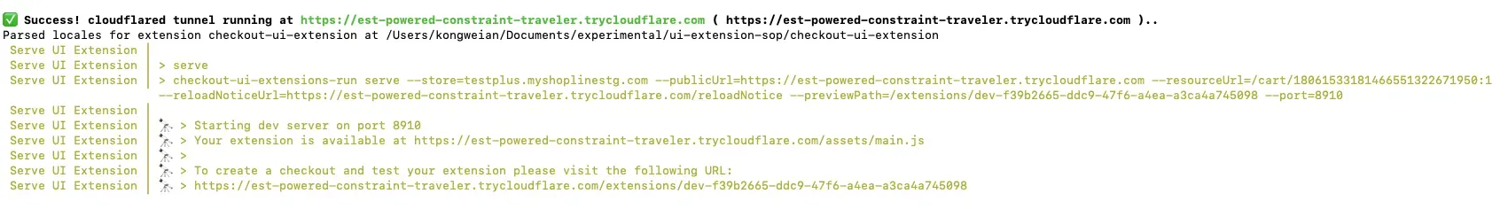
Step 5: Preview the extension
- After you complete developing the extension, run the following command under the extension directory to preview your work.
sl extension serve
- Click the last URL output in the terminal to preview the extension.
Step 6: Release the extension
- Push the extension using the following command. The SHOPLINE CLI will compile your extension code and push the compiled results.
sl extension push
Pushing the extension will not immediately make it effective on your online store. It will only become active after it is released.
- After the extension is pushed successfully, follow the prompt to click the URL to publish the extension in the SHOPLINE Admin.
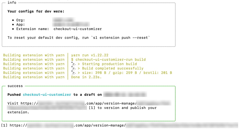
- In the SHOPLINE Admin, create an extension version first. Then click Publish under Operation to release the new extension version.
Extension activation
Checkout UI Customizers are only available for stores using the SHOPLINE Enterprise plan.
Step 1: Install the extension app
- Go to the SHOPLINE Admin.
- Find and click the Apps module in the left menu.
- Go to the App Store by clicking Go to App Store in the top right corner.
- Find the extension app and install it.
Step 2: Add the extension to the checkout editor
- Go to Settings.
- Find and click Checkout Settings.
- Click Customize checkout under Theme configuration.
- In the dropdown menu at the top, select a specific checkout page where you want to add the app extension.
- Go to the Checkout App module as shown in the following figure and click Add an app.
- Select and click the target app that you want to add to the checkout page.
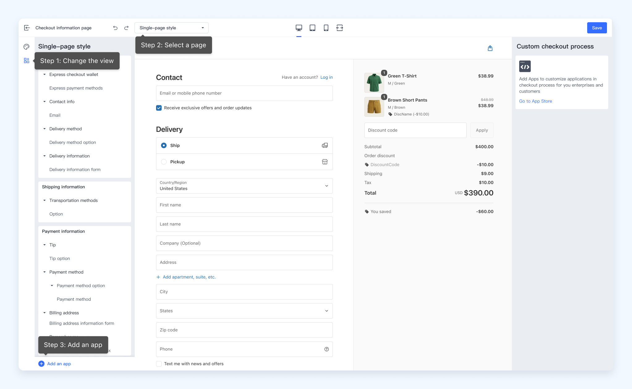
- Only apps that have been installed in the online store can have their associated Checkout UI Customizers found in the checkout editor.
- The app extension does not appear during the checkout process until the merchant adds it using the checkout editor.
Step 3: Test the extension in the store
- After successfully adding the app to the checkout page, you will find the Checkout UI Customizer in the checkout editor. Drag the extension to adjust its position to test if it applies as expected.
- Once you confirm the extension's position, click Save.
- Click View online store to check if the extension aligns with your expectations.
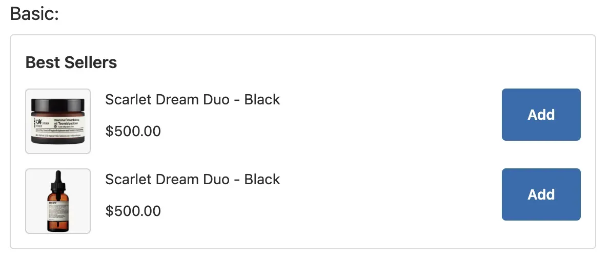
Extension example
The following code and image examples shows how to customize an image display component.
Code example
interface ItemProps {
  image: string;
  name: string;
  price: string;
}
interface GridBoxProps {
  title: string;
  children: any;
}
function BasicItem({ image, name, price }: ItemProps) {
  return (
    <Grid rows={'auto'} blockAlignment="start" columns={['auto', 'fill', 'auto']} spacing="base">
      <ItemThumbnail size="small" src={image}></ItemThumbnail>
      <BlockStack spacing="tight">
        <Text emphasis={"bold"}>{name}</Text>
        <Text emphasis={"bold"}>{price}</Text>
      </BlockStack>
      <View>
        <Button size="small">Add</Button>
      </View>
    </Grid>
  );
}
function GridBox({title, children}: GridBoxProps) {
  return <>
    <Grid rows={[20, 'auto']} columns={'fill'} spacing="base" padding={['none', 'none', 'base', 'none']}>
      <View>
        <Text size="large">{title}: </Text>
      </View>
      <GridItem>
        <Grid
          border="base"
          rows={['auto', 'auto', 'auto']}
          spacing="base"
          padding="base"
          cornerRadius="base"
        >
          <View>
            <Text emphasis="bold" size="medium">
              Best Sellers
            </Text>
          </View>
          {children}
        </Grid>
      </GridItem>
    </Grid>
  </>
}
// Customized implementation of product display
function AddToCartDemo() {
  const productList = [
    {
      image:
        'https://img-va.myshopline.com/image/store/1610440173818/01c5f3bf41533f63207f67ce922c3134865e9bfd.png?w=1056&h=1056',
      name: 'Scarlet Dream Duo - Black',
      price: '$500.00',
    },
    {
      image:
        'https://img-va.myshopline.com/image/store/1610440173818/5d55aa39c28c87881aece99f75d820b1b2db476b.png?w=1056&h=1056',
      name: 'Scarlet Dream Duo - Black',
      price: '$500.00',
    },
  ];
  return (
    <>
      <GridBox title="Basic">
        {productList.map((item, index) => {
            return (
              <BasicItem key={index} image={item.image} name={item.name} price={item.price} />
            );
          })}
      </GridBox>
    </>
  );
}
// Render the corresponding extension point
render("Checkout::Dynamic::Render", (props) => {
  return <AddToCartDemo/>
});
UI effect example

'%3e%3crect%20x='6'%20y='7.13049'%20width='13'%20height='10'%20rx='1'%20fill='black'/%3e%3cpath%20d='M12.4998%2012.936L-3.65042%200.604835L28.65%200.604838L12.4998%2012.936Z'%20stroke='white'%20stroke-linejoin='round'/%3e%3c/g%3e%3cdefs%3e%3cclipPath%20id='clip0_716_14611'%3e%3crect%20x='6'%20y='7.13049'%20width='13'%20height='10'%20rx='1'%20fill='white'/%3e%3c/clipPath%3e%3c/defs%3e%3c/svg%3e)

'%3e%3crect%20x='5.63086'%20y='7.26086'%20width='13'%20height='10'%20rx='1'%20fill='white'/%3e%3cpath%20d='M12.1306%2013.0664L-4.01956%200.735206L28.2809%200.735209L12.1306%2013.0664Z'%20stroke='%231A2C42'%20stroke-linejoin='round'/%3e%3c/g%3e%3cdefs%3e%3cclipPath%20id='clip0_716_14599'%3e%3crect%20x='5.63086'%20y='7.26086'%20width='13'%20height='10'%20rx='1'%20fill='white'/%3e%3c/clipPath%3e%3c/defs%3e%3c/svg%3e)