Overview
SHOPLINE offers a variety of UI components for the Checkout UI Customizer, enabling you to customize the checkout page and enhance the customer checkout experience. These components include but are not limited to buttons, text fields, dropdowns, and banners, which can be flexibly configured and combined to suit your needs.
You can use these UI components through the APIs provided by SHOPLINE. The components are highly customizable, allowing you to adjust their size, layout, and other attributes to match your brand style and business requirements. For example, you can collect more customer information by adding custom fields or incorporate additional interactive elements into the checkout process to improve the shopping experience.
Actions
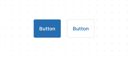
Button
The
ButtonUI component is used to perform actions such as Add, Continue, Pay Now, or Save when clicked.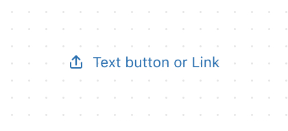
Link
The
LinkUI component transforms text into a clickable element, enabling customers to perform actions such as navigating to another page.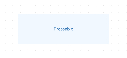
Pressable
Pressableis a versatile interactive component that detects press behaviors and lets you run logic in response to customer interactions.
Feedback
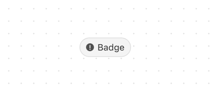
Badge
The
BadgeUI component is used to highlight contextual information about an object, such as labels or statuses.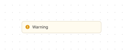
Banner
The
BannerUI component is used to prominently display important information or notifications to customers.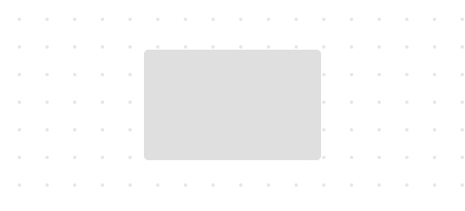
SkeletonImage
SkeletonImageis a placeholder component that shows a skeleton screen while an image is loading.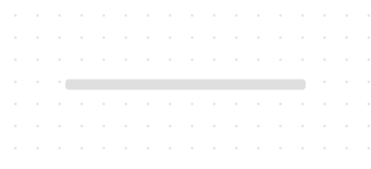
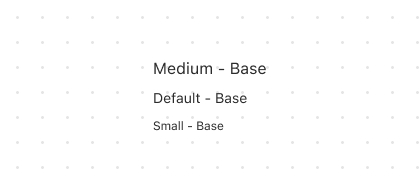
SkeletonText
SkeletonTextis a placeholder component for loading single-line short text, such as titles and labels.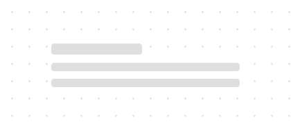
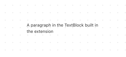
SkeletonTextBlock
SkeletonTextBlockis a placeholder component used when loading multi-line text such as paragraphs and headings.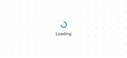
Spinner
The
SpinnerUI component is used to notify customers that their operation is being processed.
Forms
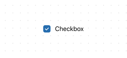
Checkbox
The
CheckboxUI component provides customers with binary choices, such as opting in to marketing or agreeing to terms.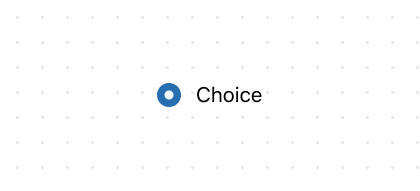
Choice
Choicerepresents an option inside ChoiceList, rendered as either a radio button or a checkbox.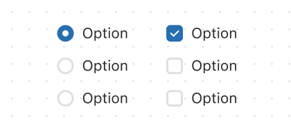
ChoiceList
The
ChoiceListUI component is used to display a single-choice or multiple-choice list for customers.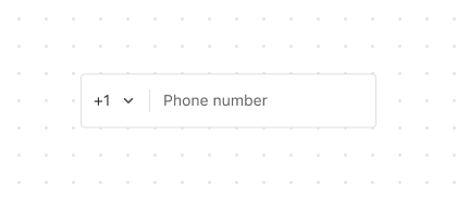
PhoneField
The
PhoneFieldUI component is an input field designed for entering phone numbers with country codes.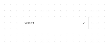
Select
The
SelectUI component allows customers to select an option from a dropdown list and is ideal when there are many options.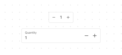
Stepper
The
StepperUI component allows users to increment or decrement numeric values such as item quantities.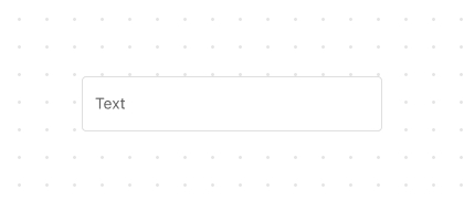
TextField
The
TextFieldUI component is used to obtain the customer's text input, such as a name or email address.
Media
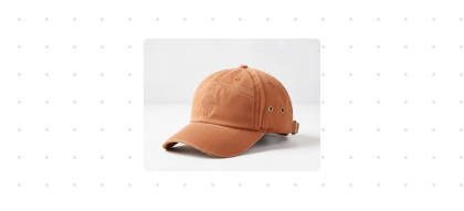
Image
The
ImageUI component is used to display the product image.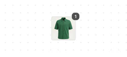
ItemThumbnail
The
ItemThumbnailUI component is a small preview image designed to help customer quickly identify a product.
Overlay
Structure

BlockLayout
BlockLayoutis used to arrange content across multiple lines, with each line sharing the available block space equally by default.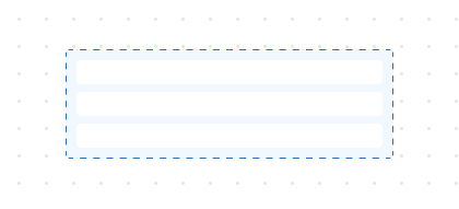
BlockStack
BlockStackis used to stack elements vertically.
Divider
The
DividerUI component is used to separate different content areas and indicate thematic boundaries.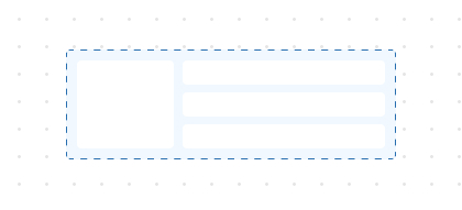
Grid
The
GridUI component is used to layout content in a matrix format consisting of rows and columns.GridItem
GridItemis a sub-container within the Grid layout system that controls the positioning and span of child elements.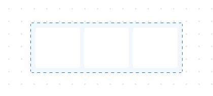
InlineLayout
InlineLayoutis used to manage content across multiple columns, with columns sharing available inline space by default.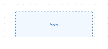
View
The
Viewcomponent is a universal container that keeps its internal content at its original size without forcing it to stretch.
Text

'%3e%3crect%20x='6'%20y='7.13049'%20width='13'%20height='10'%20rx='1'%20fill='black'/%3e%3cpath%20d='M12.4998%2012.936L-3.65042%200.604835L28.65%200.604838L12.4998%2012.936Z'%20stroke='white'%20stroke-linejoin='round'/%3e%3c/g%3e%3cdefs%3e%3cclipPath%20id='clip0_716_14611'%3e%3crect%20x='6'%20y='7.13049'%20width='13'%20height='10'%20rx='1'%20fill='white'/%3e%3c/clipPath%3e%3c/defs%3e%3c/svg%3e)

'%3e%3crect%20x='5.63086'%20y='7.26086'%20width='13'%20height='10'%20rx='1'%20fill='white'/%3e%3cpath%20d='M12.1306%2013.0664L-4.01956%200.735206L28.2809%200.735209L12.1306%2013.0664Z'%20stroke='%231A2C42'%20stroke-linejoin='round'/%3e%3c/g%3e%3cdefs%3e%3cclipPath%20id='clip0_716_14599'%3e%3crect%20x='5.63086'%20y='7.26086'%20width='13'%20height='10'%20rx='1'%20fill='white'/%3e%3c/clipPath%3e%3c/defs%3e%3c/svg%3e)